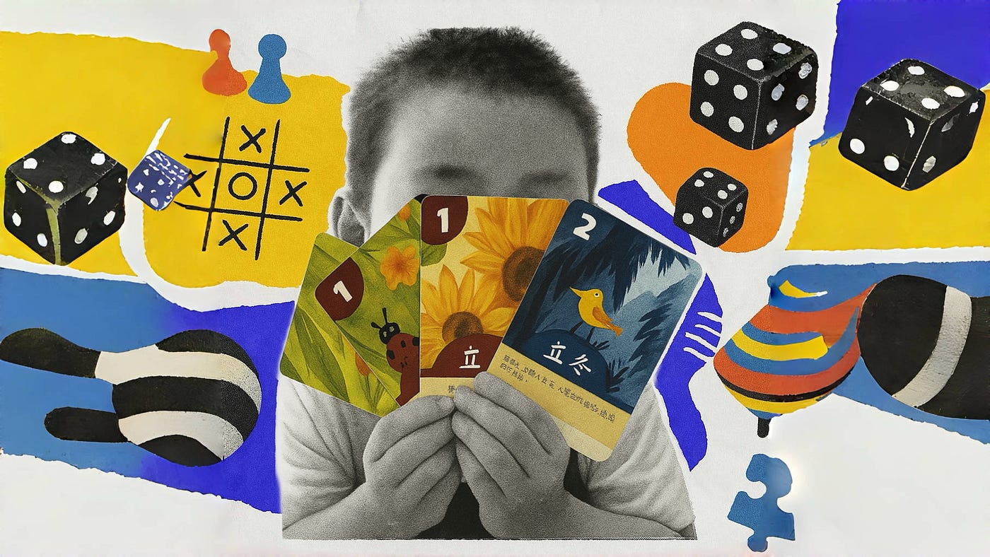
When UX dad meets board games for kids

Great kids’ board games are tangible UX journeys. Using Nielsen’s principles, they teach control, learning & social joy through play.

As a father of a 5-year-old boy, I deeply understand the importance of productive/creative pleasure for children. It’s not the passive stimulation from cartoons, but the vibration he feels when his little hand pushes the wooden snail shell across the table in the board game Rouleboule l’Escargot; it’s the confident smile on his face when he answers a question card correctly in Journey to the West Encyclopedia; it’s also the thoughtful concentration as he clutches colorful travel tickets in My First Journey: Discover China, studying the best route on the map. The time spent with my child is thus filled with joy found in one exquisitely designed, colorful box of children’s board games after another.

Time and again, picking up scattered pieces, explaining the rules over and over, and witnessing those moments of growth from clumsy attempts to slightly strategic thinking, I’ve come to realize that excellent children’s board games are essentially tangible user experience journeys. They, too, are interactions between people and a system (rules, components). Players need to understand complex rules, process information, make decisions, and derive fun, challenge, and social satisfaction from it. And within this, I’ve glimpsed the vivid application of Nielsen’s 10 Usability Heuristics.

Nielsen’s 10 Usability Heuristics are important reference standards in user experience design and a tool that has become second nature to me in my daily work. Yet, seeing this framework come to life vividly on the small tabletop has been a fascinating cross-disciplinary experience. Therefore, I want to combine my personal experiences as a father playing alongside my child with the perspective of a UX designer to discuss, based on these 10 heuristics, the UX design wisdom hidden within children’s board games. What exactly is it that allows little kids to pick up these games so easily and enjoy them?

​​I. Visibility of System Status​​

The design should always keep users informed about what is going on, through appropriate feedback within a reasonable amount of time. — Jakob Nielsen

The principle of visibility of system status emphasizes that systems should provide immediate feedback to communicate the current state of the system and prevent cognitive gaps. For children whose cognitive abilities are still developing, this principle directly impacts their gaming experience, learning outcomes, and emotional engagement. Its importance and application in board games can be analyzed in the following three ways:

1. Cognitive Support: Lowering the Barrier to Understanding and Reducing Memory Burden​​

Children (especially those aged 3–8) have limited working memory capacity and underdeveloped abstract reasoning skills. Visibility of status transforms the game process into perceivable signals through physical feedback​​.

This principle is widely applied in board games. Most score-based board games feature dedicated scorekeeping boards to record each player’s current status, allowing players to adjust their strategies based on scores.

For example, in Venture into Seasons, players can determine which solar term cards to exchange for points based on the number of solar term fragments they hold. In My First Journey: Discover China, the strong association between the colors of travel tickets and routes determines which cities players can access.
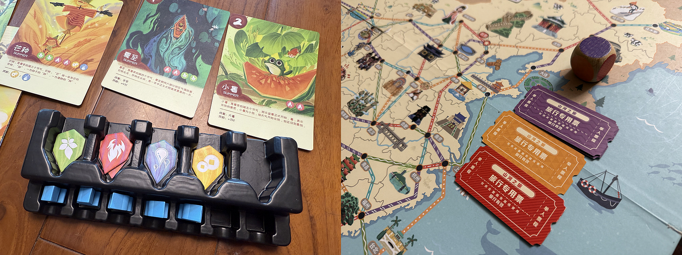
In Venture into Seasons, solar term fragments can be exchanged for corresponding solar term cards; in My First Journey: Discover China, travel tickets must match the color of the routes on the map

2. Emotional Experience: Incremental Rewards & Immersive Engagement​​

The visibility of system status empowers children with a sense of control over the game’s progression, reducing anxiety and amplifying enjoyment. For my son, watching scores shift on the tracker — experiencing each round’s triumphs and comebacks — fills him with palpable excitement.. ​​Structuring ultimate victory into phased rewards​​, which transforms a single moment of joy into ​​multiple peaks of achievement​​, sustains children’s enthusiasm throughout the entire game.
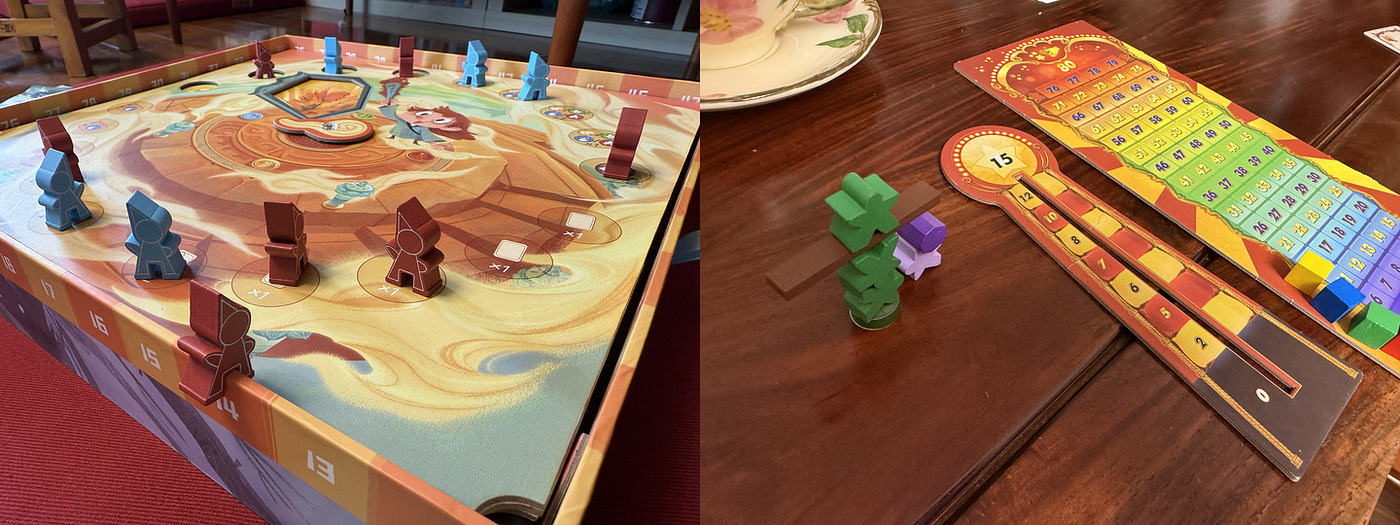
The Solar Cycle Rotation uses the ​​edge of the game’s box as a score tracker​​, while Tiny Acrobats features both scoring and score measurement boards​​.

​​3. Strategic Thinking: Breaking Visibility to Foster Skill Development​​​

To enhance challenge and engagement, some board games deliberately conceal certain game states. For example, in Polar Party, each player’s collected fish remain hidden. Players must ​​speculate and deduce opponents’ fish quantities​​ to decide whether their penguin should “hibernate” with the current catch. Similarly, games like Venture into Seasons incorporate ​​special scoring rules​​ in some cards, allowing players to seize last-minute opportunities for a dramatic comeback.
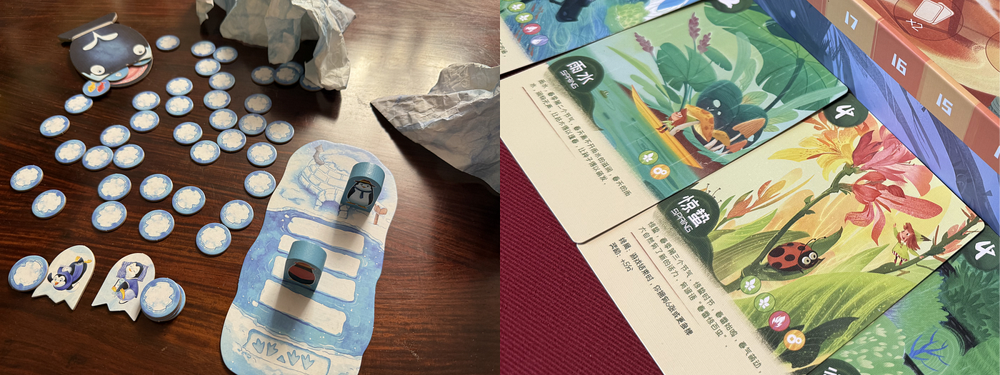
In Polar Party, what is on the reverse side of the tokens is concealed from players​​, while Venture into Seasons features ​​a set collection mechanic that grants bonus points for completing specific combinations​​.

In Bunny Boo, the designer intentionally conceals the sequence guidance for block stacking, encouraging children to complete structures through self-observation, thereby enhancing their spatial reasoning skills. In Monster Soup, the rules deliberately require children to ​​identify tactile features by touching concealed components​​ inside a drawstring bag, refining sensory recognition abilities. On the other hand, games like Gobblet Gobblers and Tim t’Aide à Ranger strengthen memory retention by ​​obscuring objectives​​, compelling children to recall and reconstruct hidden information.
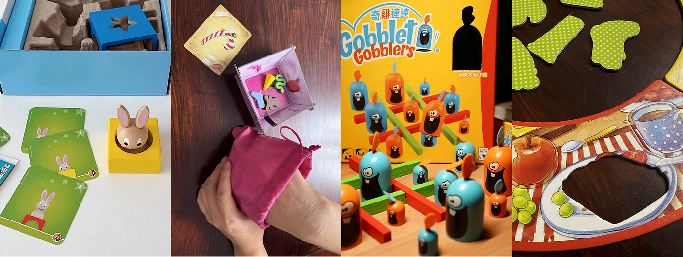
​​II.Match Between the System and the Real World

The design should speak the users’ language. Use words, phrases, and concepts familiar to the user, rather than internal jargon. Follow real-world conventions, making information appear in a natural and logical order. — Jakob Nielsen

By connecting with the real world, board games often provide children with tangible and relatable experiences. Integrating gameplay with real-world operations enhances the ​​ease of learning​​. This approach fully leverages players’ existing knowledge and intuition, reducing errors and enabling rapid rule acquisition. Not only does this lower cognitive barriers, but it also serves educational purposes — many board games with common-sense educational value exemplify this connection to reality.

1. Lowering Cognitive Barriers: Natural Transition from Known to Unknown​​

When we bring out the board game Shopping List, its components — shopping carts, checklists, and item cards (e.g., apple, milk, clothing, etc.) — instantly convey the gameplay and objectives to children. With only a brief explanation of win conditions, a three-year-old can directly grasp the “find-and-check” task based on prior supermarket experience, immediately understanding the game without needing to learn abstract symbols.
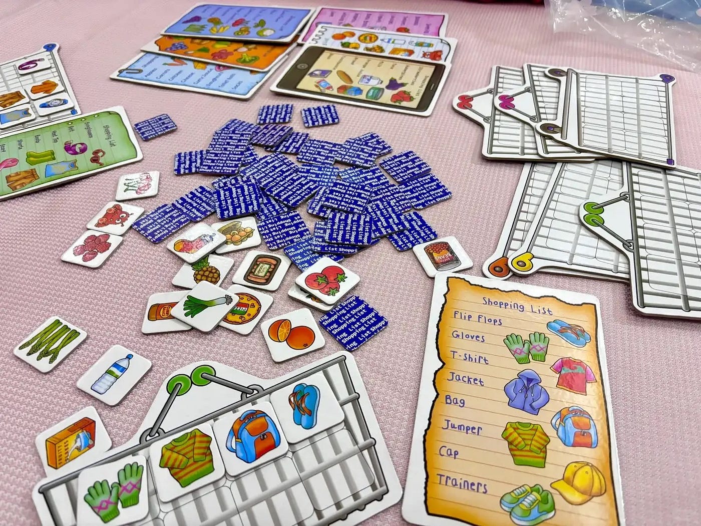
​​Draw a card — Check the list — Load the cart​

​2. Igniting Learning Motivation & Reinforcing Knowledge Internalization​​

This is exactly why my wife and I adore board games — they seamlessly integrate knowledge into gameplay, embodying the popular educational philosophy of learning through play, where engaging activities naturally spark children’s curiosity and drive to learn.

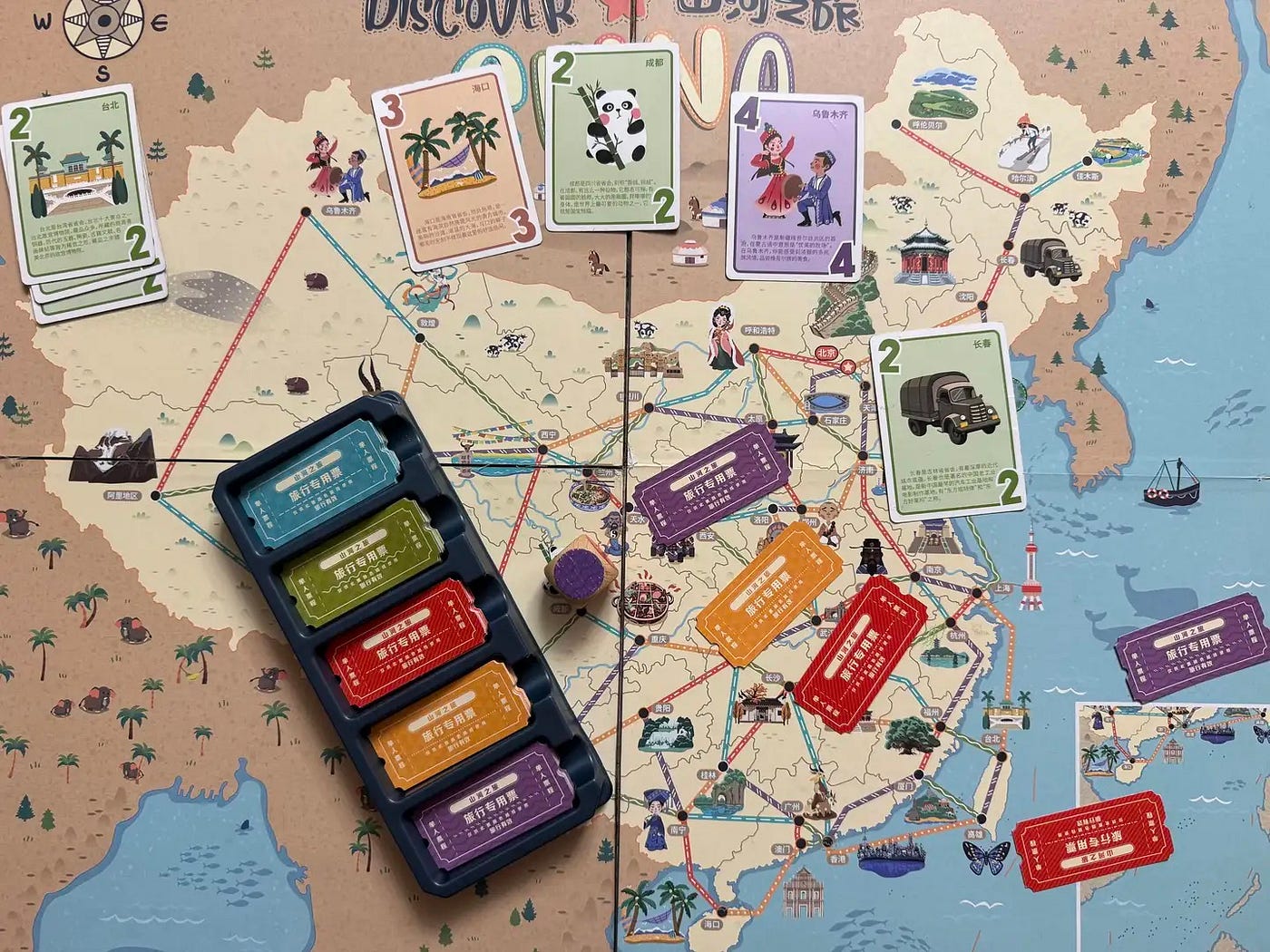
When my son plays My First Journey: Discover China, watching his fingertips trace rainbow-colored routes to locate cities on the map, I know he has become deeply familiar with the geography of China.
Watching my son play Tiny Acrobats, I see his small hands gripping those tiny props, his eyes filled with focused determination. In the game, he must carefully place balls, elephants, horses, and other elements onto the balance beam, or they will fall. For him, this is more than just entertainment. He is gradually, bit by bit, grasping the concept of balance.

Alignment with the real world is particularly crucial in board games for kids because abstract rules are often challenging for young minds to comprehend. Outstanding board game designers, much like UX designers, leverage real-world elements to facilitate understanding and ​​translate children’s lived experiences into the language of play​​. When board games become “tangible stories they can touch and play” rather than a set of abstract rules, educational goals are quietly achieved through laughter and exploration.

​​III. User Control and Freedom

Users often perform actions by mistake. They need a clearly marked “emergency exit” to leave the unwanted action without having to go through an extended process. — Jakob Nielsen

In UX design, the principle of ​​user control and freedom​​ gives users a sense of agency, preventing them from feeling trapped or frustrated. In children’s board games, this principle is central to fostering autonomy and decision-making skills, directly influencing their motivation and self-confidence.

Children crave a sense of control just as much as adults do. The principle empowers them with the initiative of “I can decide!” — a cornerstone of self-confidence. Thus, many excellent children’s board games deliberately place varying degrees of decision-making power in the hands of children.

In Polar Party, rolling the dice earns players “fish tokens” (points), but landing on a “killer whale” space results in the loss of all accumulated tokens. The key design lies in the ​​hibernation mechanism​​: players can choose to put their penguin into hibernation to safely store their current fish tokens, avoiding the threat of the killer whale. However, hibernating also means forfeiting an additional dice roll each round to potentially gain more tokens. This creates an ongoing decision point where players must weigh their options: ​​risk pursuing more rewards, or play it safe to secure existing gains?​​

After a few rounds of gameplay, my son began observing opponents, assessing his own position, and actively making judgments — “Time to hibernate now!” Even though sometimes his plans were thwarted just before he could act, the process of making his own choices and bearing the consequences (whether success or failure) brought him a profound sense of accomplishment and joy. Faced with failure, he no longer became easily discouraged but instead eagerly said, “Let’s play another round!”
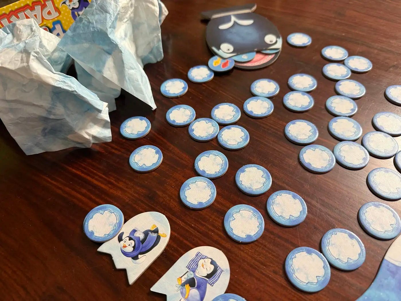
The killer whale in the distance has already taken a heavy toll, while the player below has chosen to start hibernating with one of their penguins.

What’s even more fascinating is how my son sometimes invents new rules. While playing Dog Bingo, he modified the rules to: Flip a card, and whoever finds the matching dog first scores a point!His declaration — “Play by my rules!” — was a bold assertion of independence. Through board games, he grasped the ​​scepter of control​​ for the first time — no longer just a passive participant, but a ​​creator of the game itself​​.

Truly exceptional designs genuinely respect children’s autonomy and intentionally ​​leave room for rule innovation​​. They encourage children to move beyond basic gameplay, make their own decisions about how to play, and ultimately enhance their creativity.

“You have the right to explore, the right to make mistakes, and the right to reach your destination in your own way.” This is especially true when designing for children, whether in interaction design or board game design. True freedom lies in entrusting children to navigate their own starship through the galaxy of rules.

​​IV. Consistency and Standards

Users should not have to wonder whether different words, situations, or actions mean the same thing. Follow platform and industry conventions. — Jakob Nielsen

The consistency and standards principle plays a foundational role in children’s board game design, serving as a cognitive efficiency cornerstone that significantly lowers learning costs through clear design language.

​​Color consistency is the first key for children to grasp complex rules​​. Take My First Journey: Discover China as an example: its rigorous ​​color-mapping system​​ — green tickets only work on green paths, red tickets on red routes — transforms abstract rules into ​​visual intuition​​. Children can navigate routes without memorizing complex symbols. This consistency extends to symbolic systems: in Great Explorers, the pickaxe icon represents mineral collection, the camera symbol marks animal spotting, and the specimen bag indicates plant gathering. The strong association between tools and functions creates a ​​visualized operating manual​​. This consistency is a core part of the game’s design.

​​The tools on the right correspond to the cards obtained below.

​​A series of games turns children into “skill transfer experts”.​​ After playing My First Journey: Discover China, when my son tried Globetrotter: Discover the World, he discovered both games retained the core rule of ​​ “Color-ticket for color-path redemption”​​, with only the map differing (Chinese cities → world landmarks). This is exactly like how Microsoft Office suites share a unified interface. The way to complete tasks remains consistent, significantly reducing the learning curve for new tools. Children can embark on new adventures without needing to relearn game mechanics.
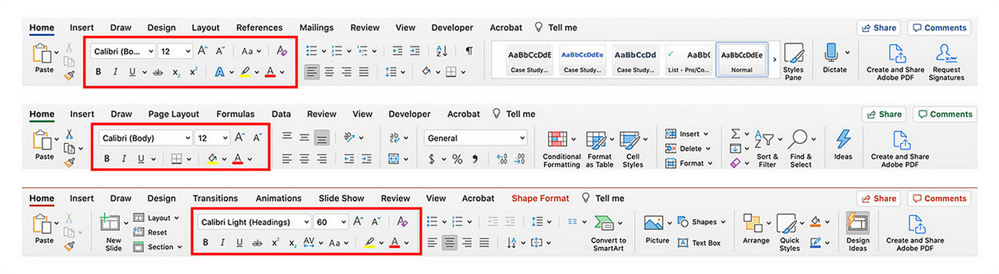
Microsoft suite consistency
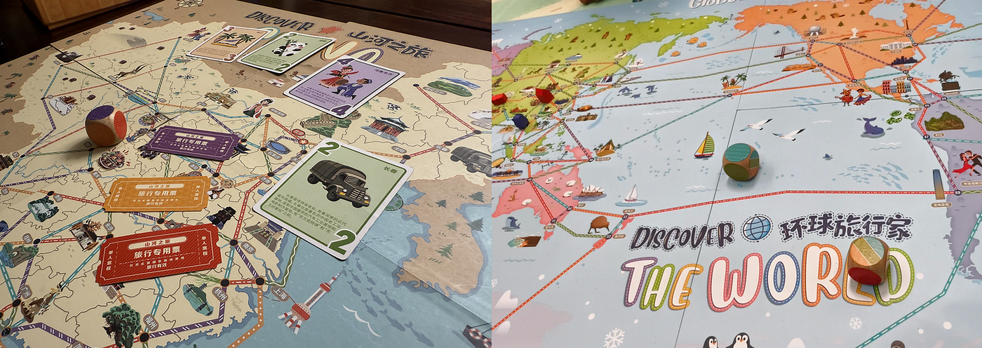
Core Ticket Mechanics of My First Journey: Discover China and Globetrotter: Discover the World

V. Error Prevention​​

Good error messages are important, but the best designs carefully prevent problems from occurring in the first place. Either eliminate error-prone conditions, or check for them and present users with a confirmation option before they commit to the action. — Jakob Nielsen

In board game design for kids, frequent mistakes can lead to frustration, feelings of inadequacy, anxiety, and even anger — ultimately causing children to resist the game. This principle is not merely a technical consideration; it is a gentle shield guarding the innocence of childhood against the sting of failure.

​​Physical Error-Proofing: Building Safe Tracks for Curiosity​​

Children’s motor coordination is still developing, requiring structural designs to mitigate risks. For example, while playing Tim t’Aide à Ranger, I often watched my son try to fit a card into the wrong slot. After a few attempts, he naturally understood it wasn’t the right match. Error prevention in children’s board games isn’t about restricting exploration — it’s about creating ​​safe tracks for enthusiastic yet clumsy little hands​​.

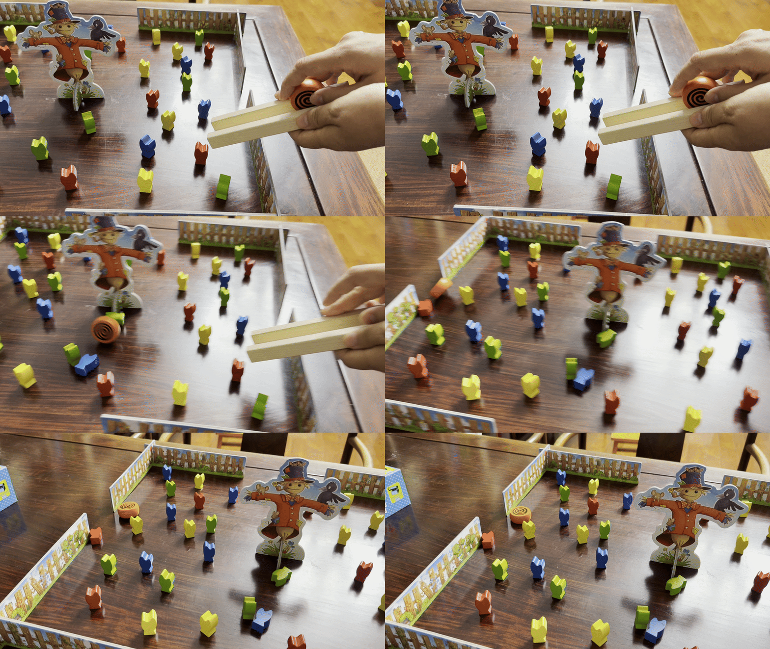
In Rouleboule L’escargot, the playing area is enclosed by a barrier. When a child throws the ball too forcefully, the barrier blocks it from flying out, preventing the game from devolving into a frustrating “search for the ball all over the floor” scenario. I’m reminded of an episode of Peppa Pig where George ends up as a ball retriever for his sister and Suzy Sheep — constantly fetching balls until he bursts into tears. The barrier in Rouleboule L’escargot avoids this exact frustration by minimizing time wasted on retrieving stray balls.
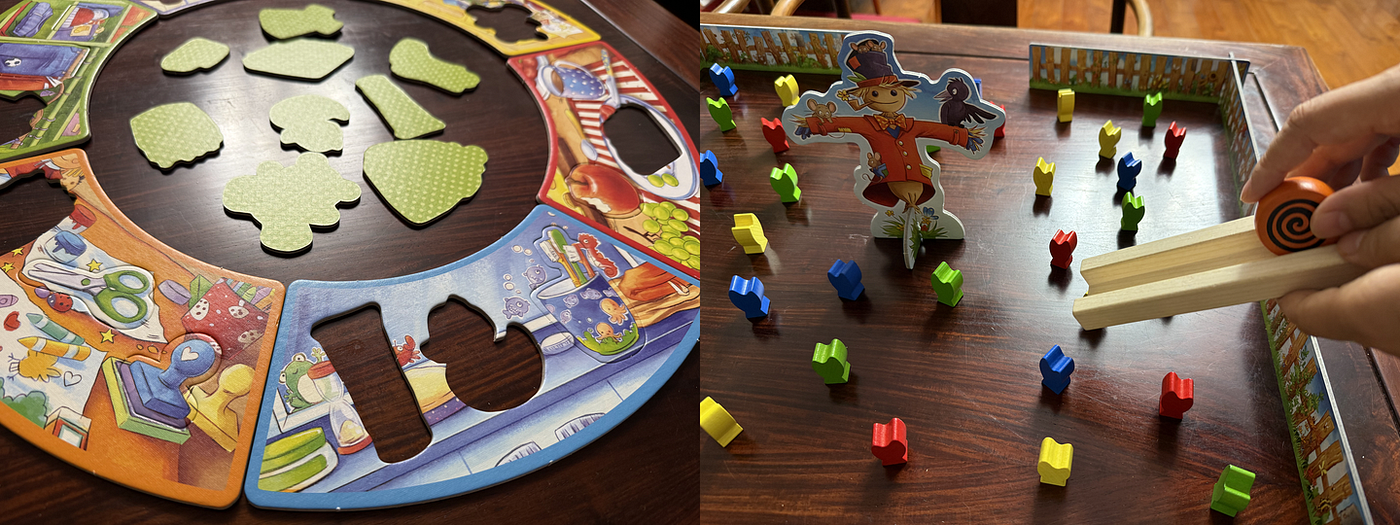
Left: Tim t’Aide à Ranger, Right: Rouleboule L’escargot

​​Inclusive Design​

Often, the absence of inclusive design itself is the most critical error. In the board game My First Journey: Discover China, the extensive use of green and red immediately struck me as a potential disaster for children with red-green color blindness. The core mechanic of the game relies on matching travel tickets to accessible routes based on color. This system would render paths indistinguishable as “a gray path” for colorblind players. This issue is not unique to board games; it reflects a broader oversight in many digital product designs, where accessibility is frequently neglected.
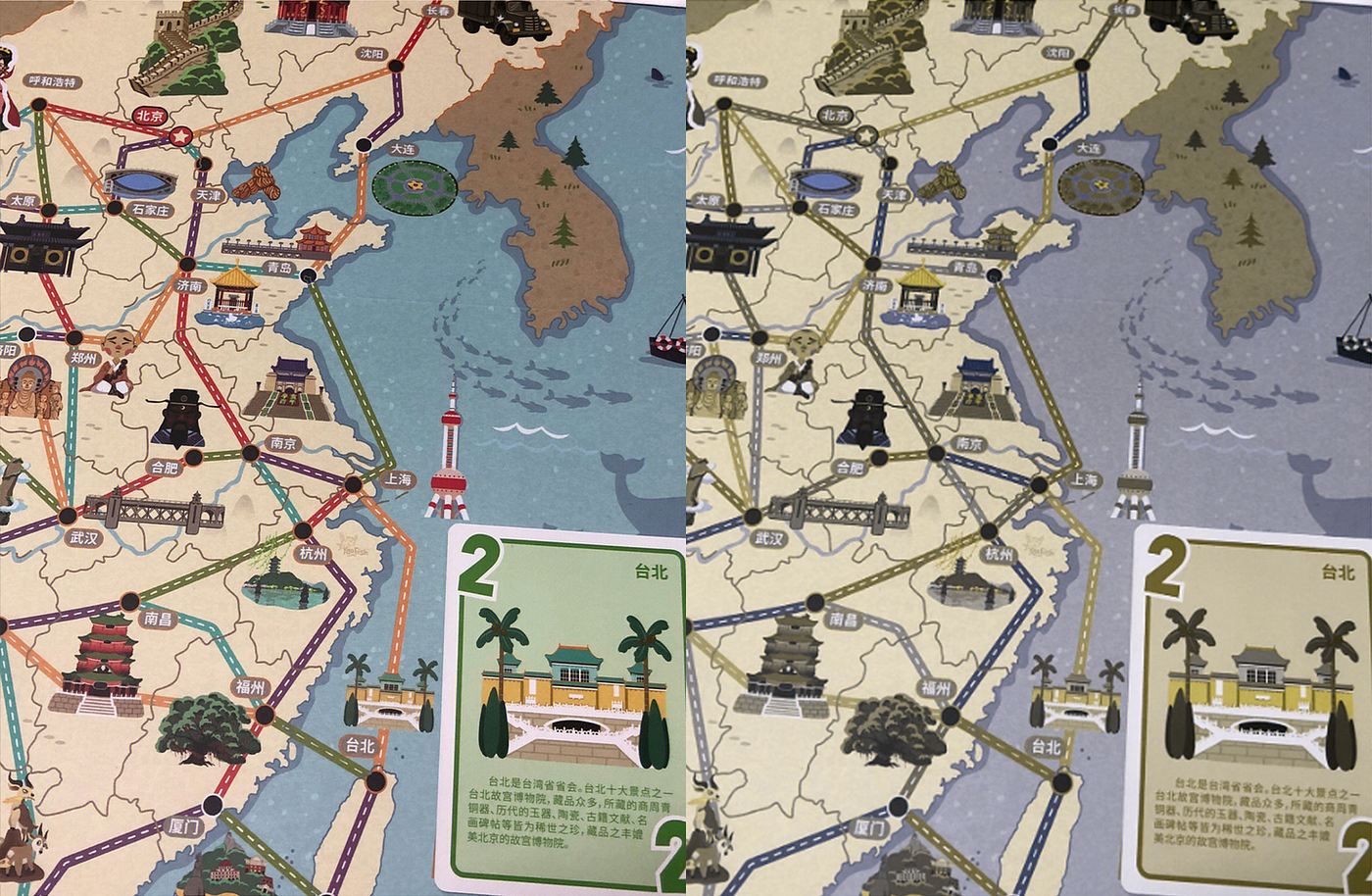
Left: board as seen by normal vision, Right: board as seen by red-green colorblindness

​​The Fun from Mistakes​​

To enhance gameplay engagement, some board games intentionally incorporate controllable mistakes into their design. These features act like built-in “airbags” — preserving space for adventure within an error-proof framework, allowing children to experience the thrill of risk-aware decision-making within safe boundaries.

In Rouleboule L’escargot, players often inevitably bump into each other’s counters, but this typically leads to shared laughter rather than post-mistake embarrassment. Similarly, in Tiny Acrobats, the collapse of poorly balanced blocks doesn’t frustrate children — instead, it motivates them to try again eagerly. The intentionally non-reinforced structure transforms the collapsefrom a failure into a lesson in engineering thinking: through repeated collapses, children intuitively grasp principles like triangles are the most stable shapeand a wider base improves balance.

Such designs deeply understand child psychology: a sense of controlled chaos can actually strengthen the desire for mastery. When children know that mistakes won’t lead to harsh consequences but are instead transformed into fun challenges or opportunities for exploration, they become more willing to take risks. This is precisely the growth value that controllable mistakesbring.

Knock them all down!

VI. Recognition Rather than Recall

Minimize the user’s memory load by making elements, actions, and options visible. The user should not have to remember information from one part of the interface to another. Information required to use the design should be visible or easily retrievable when needed. — Jakob Nielsen

While the rules of children’s board games are relatively simple, and the “burden of recall” may seem insignificant, this is precisely where design wisdom shines. In the games my son and I have played, we rarely need to refer to the instruction manual after the first playthrough — because the principle of ​​“recognition rather than recall”​​ is deeply embedded in their design: they use environmental cues to trigger intuitive responses, transforming fragile memory reliance into solid sensory cognition.

Cognitive psychology reveals that ​​recognition​​ is like answering a true/false question — it activates familiarity through external cues, requiring far less cognitive effort than ​​recall​​ (which is like filling in blanks and demands active retrieval of details).

Children under seven are in the ​​preoperational stage​​ of Piaget’s theory, where abstract thinking is underdeveloped but concrete perception is keen. Excellent board games convert recall into recognition through three key design strategies:

​​1. Visual Symbol Systems​​

My First Journey: Discover China employs ​​color-matching rules​​ (green tickets → green paths), transforming abstract route selection into intuitive color matching. Globetrotter: Discover the World establishes an ​​icon dictionary​​ — a pickaxe for minerals, a camera for animals — enabling players to understand corresponding actions without consulting the manual.

​​2. Physical Guidance Mechanisms​​

Tim t’Aide à Ranger uses ​​geometric error-proof slots​​ that only allow corresponding shapes to be inserted, allowing children to complete puzzles through ​​tactile feedback​​ rather than memorization. In Dog Bingo, blue discs are used to cover completed content, ​​visually distinguishing finished and unfinished tasks​​ through physical coverage.

​​3. Environmental Dynamic Feedback​​

In The Origin of Everything, rivers and grasslands are spatially arranged to ​​concretize the impact of the environment​​ on animals and scoring. Spotlight utilizes ​​light and shadow effects​​: by inserting a paper “flashlight” into the dark board layers, hidden patterns are instantly revealed, creating an “illuminate-to-discover” visual feedback​​. When searching for characters, the dynamic shift from blurred to vivid colors intensifies the suspense and sense of accomplishment in exploration.
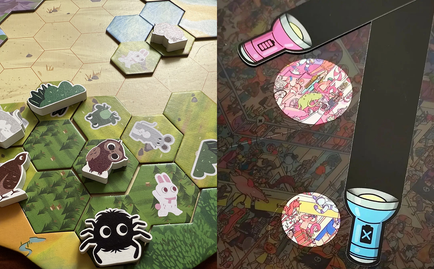
Left: terrain tiles from The Origins of Everything, Right: visual feedback in Spotlight

I remember my mother always used to say, “The palest ink is better than the sharpest memory.” When I entered the field of UX design, I came to understand that the mission of UX is to evolve every “writing tool” into a ​​sensory bridge​​ — unfolding before us as something visible, tangible, and audible.

VII. Flexibility and Efficiency of Use

Shortcuts — hidden from novice users — may speed up the interaction for the expert user so that the design can cater to both inexperienced and experienced users. Allow users to tailor frequent actions. — Jakob Nielsen

Flexibility and efficiency serve as a core mechanism in children’s board game design, balancing gameplay objectives with cognitive load. Together, they create a dynamic learning space where “entry barriers are low and skill ceilings are high.”​​ In digital product design, this principle is often implemented through shortcuts or customizable settings, while in board games, it can be broken down into two key approaches:

1. Reducing Redundant Actions to Focus on Core Skills

By simplifying processes and strengthening feedback, cognitive load is reduced, allowing children to quickly engage with core challenges. For example, My First Journey: Discover China uses ​​color-matching between paths and tickets​​, eliminating the need to memorize rules — players can intuitively match colors without consulting a manual. Similarly, Tim t’Aide à Ranger employs a ​​uniquely matching design​​ between cards and cutout shapes, making results instantly visible.

Such designs significantly minimize unnecessary steps, allowing players to focus rapidly on the game’s core mechanics and objectives.

2. Dynamic adaptability that leaves room for creativity

Children’s cognitive development varies widely, and outstanding board games should function like ​​“trees that grow”​​ — using modular design or rule switches to accommodate different age groups and skill levels. For instance, Tim t’Aide à Ranger offers ​​age-specific challenges​​ through varied use of clothing cards:

  • Toddlers can simply sort cards by color.

  • Young children can categorize by item function.

  • Older children can flip the card to hide colors and items, relying solely on card shapes to guess content and complete tasks.

In Tiny Acrobats, the scoring system allows players to earn points based on either ​​action difficulty or stack height​​. Players can choose to focus solely on height or complexity, enabling personalized gameplay.

Through expandable rules and open-ended components, these games support multi-age and multi-skill engagement. This ​​“growth-with-the-child”​​ model prevents younger players from frustration with overly complex rules while reserving deeper exploration space for older children.
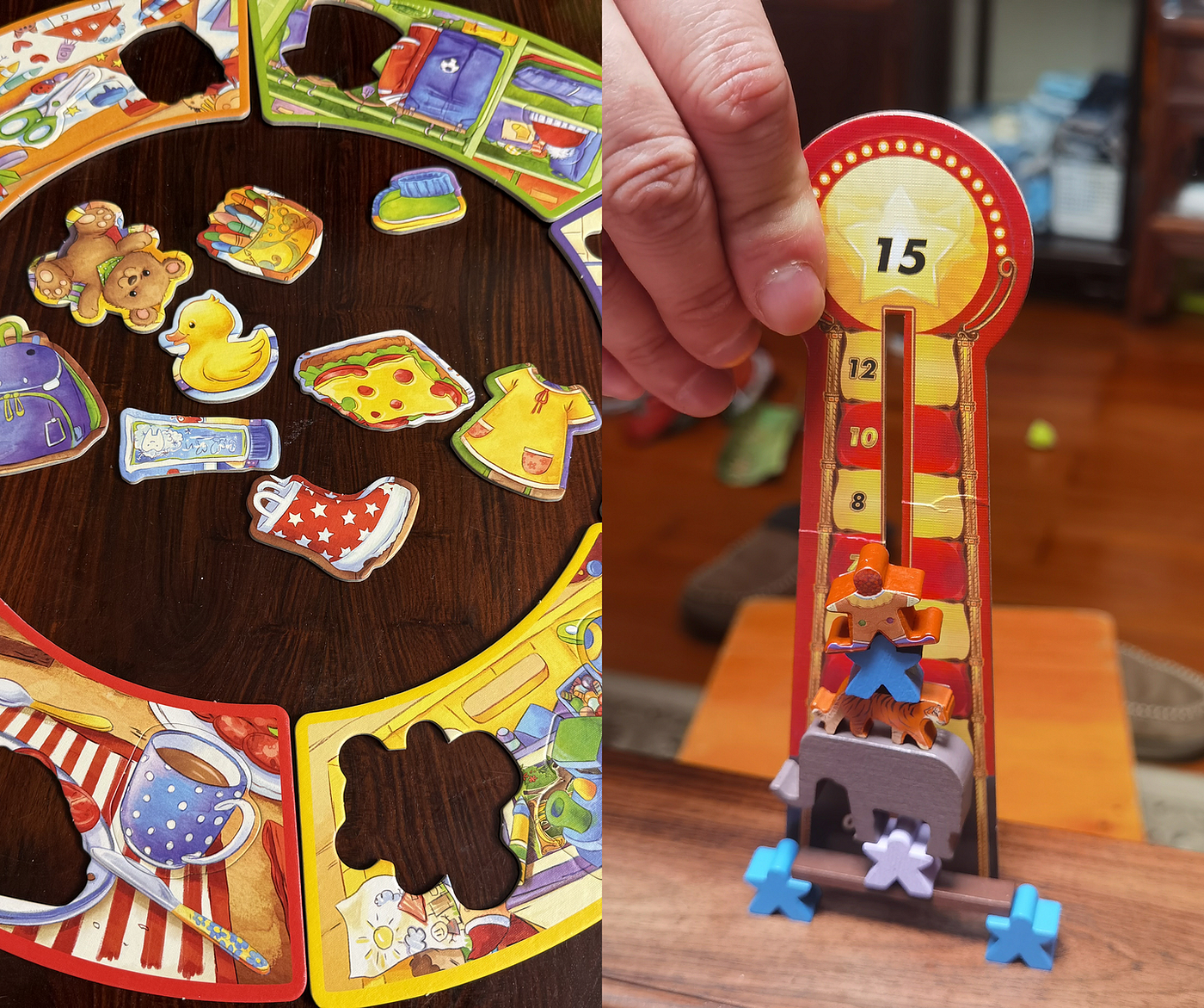
In Tim t’Aide à Ranger, players can either look at the card faces or flip them over and choose by shape alone; in Tiny Acrobats they can chase a high score by stacking tall or opt for trickier shapes to earn extra points.

VIII. Aesthetic and Minimalist Design

Interfaces should not contain information that is irrelevant or rarely needed. Every extra unit of information in an interface competes with the relevant units of information and diminishes their relative visibility. — Jakob Nielsen

Compared to adults, young children’s attention is scarce and easily distracted, and their cognitive processing abilities are still developing. Outstanding board game designs for kids employ ​​visual and interactive “subtraction”​​ to create a pure, focused playground for young players — stripping away all redundant information unrelated to the core gameplay — making objectives, rules, and key action points crystal clear.

In Bunny Boo, the entire game consists of just three primary-colored (red, yellow, blue) geometric blocks and a series of minimalist challenge cards. These cards clearly outline the target structure against a plain background free of decorative borders or distracting patterns. There are no extraneous character backstories, no flashy frames, and no attention-stealing background details. All of the child’s cognitive resources are naturally directed toward one clear task: observe, think, and manually recreate the spatial structure. This extreme visual subtraction ensures that no unnecessary elements interfere with spatial reasoning, allowing the core experience — ​​spatial cognitive training​​ — to proceed efficiently and without distraction.
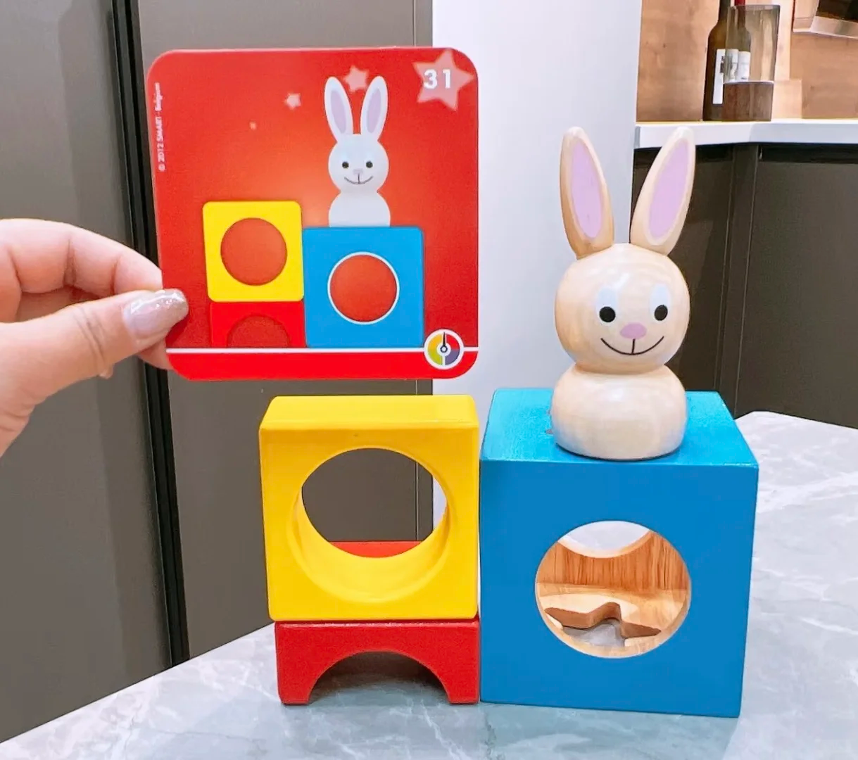
​​“Designing with White Space”​​ does not refer to physical emptiness, but rather to creating a “breathing room”​​ in information presentation and interaction design to prevent cognitive overload. It manifests through removing distractions, simplifying visual language, and emphasizing critical information.

Spotlight achieves dynamic “white space” through a clever physical interaction design. While the game’s scene boards are rich with detailed content, the designers did not expect children to process the entire image at once. Instead, they provided a flashlight prop with a ​​“spotlight”​​. When the child moves the flashlight, only a small illuminated area remains clearly visible, while the surrounding environment naturally recedes into “darkness” (visual white space). This design ​​forces the child’s visual attention and cognitive focus​​ precisely onto the key details needed for the search, blocking out surrounding elements that could cause confusion or distraction. It cleverly leverages physical constraints to create a dynamic, highly focused ​​“attention zone”​​, perfectly aligning with the core objective of “finding specific items” and significantly reducing the complexity of information processing.

The flashlight in Spotlight

These two examples vividly demonstrate the power of UX design principles in board games for kids: By eliminating noise and creating focused spaces, the design effectively protects children’s precious attention resources, directing cognitive energy precisely toward core game mechanics and learning objectives. This not only lowers the barrier to entry and enhances smoothness and fun but, more importantly, provides a structurally clear and appropriately challenging environment for children developing executive functions and information processing abilities. It allows them to focus on exploration, thinking, and problem-solving without being overwhelmed by irrelevant design details. This essentially builds a pure and efficient stage for children’s valuable cognitive development.

IX. Help Users Recognize, Diagnose, and Recover from Errors

Error messages should be expressed in plain language, precisely indicate the problem, and constructively suggest a solution. — Jakob Nielsen

In children’s board games, making mistakes is not only common but also a crucial opportunity for learning. However, how can we ensure that young children, when faced with errors, avoid falling into frustration and instead learn from them, regroup, and try again? This is precisely where the UX design principle of “Help Users Recognize, Diagnose, and Recover from Errors” comes into play. For young players whose cognitive and emotional abilities are still developing, well-designed error-handling mechanisms can help build confidence, cultivate resilience, and protect their enthusiasm for learning.​​

​​1. Clear and Immediate Error Recognition​​

Children need to intuitively “sense” when an error occurs, rather than relying on abstract explanations or others’ instructions. For example, in Gobblet Gobblers, the physical limitation that prevents a large piece from being placed inside a smaller one allows children to instantly understand the underlying logic. In Bunny Boo, if a child’s structure does not match the challenge card, the obvious visual and structural differences intuitively indicate that “something is wrong.” This kind of direct physical or visual cause-and-effect feedback is the most natural and effective language for children to understand errors.

​​2. Diagnosing and Understanding the Problem​​

Simply knowing that something is “wrong” is not enough — children need to understand why it is wrong. This is where diagnosing the problem becomes valuable. Well-designed games make the cause of errors obvious and tightly linked to core mechanics. In Tim t’Aide à Ranger, if a child tries to force a mismatched furniture card into a room board, the physical “jamming” or “inability to fit” clearly diagnoses the problem: “The shape is wrong!” The cause of the error directly points to the game’s core mechanic: shape recognition and matching. Spotlight uses its unique flashlight mechanism: if the child fails to find the target within the illuminated area, the game cannot progress. This naturally guides the child to diagnose the issue — perhaps the target is not there, and they need to move the light more carefully to search. The mechanism itself limits the scope of errors, preventing aimless confusion.

​​3. Effortless Error Resolution​​

However, the most human-centered design lies in creating a stress-free recovery process. Children’s board games should eliminate punitive consequences, making it simple, quick, and full of hope to try again. Bunny Boo and Gobblet Gobblers are perfect examples: built something wrong? Just dismantle and rebuild! Placed something incorrectly? Pick it up and try again! There are no point deductions or forced pauses, let alone blame. The cost of recovery is minimized, encouraging children to experiment boldly and explore repeatedly. In memory games like Shopping List, if a child flips the wrong card, they simply cover it again, leaving the game state almost unaffected, allowing them to immediately engage in the next attempt. Even in Tiny Acrobats, the collapse of the circus members is designed as a thrilling climax, with the joy of rebuilding following closely behind, cleverly transforming “failure” into the starting point of a new round of play.

​​4. Reversal as a Form of Error Recovery​​

For board games, I find one of the most interesting forms of “error recovery” to be the element of ​​serendipitous reversal​​. Reversal mechanisms essentially provide players with a systematic compensation for dynamic error correction and balance restoration. When players fall behind due to strategic mistakes, poor resource allocation, or plain bad luck, the game offers specific rules or events that transform their disadvantaged state into a new strategic opportunity.

For example, the special opportunities in the shop in Venture into Seasons. When players fall behind due to suboptimal early-game strategies or other reasons, the in-game shop provides nonlinear comeback opportunities. Although the shop may also pose risks of losing points, for players already significantly behind, the potential rewards far outweigh the risks. Through the shop, players can quickly catch up on scores and rejoin the competitive race. This effectively serves as a systematic recovery for errors caused by earlier strategic missteps, bad luck, or opponent pressure.
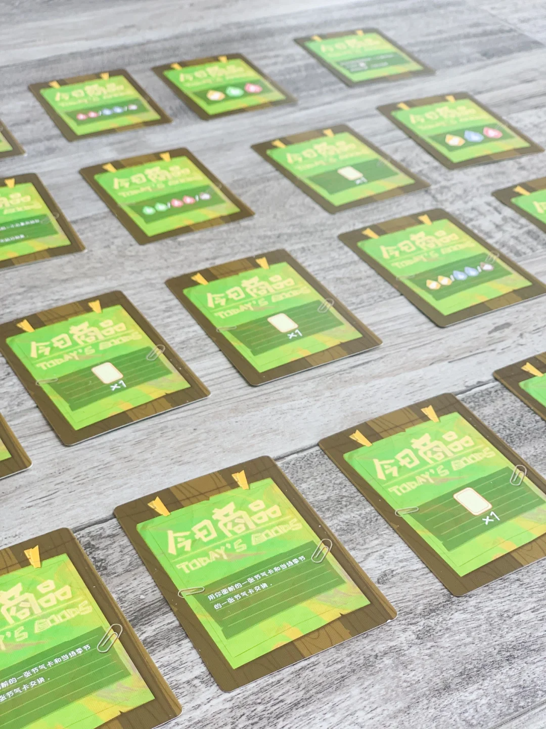
​​Serendipity Shop Card​

In Great Explorers, players may occasionally ​​stumble upon bonus cards​​ or draw ​​event cards​​, which can provide an immediate catch-up effect for those who are falling behind. Compare to the shop opportunities in Venture into Seasons, the surprises in Great Explorers rely more on ​​luck rather than strategy​​. From a design perspective, the strategic choice of higher-risk but higher-reward opportunities in Venture into Seasons tends to be ​​less frustrating for leading players​​ and more acceptable than purely luck-based opportunities.
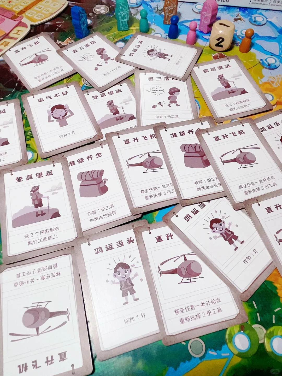
Fortune smiles!

In board games for kids, carefully designed ​​“comeback mechanisms”​​ are far more than clever tricks to enhance fun. They represent a gameplay extension of the UX design principle: ​​“helping users recover from errors or disadvantages.”​​ These mechanisms ensure that temporary setbacks do not push young players into the abyss of despair but instead pave a hopeful path for them to catch up. By providing clear and visible opportunities for reversal — whether through strategic reserves or moderate luck — designers effectively safeguard the game’s fairness, suspense, and every young player’s positive experience. This allows them to play with anticipation and smiles until the very end, even through the twists and turns of the game.

X. Help and Documentation

It’s best if the system doesn’t need any additional explanation. However, it may be necessary to provide documentation to help users understand how to complete their tasks. — Jakob Nielsen

An effective instruction manual for children’s board games is a critical component of UX design, directly determining whether players — especially parents responsible for teaching and the children themselves — can smoothly and enjoyably enter the world of the game. An outstanding manual not only clearly communicates the rules but also lowers the learning barrier, sparks interest, and even immerses users in the game’s atmosphere.

Excellent board game manuals for kids avoid being a dry list of rules. Instead, they address the core needs of both young players and their guides (parents), transforming rule-learning into a smooth and enjoyable experience through the following key features:

​​1. Clear Information Hierarchy and Visual Guidance​​

A well-structured information hierarchy and visual guidance form the optimal cognitive pathway when encountering a new board game. An excellent instruction manual helps children and parents avoid information overload during their first interaction with the game. Through careful visual architecture, complex rules are broken down and reorganized, using icons, colors, typography, and illustrations to establish a clear information flow that guides the eye naturally and makes key points immediately understandable.

For example, the manual for The Origin of Everything relies almost entirely on vivid imagery: children can instantly see how to set up the game board, place cards, perform actions, and earn points, with step-by-step numbering to clarify procedures. This allows even young children with limited literacy to imitate and understand gameplay through visuals, significantly enhancing their sense of autonomous participation.
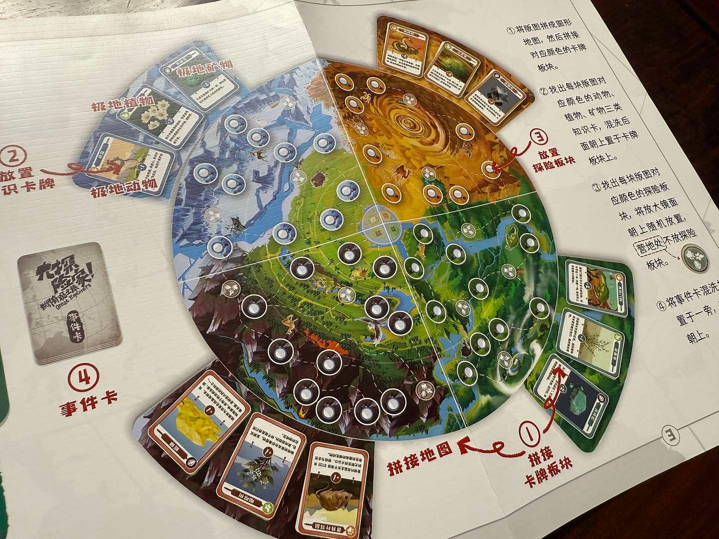
The instruction manual for The Origin of Everything directly utilizes in-game visuals as explanatory content

For board games like Polar Party designed for young children, the instruction manual only requires a small section at the bottom of the packaging box. It uses large, contextual illustrations and brief text, allowing children to imitate actions just by looking at the images, so literacy is no longer a barrier to understanding the gameplay.
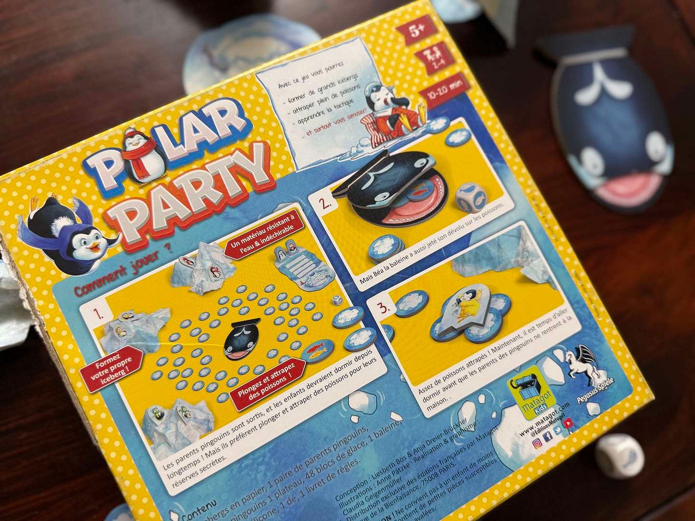
The instructions for Polar Party are succinctly explained on the back of the packaging box

​​2. Layering of Gameplay and Educational Content​​

Many board games for kids carry the dual mission of being both entertaining and educational. However, forcibly inserting knowledge into rule explanations often backfires. Excellent instruction manuals strategically separate and blend the ​​core gameplay rules​​ (“how to play”) with ​​educational content​​ (“what to learn”), ensuring that fun takes priority while knowledge is seamlessly integrated.

Most board game manuals distinguish between ​​rule-based content​​ and ​​knowledge-based content​​:

  • Core game mechanics are explained in detail through ​​clear rule modules​​ and rich contextual illustrations, ensuring smooth gameplay.

  • Educational content (e.g., seasonal climate features, animal habits, historical backgrounds of wonders) is primarily presented in ​​independent card descriptions​​, detailed map illustrations, or dedicated “Knowledge Tips” sections in the manual. This content is designed for exploration during breaks or for interested players.

This layered approach allows parents to easily focus on teaching the rules during gameplay, while educational elements naturally emerge as surprises or topics for extended discussion, which never interfere with the core flow.
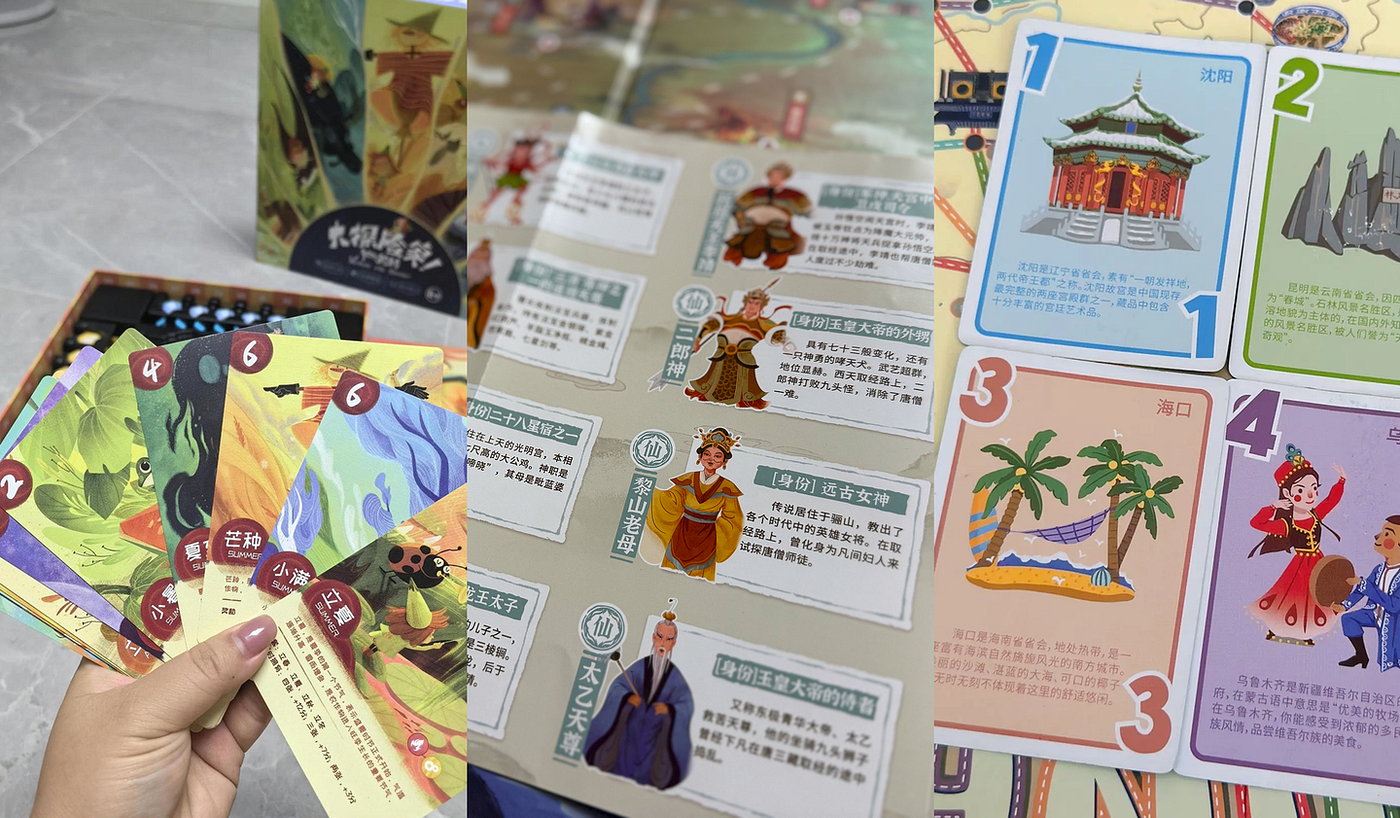
Solar-Term Knowledge Cards from Venture into Seasons, the stand-alone character brochure in Journey to the West Encyclopedia, and the City Knowledge Cards in My First Journey: Discover China

​​3. Multimedia Assistance​​

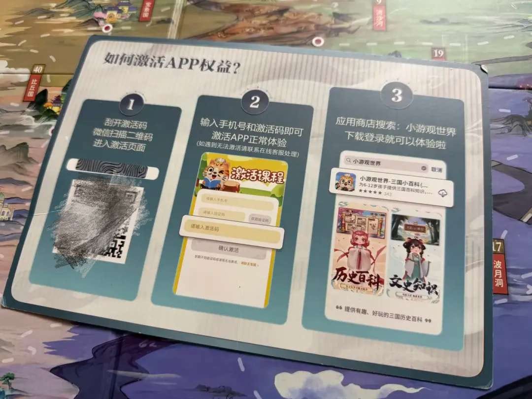
Building on paper-based instructions, many board games now incorporate digital multimedia resources, opening new doors for rule learning and knowledge exploration. While not essential, when used effectively, these tools significantly enhance the experience — particularly for explaining complex rules or abstract concepts and fostering immersive play. For example, Journey to the West Encyclopedia allows players to scan a QR code to access officially produced, lively demonstrations packed with educational content. This multimedia extension does not disrupt the logical flow of the physical manual but serves as an on-demand supplementary resource. It simultaneously supports rule comprehension and enriches knowledge delivery, achieving educational goals in a more vivid and engaging manner.
Tiny Acrobats, on the other hand, leverages a carefully composed, joy-filled circus-themed soundtrack to intensely amplify the game’s thematic atmosphere. This approach:

  1. Instantly immerses children in an exciting circus setting;

  2. Establishes a ​​sense of ritual​​, marking the official start of gameplay and helping children transition and focus their attention;

  3. Serves a practical function: players must complete corresponding circus performance actions before the music ends. The music acts as a timer, much like real circus acts requiring timed performances, thereby heightening the game’s excitement and immersion.

This use of sound for emotional warm-up and atmosphere building is a powerful complement to traditional paper manuals in terms of “first impressions” and “emotional connection.”

A truly outstanding board game manual for kids demonstrates its design wisdom by transforming complex information into an experience easily understood by both children and parents. It’s not just about accurately conveying rules — it’s about using thoughtful design strategies to reduce cognitive load, ignite enthusiasm for participation, and skillfully balance fun with learning objectives. Unlike digital product design, where interactive guidance can be embedded during use, board games rarely allow in-game prompts, making clear instructions and documentation even more critical.

​​Conclusion: Board Games — A Child’s First “Well-Designed Product”​​

Nielsen’s 10 Usability Principles have been a key, unlocking my understanding of the design secrets behind children’s board games. Board games are likely the first complex “products” children encounter in their lives. A well-designed game, grounded in solid UX principles, doesn’t just bring joy — it subtly teaches children how to understand rules (systems), make choices (control), face setbacks (error tolerance), and seek help (documentation). It shapes a positive, confident, and exploration-driven “user experience.”

As a UX designer, my greatest joy lies in discovering the nuances of user experience in everyday life. Beyond digital products, the colorful cards and exquisitely crafted wooden components reflect the essence of our UX pursuits: understanding user motivations, helping users achieve goals, and creating “Aha moments.” This matters equally — whether for adults facing screens or children playing on the floor.
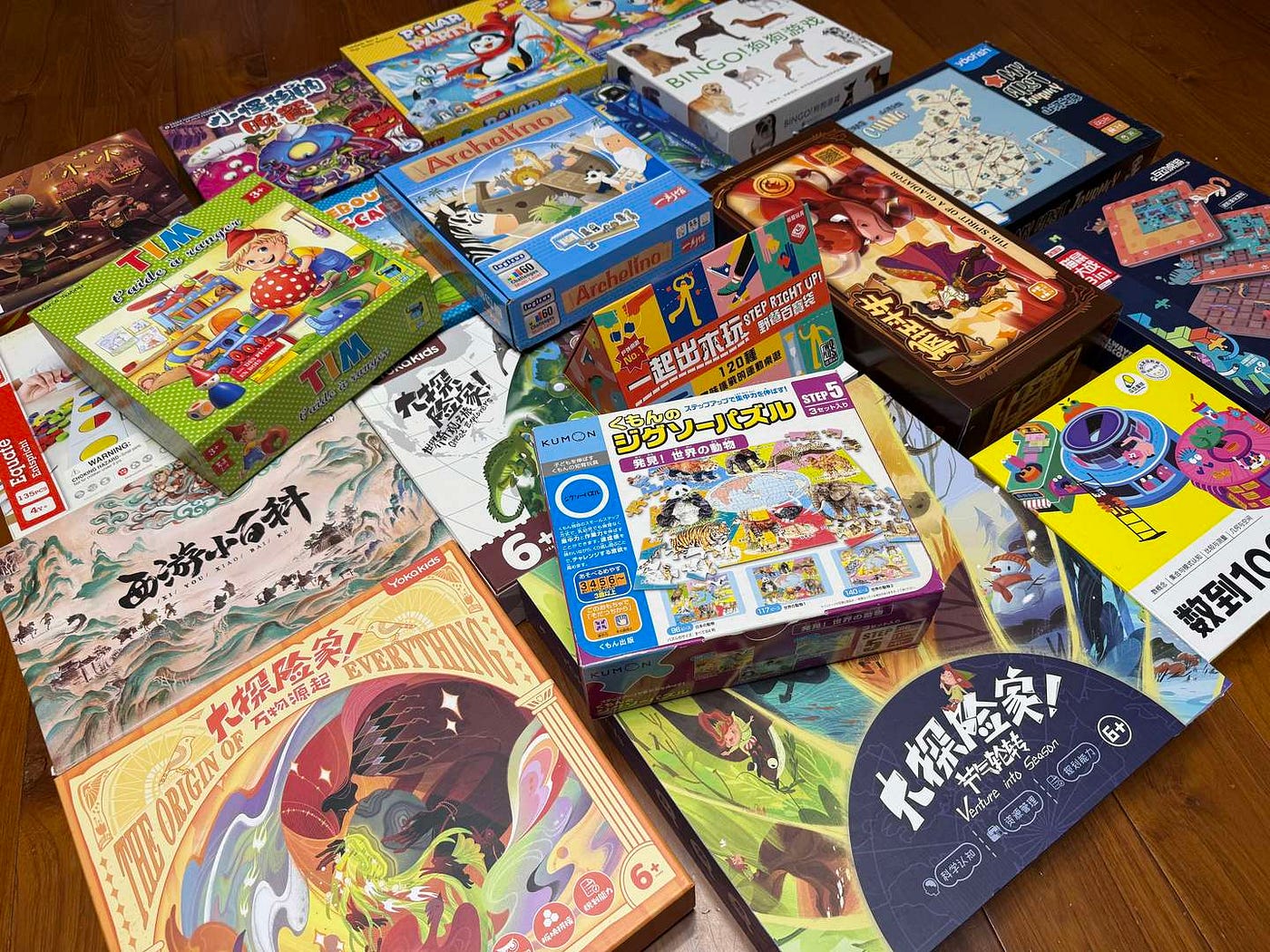
Bonus: My Recommendations of Board Games​​ for Kids

1. Dog Bingo (Age 3+)​

Highlights: Memory-matching gameplay; children can create their own rules to practice reaction skills and rule awareness.

2. Shopping List (Age 3+)​

Highlights: Simulates supermarket shopping; develops categorization skills through “find-and-check” tasks.

3. Spotlight (Age 4+)​

Highlights: Innovative “flashlight focusing” mechanism; dynamic white space design protects attention span and enhances observation and patience.

4. Polar Party (Age 5+)​

Highlights: Risk-based decision-making design; fosters strategic thinking and emotional management.

5. Rouleboule L’escargot (Age 3+)​

Highlights: Helps understand how height affects speed; improves hand-eye coordination.

6. Tim t’Aide à Ranger (Age 3+)​

Highlights: Age-tiered play that grows with developing skills (color → shape → memory challenges).

7. Bunny Boo (Age 3+)​

Highlights: Minimalist blocks and target cards focus on spatial cognition training; visual guidance for self-correction.

8. Gobblet Gobblers (Age 4+)​

Highlights: Physical error prevention with piece sizes; hidden objectives exercise memory and strategy; simple rules with deep gameplay.

9. My First Journey: Discover China (Age 4+)​

Highlights: Intuitive color-bound paths and tickets; integrates Chinese geography knowledge; combines strategy and education.

10. Journey to the West Encyclopedia (Age 4+)​

Highlights: Card-based Q&A + multimedia knowledge extension; seamlessly integrates traditional culture learning into gameplay.

11. Tiny Acrobats (Age 4+)​

Highlights: Combines balance building with musical timer; collapses transform into engineering thinking lessons.

12. Venture into Seasons (Age 5+)​

Highlights: Explore the magical world of the 24 solar terms.

13. Great Explorers (Age 5+)​

Highlights: Tour the world’s classic four natural wonders from home.

14. The Origin of Everything (Age 5+)​

Highlights: Play as Gaia’s little helper in Greek mythology to restore ecosystems and revitalize wastelands.

Design Thinking in AI Product Best Practice

As a music platform, music podcasts are a key focus and a distinctive feature in NetEase Cloud Music’s podcast business. However, we’ve faced three major challenges in producing these podcasts:

  1. Low Pass Rates: Few podcasts meet platform standards due to low spoken-word ratio, and there are insufficient podcasts suitable for distribution.

  2. Low Hit song Coverage: New content often fails to align with trending songs, leaving users with fewer appealing options.

  3. Slow Creator Workflow: Despite providing efficiency tools, hosts spend 4–5 hours producing a single music podcast episode due to creative bottlenecks.

In the age of AI, our platform is equipped to provide hosts with a fast, all-in-one program production service. We are excited to introduce an AI music podcast production tool designed to assist users throughout the entire production process, from song selection and scriptwriting to final audio synthesis.

However, users are primarily focused on whether their pain points are addressed, rather than the technology we employ. They want to know if our product offers superior solutions and enhanced value compared to other offerings. Therefore, we began by mapping the host’s creative journey to deeply address their needs.

Where Does AI Fit In?

When designing program production tools for hosts, it’s essential to thoroughly understand their creative workflow, including the challenges and issues they encounter during content creation. Only by mastering their workflow can we accurately identify areas where AI can make a meaningful impact, ensuring that AI technology delivers tangible and valuable support.

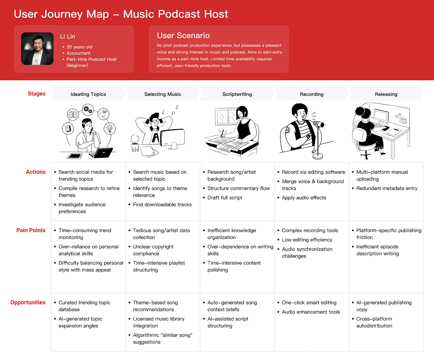
Music Podcast Host ​User Journey Map

The diagram above illustrates the typical user journey of our major hosts in podcast production. The main challenges for users lie in selecting a specific program theme and managing time-consuming operations across various production stages. AI technology steps in with notable benefits in the following areas:

  • Speeding up tasks

  • Simplifying task processes

  • Unleashing creative potential

Based on the identified pain points and opportunity areas in the diagram, we have pinpointed specific stages that can be enhanced through AI, automated, or simplified. Recent discussions with our internal team and technical experts confirm that third-party Generative AI and Prompt Engineering can facilitate:

  • Music podcast theme generation

  • Script drafting and refinement

  • Program synopsis creation

Additionally, NetEase Cloud Music’s proprietary Miyue model — leveraging big-data analytics and deep music domain expertise — provides theme-specific song recommendations.

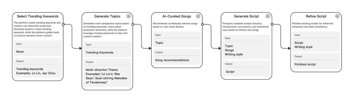
Building on these AI capabilities, we have focused our product’s core functionality on three critical steps: theme ideation, music curation, and scriptwriting. We have clearly defined both the input required from users and the AI-generated deliverables at each stage.”

Product Design

1. ChoosingTrending Keywords

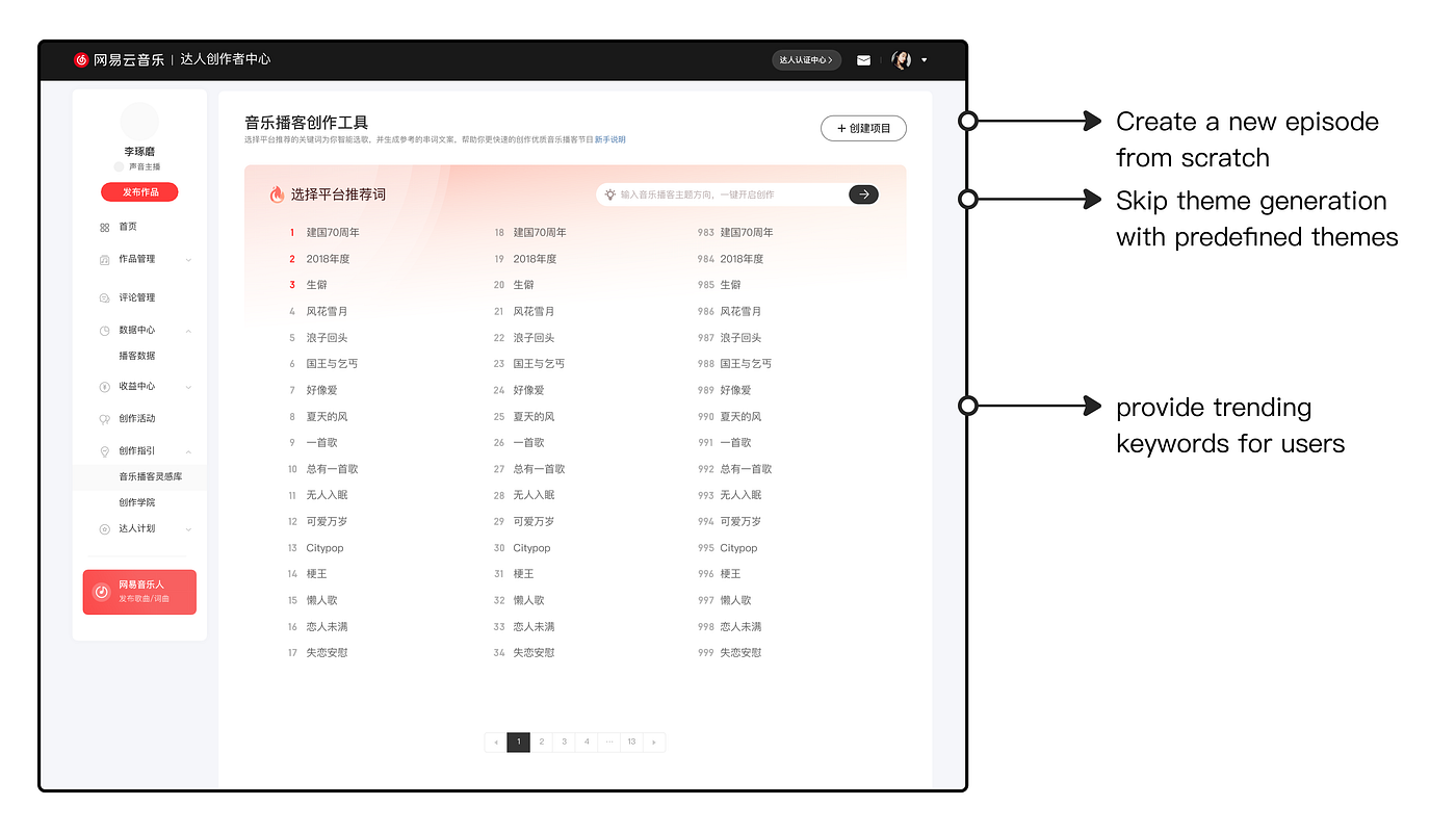
When leveraging large language models (LLMs) or other NLP AI tools to achieve effective outcomes, users often face challenges in identifying suitable prompts. Although the final program requires well-defined themes (e.g., Rhythm Revolution: The Dance Empire of Bruno Mars), we prioritize guiding users to select ​​trending keywords​​ as prompts. This approach enables multi-angle thematic exploration

When we started to design the product, we pondered the potential of harnessing AI to aggregate trending themes across the web, aiming to inspire hosts to craft the episode around the latest music trends. Yet, we settled on trending words that are less covered in our platform as prompts. This approach, particularly in the nascent stages of our music podcast, helps guide hosts to produce more podcasts covering popular tracks and singers, thereby increasing the host’s exposure and allowing the podcast to gain more traffic in the short term, while also securing a more enduring distribution footprint beyond fleeting trends.
This case reaffirms that AI adoption hinges not on technological sophistication, but on ​​aligning with user needs and platform objectives​​. Consequently, we utilize existing platform data for recommendations instead of generating entirely new AI content

Additionally, if hosts already have predefined themes or content in mind, they can build the episode themselves and use our tools later for polishing, or simply tell us their preset theme and let the music-podcast creation tool recommend matching tracks.

This embodies our user-centric control principle: users may either use the end-to-end workflow or selectively skip steps to access only the functionalities they need.

2. Generating Theme

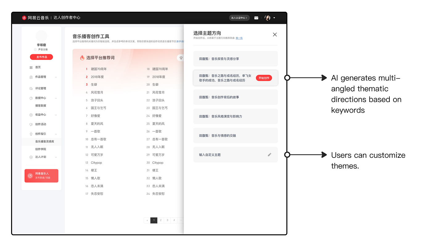
Once a user selects a trending keyword, the AI expands it into multiple thematic directions, ranging from genre, vocal style, signature works, lyrical depth, backstory, and historical accolades to more. Thus, hosts can pick the direction they prefer.

As noted earlier, choosing an episode theme is a major pain point in production. By selecting trending keywords, hosts receive a selection of AI-generated theme ideas that enable them to lock on exactly what they want to explore, slashing both time and effort.

Throughout the process, the AI offers options and room for adjustment rather than a single finished result. This keeps users in control, boosts creative flexibility, and ensures each episode remains personal and distinctive.

3. Generating Content

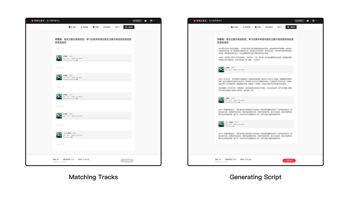
With AI, we can now deliver end-to-end content generation. By precisely matching tracks to the user-chosen theme and automatically crafting contextual scripts​​, we save users hours of writing time.

In the initial version, we split the workflow into two independent steps for maximize flexibility: after receiving music recommendations, users could either self-write the script or leverage AI generation. Post-launch data showed, however, that nearly everyone opted to have the AI-generated scripts followed by fine-tuning. Accordingly, the next iteration simultaneously produces matched tracks and contextual scripts upon theme confirmation​​.

While preserving users’ flexibility remains valuable, we unhesitatingly optimize defaults when they demonstrably enhance efficiency.

4. Episode Recording

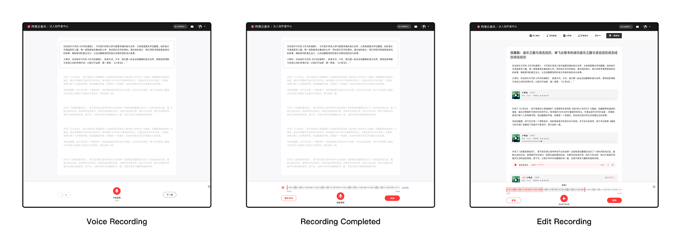
Users can record episodes directly on our platform. While veteran hosts may prefer professional external tools, our integrated recorder specifically targets non-experts seeking an all-in-one workflow solution. It supports fundamental features including basic recording, audio trimming, and background music integration, augmented by text-to-speech (TTS) and voice-cloning capabilities that transform scripts into audio delivered in the user’s authentic voice. Experienced hosts retain the flexibility to export scripts prior to the recording and use their preferred tools to record.

Once recording is completed, users can proceed directly to the publishing page for immediate platform release. While we have now established the full workflow of the AI music-podcast builder, opportunities remain to refine design details that optimize user experience more holistically.

AI Experience in Details

1. Onboarding for New Users

For a tool-based product, onboarding proves critical. The core design challenge for AI products lies in clearly conveying capabilities and benefits while preventing user overwhelm or confusion.

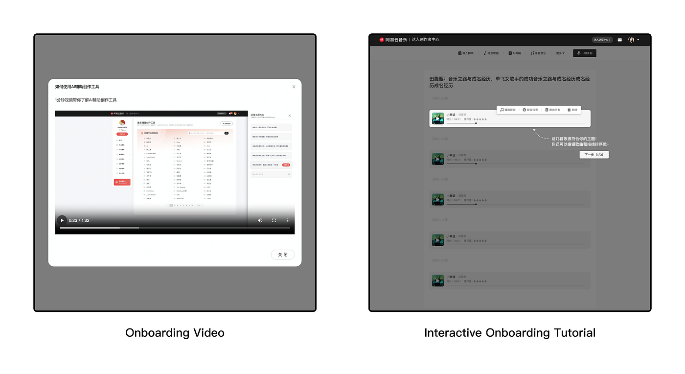
To address this, we deploy a concise yet comprehensive tutorial video upon initial launch. This video systematically guides users through the AI-powered music-podcast creation workflow while spotlighting unique AI functionalities. When users subsequently reach the content-editing interface, context-aware interactive walkthrough activates to demonstrate exactly what to do next and how the tool will help them reach their goals.

2. Optimize Creativity and Control

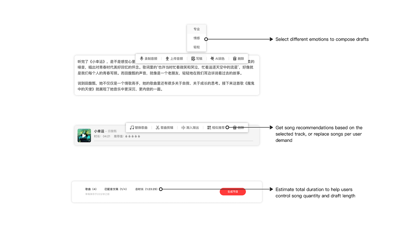
When designing a creative experience, the foremost concern is to balance the user’s need for both creativity and control, ensuring they have the final say in the output. As noted earlier, one of AI’s greatest strengths is its ability to spark human creativity — especially in content creation, where igniting that spark is central to a product’s success. Yet we must never forget that AI is only an assistive tool: the tool is meant to be wielded by people, not the other way around. Therefore, every design choice should leave users feeling that everything is within their grasp and that they can adjust course at any moment.

As shown in the above picture, we provide users with a suite of tools to spark creativity and give them more control over their content. Due to limited resources, we have not yet been able to deliver a fully comprehensive service. We will outline our plans to expand and refine these offerings in a later section.

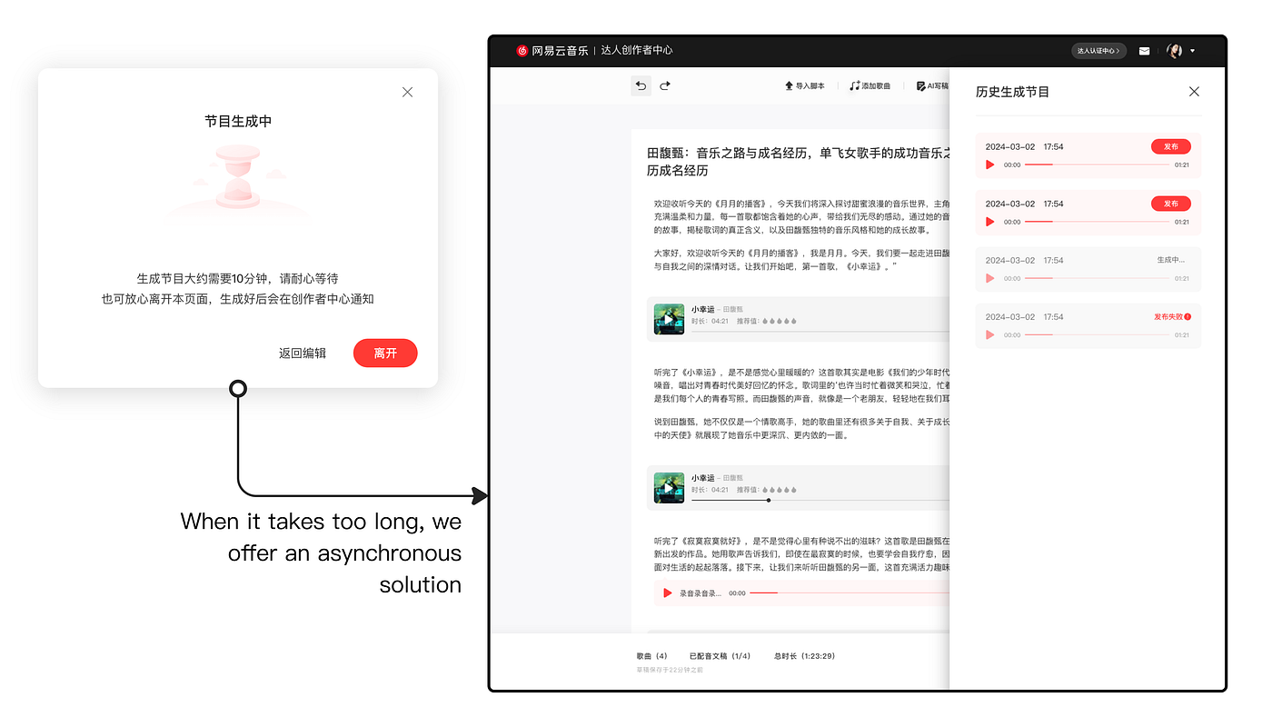
3. Waiting Time

Generative AI requires time to compute results, so crafting a strategy that keeps users engaged and informed during this interval is crucial.

Version History

For tasks that take more than one minute, we prioritize implementing asynchronous processing. This allows users to proceed with other tasks while processing occurs on the server, with immediate notifications upon completion.

Data & Feedback

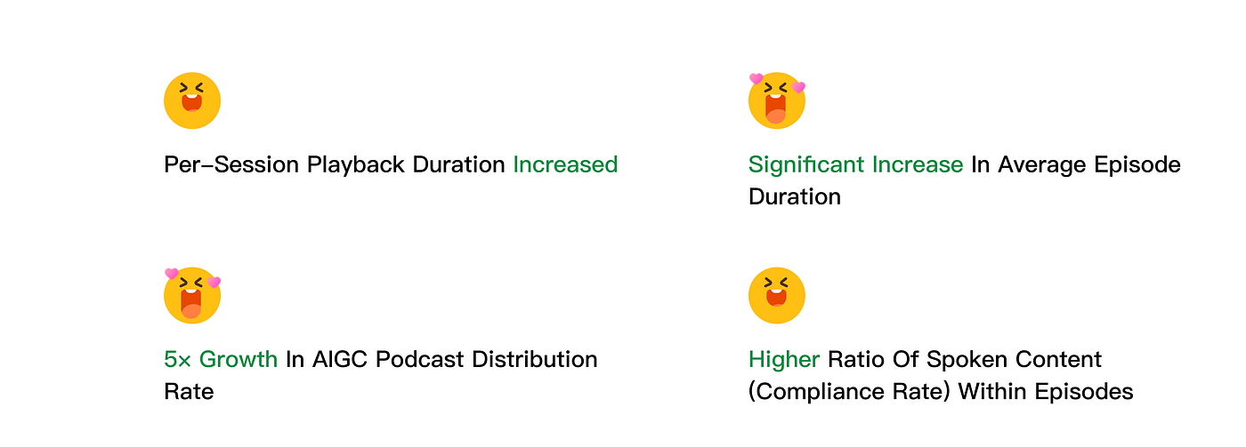
Since the music-podcast creation tool launched on 21 May 2024, it has helped produce more than 200 episodes per month. During this period, we have gathered the following insights:

Statistic Performance

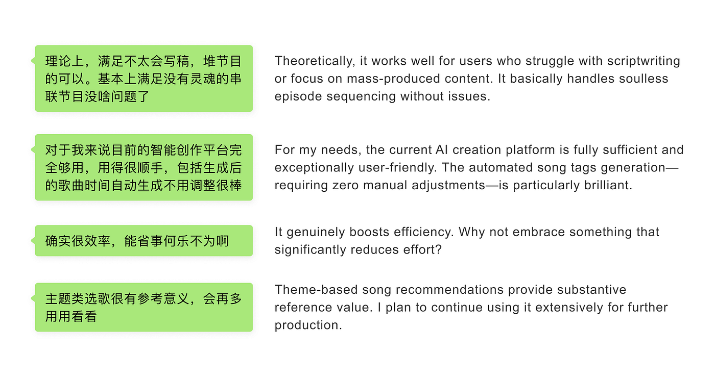
After launch, we gathered invaluable feedback via user interviews

User Feedbacks

We have received overwhelmingly positive feedback from hosts, alongside notable suggestions — particularly regarding infusing AI-generated scripts with greater personality, diversifying writing styles, and enhancing recording tools, as noted in the first user comment. These points will be prioritized in the next product cycle.

Beyond addressing specific pain points, we have established a long-term roadmap focused on continuously elevating performance and user experience. This ensures our tools evolve alongside rising expectations.

Future Outlook: Next Steps and Roadmap

Since the MVP version launched, we have rolled out background music, TTS, voice cloning, style and quality alerts, and numerous UX refinements based on user feedback. Looking ahead, we will focus on the following key areas:

1. Enhancing Content Diversity to Counter Homogeneity​

While we previously highlighted AI’s strength in sparking user creativity, our current tool still struggles to deliver distinctly varied outcomes across content generation sessions. This necessitates ongoing refinement of our data model and the introduction of expanded creative controls to diversify expressive options.

Take Adobe Firefly and similar AI tools, which let users tailor outputs through a variety of adjustable settings. Therefore, we plan to equip the AI with expanded configuration options, empowering users to craft more personalized content. This involves learning expression patterns from hosts’ historical content, enabling them to embed unique insights and perspectives into script generation styles. The system will thereby ensure outputs authentically reflect hosts’ intellectual depth and align with their distinctive personality.​

Users can edit and refine the generated images directly within Adobe Firefly

2. Contextual Assistance

Given that today’s AI models can already understand language, context, and user behavior, we can leverage these capabilities to deliver more precise, in-the-moment suggestions, guidance, and recommendations.

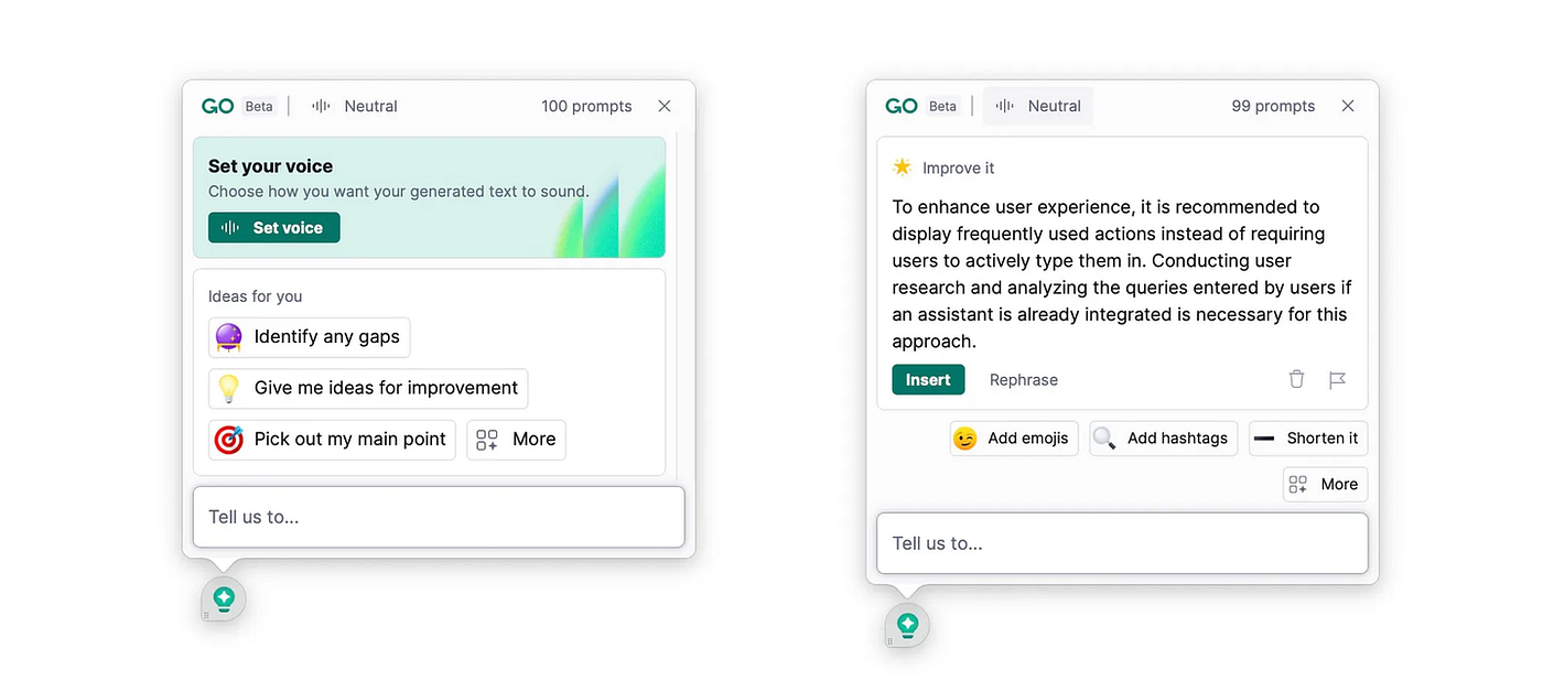
For example, Grammarly Go surfaces relevant actions — such as “shorten” or “improve” — when a user selects text. Yet this is only an early step. Our goal is to personalize these suggestions even further, aligning them tightly with each user’s specific needs and preferences.

Grammarly’s context-aware suggestions

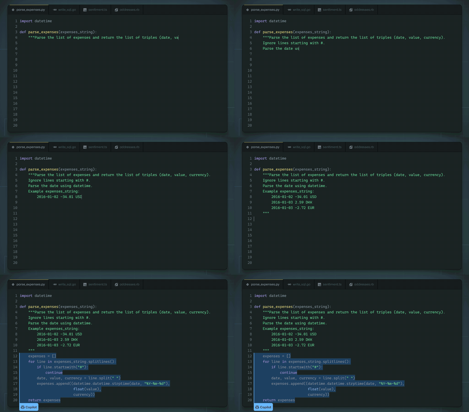
GitHub Co-pilot exemplifies exceptional contextual understanding. It seamlessly integrates intelligent suggestions into the coding workflow, enabling users to efficiently complete programming tasks without interrupting their current workflow or switching windows to search for solutions.​

Github Co-pilot Experience

For our music podcast production tool, we currently offer only video tutorials and pre-set interactive onboarding guides, underutilizing AI’s potential for personalized guidance. For instance, when users input an artist’s name, the system could automatically provide relevant artist information and related songs. Similarly, after song selection, it should recommend additional tracks aligned with user preferences.

However, designing such contextual experiences requires AI models to deeply comprehend users’ current workflows and past content interactions. Without this contextual understanding, we can only deliver generic pre-set recommendations. Therefore, technological capabilities must be validated before implementing these designs.

3. Agentic UX

Several months ago, I was fortunate to come across Professor Andrew Ng’s presentation “Agentic Reasoning” at Sequoia Capital’s AI Ascent summit, which offered fascinating insights.

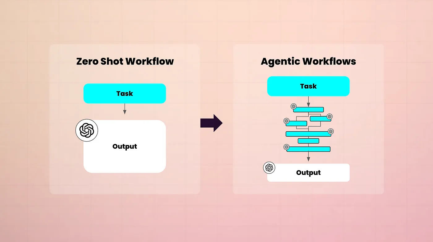
Professor Ng shared forward-looking perspectives on AI agent evolution, emphasizing AI agent and agentic workflows. His talk has provided a deep exploration of these concepts, which you can find in the video. I firmly believe future AI product experiences will be built upon this agentic workflow.

Zero Shot Workflow vs Agentic Workflows

The ideal User Experience Flow for the AI music podcast production tool will be: I (the user) would instruct the AI:

“I want to create a CityPop-style music podcast episode. It should include classic songs and representative artists of the genre, while also recommending relevant tracks based on recent trends — cleverly integrating song emotions with trending events. The tone should be light and enjoyable, with a total duration capped at 45 minutes.”

The AI would then assist me in producing the episode content.

Most existing tools merely provide fragmented inspiration or generic suggestions after users input parameters, failing to deliver fully personalized, end-to-end content customization. ​​Agentic workflows​​ can bridge this gap. Future AI will exhibit full autonomy, real-time web information synthesis, personalized service delivery, multimodal planning capabilities, and rich interactive content generation

Therefore, as technological advancements now enable the realization of AI agents, the design field must enter a new era of Agentic UX. Leveraging these capabilities, we need to reimagine user journeys — holistically supporting task execution through AI while enabling iterative refinement of outputs via conversational co-creation.

Summary

I’d like to summarize my hands-on experience with AI projects from two perspectives: the design process and the design principles.

Human-Centered AI Product ​​Design Process

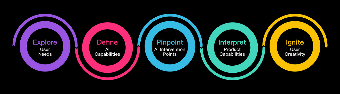
User experience designers universally adopt ​​Human-Centered Design (HCD)​​. For AI products, we adhere to this principle with a ​​user-centric approach​​, refining a five-phase framework.

​​1. Explore User Needs​​s​ The essence of user experience design lies in serving users, solving problems, and helping achieve goals. Therefore, our starting point must be users’ actual needs. Just as we deeply understood user needs and pain points before launching the project, this enables us to precisely identify which technologies can bring substantial help to users when exploring AI technology.

​​2. Define AI Capabilities​​ Collaborate with the development team to clarify AI’s current capabilities and identify which AI technologies we can leverage to achieve breakthrough innovative solutions. This provides a solid technical foundation for subsequent discussions on the specific implementation of AI solutions.

3. Pinpoint AI Intervention Points​​ Deeply analyze user needs, examine user journeys and scenarios, seek suitable opportunities to solve user pain points, and evaluate the unique value of AI solutions compared to traditional technologies. Simultaneously, consider how to translate user needs into actionable data inputs and ensure AI outputs meet user requirements. The user journey map helps us identify potential areas where AI can be implemented during this process, seeking ways to leverage AI’s unique capabilities to support user tasks at each stage, and vividly demonstrating the entire workflow through design.

​​4. Interpret Product Capabilities​​ As a new technology, AI requires us to clarify user expectations for the product and build trust. We need to clearly communicate the product’s capabilities and the outputs it can provide. Simultaneously, empower users with autonomy and control, enabling them to steer the AI’s output.

5. Ignite User Creativity​​ During continuous product iteration, a key optimization is igniting user creativity. As one of AI’s core advantages, we should continuously explore AI opportunities to maximize its capabilities. This is also built upon a deep exploration of user needs and understanding of AI capabilities. Through user feedback, enable AI models to learn from data and optimize, providing users with more personalized choices. The ability to ignite user creativity is a core competitive advantage of AI products.

These five phases constitute the human-centered AI product design process.

​​AI Product Design Principles​​ During the design process, I referenced numerous AI products such as Atlassian’s Loom, Notion, Grammarly Go, and Kimi. Combining their experiences with my project reflections, I’ve summarized the following ten AI product design principles:

AI Product Design Principles​​

During the design process, I referenced numerous AI products such as Loom from Atlassian, Notion, Grammarly Go, Kimi, and others. Combining their experiences with my project reflections, I’ve summarized the following ten AI product design principles:

  1. ​​Clarify AI’s Added Value​​: Ensure AI adoption solves user problems more effectively than traditional methods, not just for using AI itself.

  2. ​​Manage User Expectations​​: Clearly indicate which features use AI and transparently communicate expected outcomes. For AI-generated content loading times, provide users with clear time estimates or a draft function that saves users’ work.

  3. ​​Emphasize Value Over Technology​​: When introducing AI features, focus on how they help users achieve goals, improve efficiency, solve problems, or enhance experiences — not technical details.

  4. ​​Maintain Familiarity​​: Avoid “innovative” unfamiliar UIs just to showcase AI’s “magic.” Use established UI patterns to reduce learning costs, keep users task-focused, and build system trust.

  5. ​​Add Real-World Context​​: Providing contextual information with AI outputs helps users evaluate content value (e.g., including music reviews and encyclopedic references when generating songs/scripts).

  6. ​​Comprehensive Function Guide​​: Offer detailed guides to help users understand AI’s effectiveness and how AI helps achieve the goal. Keep this information outside core workflows to avoid distractions. The onboarding process prior to system entry serves as the ideal moment to deliver this information.

  7. ​​Immersive Prompts​​: Offer contextual prompts/suggestions when users engage AI features. Focus on decision-making and task-completion information — not technical explanations.

  8. ​​Automate Low-Risk Tasks​​: Prioritize high automation in low-risk scenarios while allowing user adjustments (e.g., our automating combined text/song recommendations in later iterations).

  9. ​​Always Provide Manual Overrides​​: If systems fail or output quality is poor, offer manual alternatives. Users should seamlessly continue workflows from where AI left off (e.g., manual editing alongside AI generation).

  10. ​​Phased Automation Approach​​: Balance automation and user control. Provide one-stop automation services where possible, while allowing step-by-step automation. For example, we can deliver final results all at once, or meet separate AI automation needs at each phase — such as track selection, text generation, and text polishing.

Following these principles ensures user-centric designs that fully unleash AI’s potential, creating solutions that meet user expectations while aligning with platform objectives.

In the end, we extend my sincere gratitude to the ​​NetEase Cloud Music Long Audio Technology Team​​ for their expert technical support throughout this project, and to the ​​Innovative Algorithms Department of NetEase’s Data Intelligence Center​​ for providing the AI Miyue Algorithm capabilities. Special thanks are due to ​​Zou Min​​ from the Product Center, who not only spearheaded this initiative but also led the team in exploring future directions for AI-assisted production, navigating numerous obstacles during R&D, and ultimately driving the project to successful implementation.

My Best Practice of Design QA

As a designer, have you ever asked following questions on the product you designed:

“It doesn’t seem to be what I designed.”

“This is different from what I thought.”

“It should’ve used the library components, why it’s not the same?”

If you only have these doubts after product release, you may need design QA in your design process.

Why Do We Need Design QA

Design QA is a key step in the design process. A designer’s responsibility is not just design and hand over to developers, but also to ensure that the details of the design have correctly implemented. Once the code is ready in the test environment, the designer should participate in the product test to ensure that the final product is consistent with the design, as well as spotting bugs and problems during the test process.

We often find that the developed product is different from the design and our expectations. This is usually due to three reasons:

1. The developer’s brain works differently from designer’s

It is common that developers understand specifications differently from designers. Due to the misunderstanding, sometimes developers will develop it as what they feel right but not what designers intended to. Designers need to pick out these problems in the design QA process and fix them with developers so that the product is not just working but with good user experience.

2. Design Issues

Some design issues may be discovered after development, especially the subtle experience of micro interaction, or edge cases that are not considered. Although the designer are expected to avoid issues caused by the design before development, there is always a possibility that the actual performance is not what you expected. Design QA is a good opportunity to check design issues again.

3. The developers didn’t follow the design

Sometimes, it may simply because that the developers do not pay attention to the details of the design. Developers have different focus from designers, thus developers are likely to involuntarily ignore some design details. This is also the reason why design QA is required.

Due to the above reasons, there’s always a gap between developer’s implementation and the design. Design QA provides a chance for designers to find and fill the gap between them, and help find possible issues in the design.

If design QA is missing in the design process, it is likely to cause UX debt. This concept originated from Ward Cunningham’s concept of Technical Debt, a word used to describe the debt incurred in the later stage due to the simpler rather than a more perfect way of implementation in the development stage. Joshua Kerievsky applied it in the field of user experience. He believes that it is like technical debt. Whether it is to save time or because of technical constraints, we finally have to pay a price to repay UX debt.

Design QA Process

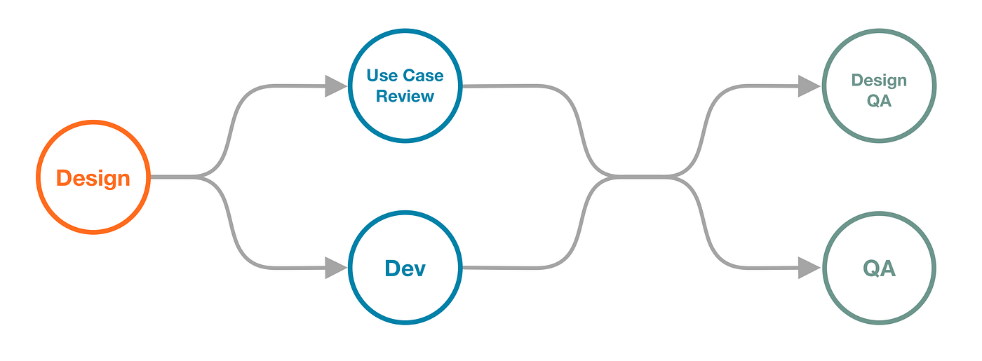
Design QA is preferably carried out in parallel with technical QA after development. Once the product is ready to test, you’ll have a functional demo to play with. Make it parallel with technical QA can avoid the entire process taking too long or causing repeated work for technical QA.

On the other hand, it is often said in medical science that prevention is better than cure. This is the same in product development.

To avoid problems being found only after the product release, we need to conduct QA before going online. In addition, to minimize problems in the demo we receive, we not only need to make a detailed specification in the design, but also participate in the test case review initiated by QA.

QA will write corresponding test cases for requirements to guide product testing. For some complicated requirements, QA will initiate test case review session with all stakeholders to review. This is a good opportunity for designers to understand how developers and QAs understand the design. Also, it helps expose any misunderstandings, and can be aligned immediately to avoid developers implement in a wrong way. When the requirements and business logic are complicated, test case review can help find and avoid many potential problems.

How Design QA Works

Let’s get a test version or a test URL, enter the test environment, and then you can look for potential issues like a hunter looking for preys.

I will generally focus on the following things during design QA:

  • Anything inconsistent with the design

  • Detail experience and the implementation of animations

  • Edge cases

To complete design QA with least problems left, I normally use the following methods:

1. Compare and review

Compare the design document with the demo implementation. We are able to find the differences between the implementation and the design by comparing these two. As mentioned earlier, the misunderstanding between designers and developers and the negligence by developers can easily lead to the difference between the implementation and the design. Therefore, compare and review with the design document can help us find anything that is missing or wrongly implemented.

2. Apply user scenarios

Simulate user scenarios for design QA. We can write some user scenarios to reflect the steps and tasks that users will take. By getting into user’s role to complete the process, we can find possible issues in the real scenario. For example, the user may need to switch the app to view other information when entering text, and find out the entered content has been erased after switching apps, or the user may find that the text is not correctly displayed after entering a large amount of text.

3. Complete walk through

Walk through all relevant elements and processes. The implementation is usually not an independent part from other features, it will interact with others. Therefore, in addition to test the designed features, it is also necessary to test other features that are not designed to be changed in this development, including unchanged features in the same page, as well as the upstream and downstream processes of the designed feature.

Creating a Design QA Document

It is seen that many designers are used to throwing problems into the IM after problems being identified. In that way, problems are often unnoticed, lost, and untraceable. Additionally, it makes design QA less official. Therefore, it is necessary for designers to create a well-formatted design QA document.

The design QA document should preferably support online collaborative editing, so that the problems can be synchronized to relevant stakeholders, and the business side are also able to record problems in the same document if they participant in the QA process (which is welcome). Further more, stakeholders can trace the solution to the problem, whether it is fixed and reviewed by designer again. For the format of the document, my best practice is to record in a form of spreadsheet. Each problem occupies a row, and each column consists relevant information of the problem.

1. Number

Number every problem. it helps stakeholders quickly understand which problem they are talking about when communicating with each other.

2. Client

For multi-client requirement, we need to note which client the problem refers to, so the corresponding developers can fix it. You can also create separate documents for each client, then you don’t need this column in that case.

3. Location

Describe where the problem occurs, so the developers can locate the problem. Usually I will describe it in the format of “Page-Module”. For example, “home page — Recommended”, or “playing screen — progress control”, etc.

4. Current Behaviour/Expected Behaviour/Screenshot

A typical way to describe a bug. For each problem we found, describe what the current behaviour and problem is, and what the solution and behaviour we expect. With this description, the developer can understand what the problem is and what the final presentation the design wants to achieve, thus fix the problem correctly.

When describing the problem, we may need to describe whether it is occasional or definite, how to trigger the problem and current behaviour, as well as client model. For complicated problems that are not easy to understand by text description, a screenshot or a screen recording can be helpful, compare the screenshot with the design would be easier to understand.

5. Priority

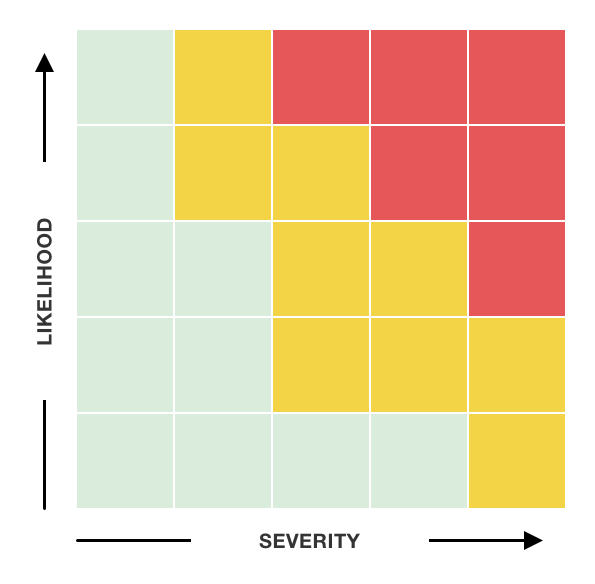
We can use the risk matrix to decide the priority of the problem based on its severity and likelihood (to happen) of the problem.

Severity refers to the impact of the problem on user experience and business requirements. Likelihood refers to whether the problem occurs occasionally or definite, whether it is in the main process or a branch that is rarely used. You can see the examples with different priorities listed below according to the risk matrix:

  • High: the function does not meet the requirement, there’re major experience problems, etc. (e.g. text or pictures are obviously misplaced, entering a dead end and unable to exit)

  • Medium: experience problems that won’t stop users to complete the task, or inconsistent behaviour (e.g. the exit animation is not consistent with other pages, or the coverage of hot spot is slightly small)

  • Low: problems that are not easy to trigger and do not affect the use of the feature, possible experience optimization, etc. (e.g. non-serious copywrite problems, optimization of animation)

A defined priority helps designers decide can we release the product with problems unsolved (due to cost and time) and how we deal with problems left after product release.

Generally speaking, high priorities should be fixed before going online. Medium priorities need to be fixed in the next one or two iterations. Low priority problems can be fixed when there’s opportunities to make it fixed in a certain iteration. I’ll also ask developers to add a difficulty dimension to understand the cost to fix the problem and take that into consideration .

Risk Matrix

6. Fixed Confirmation

It is better to provide a check-box for developers to tick a problem in one click. Developers can tick it after problems being fixed. Once designers see the problems is ticked, we can start second round QA.

7. Note

If it is difficult for developers to fix or a different method is adopted, the reason for not fixing the problem, or downgrade plan can be mentioned in the Note column, and we can go offline communication after first round of bug fix.

8. Design Check

The fixed problems need a second round design QA by designers to ensure that the problems have been fixed as expected. If the result doesn’t meet the expectation, we should make a note here.

9. Dev Name

Sometimes, there are multiple developers involved in a requirement. Developers should claim the problem they are responsible for. Designers can therefor know whom to communicate with offline and improve efficiency.

Design QA Problems and Solutions

I have also encountered some problems in the process of design QA. The followings are common problems I’ve met and solutions of my best practice.

1. If there’s no time to fix the problem, shall we delay the product release?

Every designer may have the experience of arguing with the product owner about whether a problem should be fixed before release. For the team that adopts agile method through rapid iteration, one can use the priority I mentioned above to decide when to fix the problem. High priority problems are generally problems that must be fixed before going online, and other problems can be fixed later. Therefore, define the priority first with the product owner according to the nature of your product, and then apply it in the work.

2. How to push the fix in the following iteration?

It is better to fix remaining problems in the following iterations otherwise the UX debt will eventually come to you. The unsolved problems should be recorded in one document. Each iteration should reserve some resources to fix the remaining problems, or fix them through other requirements. The designer also needs to actively ask the developer about the cost of the solution, it would help fix problems. For problems that do not require a standalone requirement, urging QA and developers regularly can also help push the problem to be fixed. For example, I once found a problem that depends on a pre-work of another team. As I asked regularly, when the pre-work was completed, QA informed me immediately and the problem was fixed soon. Anyhow, only by creating a system to fix the remaining problems can we better solve the UX debt.

3. Prevent product release without design QA

Primarily, we should create an official design QA process. Align design QA process with developers, QAs and product owner, make it official, and ensure that the designer has reviewed the product before going online. In addition to the process, it should also ensure that the designer is able to know the demo is ready and there’s a method to notify the designer. In Cloud Music, we have automated this process with every information that a designer needs to start design QA are automatically sent to us. We know what environment to use, what account to log in, how to load the mock data, and the most important information — when the product will be released. We can therefor avoid the delay of design QA due to other work and avoid insufficient time for developers to fix.

Summary

Design QA is an important and indispensable part of the design process. The above design QA process and follow-up procedure are effective methods for us in Cloud Music through communicating with many stakeholders. The design QA document, how to design QA and problem solving are the best practices in our work. The design QA document is designed after communicating and interviewing with developers and QAs, which is convenient for them and designers as well. As a UX designer, the user experience of developers as the user of the design QA document should also be considered.

A small tip to my designer fellows, when we describe the problems, it is better to use the word “unexpected behavior” instead of “bug”. It helps to maintain a better relationship with developers :).

References

A. Kaley , ‘UX Debt: How to Identify, Prioritize, and Resolve’, Nielsen Norman Group, 2018, https://www.nngroup.com/articles/ux-debt/, (2021–11–17).

K. Dunwoody, S. Rector , ‘UX Debt in the Enterprise: A Practical Approach’, UXPA Magazine, 2015, UX Debt in the Enterprise: A Practical Approach, (2021–11–17).

J. Talbot , ‘What’s right with risk matrices?’, Success and Leadership, 2017, What’s right with risk matrices?, (2021–11–17).

Redwerk. “QA Illustration.” dribbble, 23 Nov. 2021, QA Illustration.

How to Generate Leads on Your Site — Display CTA Button at the Right Place

The first step for encouraging people to sign up for email newsletters is to make people aware with a visible sign-up button.

Sometimes we want our visitors to subscribe to the newletter, sometimes we want our visitors to download the ebook, and sometimes we want our visitors to try the demo. All these means we want every visitor on our site to click that CTA button and become potential clients.

But getting people to do what we want can be tough. Here I’d like to summarise different solutions to get visitors click that CTA button. There are multiple solutions to make a CTA more noticeable such as attractive headline, animations, colour contrast, interactive form, etc. Those can really make a difference. However, in this article I want to solely focus on where and in what form we can display the “advertisements” for getting visitors.

Popup Overlays

KarmaKoma

KarmaKoma

I know there are many books and articles talking about using popup overlay is a really bad UX solution to get users’ attention. But it works. Although you may not notice the exit rates are also high and the more visitors you attract, there are more you push away.

So be very careful choosing this sulotion. If you are so desperate to get visitors, do it creatively. Instead of pop up the overlay immediately, let visitors stay on the page for 5 seconds and then pop up. So visitors may already get into your story and are willing to take actions.

Another way of using popup is instead of full screen overlay, make the popup somewhere without interrupting users’ reading experience. You can call it Unobtrusive Popups.

Unobtrusive Popups

Popup from Getproper, it covers a part of the content

Popup from Getproper, it covers a part of the content

Popup from Precision Marketing Group, it is at the bottom right so it doesn’t cover any content

Popup from Precision Marketing Group, it is at the bottom right so it doesn’t cover any content

An optimised version of popup overlays in terms of the UX. It is still eye-catching but least disturbing to the visitors. It will be less annoying than a full screen overlay that is exploded in front of your face.

The unobtrusive popups could be directly displayed somewhere or slides in from the edge once a visitor enters the page. It is normally floating on the screen so whenever visitors feel the content is valuable enough, they can make the action anywhere on the page.

Header CTA Button

Bloomberg

Bloomberg

The New York Times

The New York Times

Another “lazy” way to get visitors subscribe to you site is to put that CTA button on the header row. When visitors arrive at your site, they’ll browse left to right, top to bottom. Most visitors follow this behavior if they are not attracted by a big intriguing image on the screen, but it is certainly what a visitor will do if it’s not one’s first move.

The advantage of this is that the header row is most likely across the site. So it is not limited to any particular page. The drawbacks are also obvious. Due to the size of the header row, you cannot make it visually appealing. The copy will certainly be simple like Subscribe, Free Download, or Try Demo, etc. Nonetheless, for any visitor that do want to subscribe, the button is there. Make sure it is visually different from any other links.

In the Middle of the Content

Smashing Magzine

Smashing Magzine

TechCrunch

TechCrunch

This is especially useful when you have a long content. You have a lot of space to make a creative design to attract visitors to click the CTA button. It is also less disturbing and as visitors have already read part of your content, it is more likely that they’ll take what you are offering here.

Bottom of the Page

Peloton

Peloton

All the solutions above will more or less disturb visitors reading experience, but this solution is 100% trouble free. Give you and also your visitors a chance to subscribe once they reach the bottom of the page. 

The drawback is that visitors have to scroll to the bottom to be able to see this, so make sure it is applied to those with less content and you may want to use this solution together with other options. Nonetheless, there’s no harm in putting it at the bottom since it doesn’t interrupt the experience at all.

Exit Intent Popup

Ryan Robinson Exit Intent Popup

Ryan Robinson Exit Intent Popup

Very much like the popup overlay, just it is triggered when visitors decide to leave your site. We mentioned that popups are annoying, but some may argue that the visitors are leaving anyway, it’s your last chance to get their attention before you never see them again. But still, use it as if you are desperate to raise your conversion rate.

Summary

I’ve listed some commonly used solutions to display the CTA button. Some are disturbing but effective, while some are less effective but user friendly. Balance is the key. Other than that, choose a solution or a combination of solutions that suit your site, then work on the content, be creative, make it what visitors exactly want, then you’ll get rewards from the increasing conversion rate.

Chinese Version: 如何让你的网站获得潜在客户-在正确的地点展示CTA按钮

如何让你的网站获得潜在客户-在正确的地点展示CTA按钮

想要用户订阅你网站的电子邮件第一步是让用户能够发现你的订阅按钮。

有时候我们希望用户能够订阅网站的电子邮件,有时候我们希望用户能下载网站的电子书,有时候我们又希望用户能够试用我们的产品。所有这些都意味着我们希望访问网站的每个用户都可以点击我们为其量身定制的CTA按钮并成为我们的潜在客户。

但是,让用户按我们的想法去做不是一件容易的事。在本文中,我想总结一下不同位置展示CTA按钮的方式。有多种方式可以使得CTA更加引人注目,例如夸张的标题,有趣的动效,色彩对比,交互形式等。这些方法确实能够产生效果。但是在本文中,我想把重点放在网站的“广告”可以在什么地点展示从而吸引到用户点击。

全屏弹窗

KarmaKoma

KarmaKoma

我知道有很多书和文章里都有提到,通过全屏弹窗来吸引用户注意在UX的角度来看是非常危险的。但这确实有效果。尽管你可能不会注意到退出率也同样很高,并且在吸引了更多用户的同时,也让很多用户决绝地离开了你的网站。

因此,在选择这种方法时要非常小心。如果你非常急于吸引用户,最好选择更有创意的方式来使用全屏弹窗。例如,让用户在页面上至少停留5秒钟后再弹出窗口,而不是立即弹出。这样,用户可能已经阅读了部分网站的内容,更有可能为之采取行动。

另一种使用弹窗的方法是,与其使用全屏弹窗,将弹出的窗口放在不影响用户阅读体验的位置。你可以称这种弹窗为“非模态弹窗”

非模态弹窗

Getproper的弹窗,遮盖住了部分内容

Getproper的弹窗,遮盖住了部分内容

Precision Marketing Group的弹窗,位于右下角,没有遮挡任何内容

Precision Marketing Group的弹窗,位于右下角,没有遮挡任何内容

作为全屏弹窗的UX优化版。非模态弹窗仍然引人注目,但对用户的干扰较小。这比全屏弹窗在你面前炸开要好多了。

非模态窗口可以直接显示在页面某处或从边缘滑入。同时窗口一般会浮动在页面上,这样只要用户觉得内容有足够的价值,他们就可以在页面上的任何位置点击CTA按钮。

导航栏CTA按钮

Bloomberg

Bloomberg

The New York Times

The New York Times

让用户订阅的另一种“懒惰”的方法是将CTA按钮放在导航栏上。当用户来到你的网站后,大多数用户都会遵循从左到右,从上到下的浏览行为,除非页面上有刻意吸引人的巨幅图片将用户视线所引走。但是,哪怕导航栏不是用户第一时间注意到的,那也会是第二个注意到的区域。

这样做的好处是,同样的导航栏基本上会出现在网站的所有页面。因此,它不会局限于某个特定的页面。当然缺点也很明显。由于导航栏的大小及功能限制,按钮很难做到在视觉上非常突出。文案也会较为简单,例如“订阅”,“免费下载”或“试用”等。尽管如此,对于确实希望订阅的用户来说,按钮始终就在那里。同时记得确保按钮在视觉上与其他任何的链接都不相同。

在内容之间

Smashing Magzine

Smashing Magzine

TechCrunch

TechCrunch

当你网站的内容较长时,这种方式会更加有效。在这里我们有大量的空间来进行创意设计,以吸引用户点击CTA按钮。同时也减少了对用户的干扰,而且用户已经看过了网站的部分内容,因此他们很可能会接受在这里提供的“广告”内容。

页面底部

Peloton

Peloton

之前的方案都会或多或少地干扰到用户的阅读体验,但是这个方案完全不会打扰到用户。当用户达到页面底部时,给你的用户及自己一个让他们能够订阅的机会。

这个方案的缺点在于用户只有滚动到页面底部后才能看到我们想要宣传的内容,因此尽量将其应用于内容较少的页面,并且你可能会希望将此方案与其他方案一起使用。尽管如此,将其放到页面的底端也没有什么害处,毕竟它对阅读体验没有任何负面影响。

退出弹窗

Ryan Robinson的退出弹窗

Ryan Robinson的退出弹窗

退出弹窗本质上和全屏弹窗是一样的,交互上的唯一区别在于当页面检测到用户离开的意图时即会触发。我们提到过弹窗会让用户感到不快,但是有人会争论说用户已经决定了要离开,那么这是你获得用户的最后机会。但仍然,只在你极其迫切提高转化率的时候考虑使用它。

总结

我在本文中列出了一些CTA按钮常用的展示方案。其中一些容易打扰用户,但有效。而有的效果没那么好,但不影响用户体验。平衡在这里是关键。除此之外,选择适合你网站的方案或组合方案,然后优化内容、发挥创意、使其针对来访用户的需求,然后便有机会提高转化率并获得你想要的客户。

English Version: How to Generate Leads on Your Site — Display CTA Button at the Right Place

How to implement 2FA on your site from a designer’s view

Recently we implement a Two Factor Authentication on our site. Before starting design, I had gone through lots of other sites to see their 2FA to get some basic understanding of it. If you haven’t had any experience with 2FA before neither, here I’ll recommend Authy for your initial research. They have collected numerous sites that use 2FA with detailed step-by-step guide with screenshots.

All those Authy guides are great but they are all about how to activate 2FA on the site, which is not enough for a designer to consider all the possible flows of 2FA. After some trials I summarized the places where a designer should consider when implementing 2FA.

  1. Where to activate and deactivate 2FA?

  2. What is 2FA setup process?

  3. Things about authentication code and key.

  4. Things about backup code.

  5. Where to implement 2FA?

  6. Where to prompt 2FA?

1. Where to activate and deactivate 2FA?

This is a pretty simple answer. Normally in the Security section of Settings, or Profile.

Enable 2FA in Dropbox

Enable 2FA in Dropbox

Enable 2FA in Google.png

Enable 2FA in Google.png

Simply add a 2FA section with a toggle (or other form) to turn on 2FA. You could also add a paragraph of explanation here as Google.

2. What is 2FA setup process?

You can also find the 2FA setup process in Authy guide. Normally it includes following 3 steps:

1. Account Verification (Text/Voice call/Password/etc.)

The first step to enable 2FA is to verify your identity. If others get your 2FA key and get authentication with their phone, then you’ll never be able to go through 2FA in your account (actually, you may even not be able to log in). So it is important to verify the identity before actually starting 2FA setup.

You can either use the account password to verify or have SMS sent to your phone or voice call to get the verification code.

2. Get Authentication Code (Text/Third Party Authenticator App)

Next step is normally to provide a key for third party authenticator app to activate it on its app. A better way is to provide a QR code encrypted the key for the app to scan. The third party authenticator app (you could use Google Authenticator or Authy) will then generate the authentication code.

Authentication Example (BABB)

Authentication Example (BABB)

Some sites also provide SMS text to send authentication code.

Choose your preferable way to receive authentication code (Slack)

Choose your preferable way to receive authentication code (Slack)

3. Backup Codes/Recovery Codes

After verifying your authentication code. Some sites will directly provide user backup codes or recovery codes. The backup codes are used when you cannot access to your authentication code or even when you lost your phone.

Backup code from Twitter.

Backup code from Twitter.

Many sites also provide multiple backup codes at once.

Multiple backup codes from Slack

Multiple backup codes from Slack

The codes are stored in the database. Google will detect which code is used and display “Already Used” instead of that code if you enter the backup codes view next time.

3. Things about authentication code and key

Authentication code is generated from the third party app. To get the code, the app need to have the key which is provided by your server and this requires backend support to provide the key. The database only stores one key so if user wants to change a phone or use another app, they need to get a new key. You can provide a link once the 2FA is setup that gives user a new key.

Get a new key (Google)

Get a new key (Google)

There are also some references for creating 2FA key from technical perspective:
Enabling Two-Factor Authentication For Your Web Application — Bozho’s tech blog

Simontabor/2fa

双因素认证(2FA)教程 — 阮一峰的网络日志

4. Things about backup code

Whenever it requires authentication code, user should have the option to switch to use backup code, and backup code can only be used once. Consequently you should be able to generate new backup codes for users.

You can get codes here (Facebook)

You can get codes here (Facebook)

I like how Google provides the code for users. They nicely put a check box in front of each code and dashed line for user to cut.

Google’s backup codes

Google’s backup codes

5. Where to implement 2FA?

Most sites require 2FA when user logs in to protect your money, sensitive data or other important things. So you can simply add an extra step after asking for password. However our site has done it differently.

Having 2FA in login process (GoSquared)

Having 2FA in login process (GoSquared)

Our platform has industry experts, practitioners, and professionals who shares their views and analysis to a global audience. A typical scenario of our user is the audience who read articles on the platform. They don’t use our Wallet feature often, therefore to go through 2FA in order to see our content would be over complicated for them.

In summary, it’s a UX question that where you would like to implement 2FA.

6. Where to prompt 2FA?

This is a UX consideration where we should notify users to implement 2FA. Especially if there’s sensitive or important data that requires high security protection, it would be great if we proactively notify users to turn on 2FA. Binance will ask you to enable 2FA as part of sign up process and also each time you make transactions if you haven’t done that.

Pop-up message to ask enabling 2FA (Binance)

Pop-up message to ask enabling 2FA (Binance)

So, this is what I’ve figured out when implementing 2FA on our site. If you only find the 2FA setup process somewhere else, I hope this one gives you a quick guide about other things to be considered.


Original posted at Medium

从设计师的角度看如何在网站上实现2FA(双因素认证)

我们最近在网站上完成了2FA验证的设计和部署。在开始设计之前,我研究了很多其他网站,观察他们的2FA是如何设计的。如果你之前没有任何2FA的经验,我会推荐Authy作为初步研究的开始。他们收集了许多使用2FA的网站,并提供了详细的分步指南和截图。

不过虽然这些Authy指南都很详尽,但它们都是关于如何在网站上激活并使用2FA的,对于设计师来说只有正确流程并不足以满足设计的要求。在实际试用过一些2FA流程后,我总结了一下设计师在实施2FA时应该考虑的地方。

  1. 在哪里激活和停用2FA?

  2. 2FA的设置流程是怎样的?

  3. 关于认证码和密钥。

  4. 关于备份码。

  5. 在哪里使用2FA?

  6. 在哪里提示2FA?

1. 在哪里激活和停用2FA?

这个问题的答案很简单。2FA通常位于“设置”或“个人中心”里的“安全”部分。

在Dropbox上开启2FA

在Dropbox上开启2FA

在Google上开启2FA

在Google上开启2FA

你可以简单地添加一个开关样式(或其他形式)的2FA设置。你也可以像Google一样在这里添加一段关于2FA的解释及其他信息。

2. 2FA的设置流程是怎样的?

你可以在Authy的指南中找到各种2FA设置过程。通常包括以下3个步骤:

1. 帐户验证(短信/语音通话/账户密码等)

启用2FA的第一步是验证身份。 如果其他人获得了你的2FA密钥并通过他们的手机进行身份验证,那么你永远都不能通过自己账户的2FA验证。因此,在实际启用2FA之前验证身份非常重要。

你可以通过发送短信到手机或者使用语音电话来获取验证码或者直接使用账户的密码进行验证。

2. 获取验证码(短信/第三方验证器)

一般来说,第二步我们需要为第三方验证器提供密钥。更好的方法是提供一个包含密钥的二维码。 第三方身份验证器(您可以使用Google身份验证器或者Authy验证器)生成验证码。

密钥验证示例 (BABB)

密钥验证示例 (BABB)

一些网站也会提供通过短信的方式发送验证码。

选择适合你的方式接收验证码 (Slack)

选择适合你的方式接收验证码 (Slack)

3. 备份码/恢复码
在确定了验证码之后。有些网站会直接提供备份码或者有些网站称为恢复码的一串数字给用户。当用户无法访问身份验证码,甚至手机丢了的时候,用户可以使用备份码登录。

Twitter的备份码

Twitter的备份码

很多网站会同时提供多个备份码。

Slack一次性会提供多个备份码

Slack一次性会提供多个备份码

备份码是存储在数据库中的。如果下一次进入备份码的页面,Google会检测哪些备份码已经被使用并显示“已使用”而不是继续显示该代码。

3. 关于认证码和密钥

验证码一般是通过第三方应用程序生成的。应用程序需要拥有服务器提供的密钥来产生验证码,这需要后端支持才能提供密钥。数据库只存储一个密钥,因此如果用户想要更换电话或使用其他应用程序,则需要获取新的密钥。 在设置好2FA后,我们可以提供一个链接,为用户产生新的密钥。

获取新的密钥 (Google)

获取新的密钥 (Google)

这里为大家提供几个技术方面创建2FA密钥的参考:
Enabling Two-Factor Authentication For Your Web Application — Bozho’s tech blog

Simontabor/2fa

双因素认证(2FA)教程 — 阮一峰的网络日志

4. 关于备份码

在任何请求验证码的时候用户都可以选择使用备份码。每个备份码只能使用一次。 所以我们需要有一个地方为用户生成新的备份码。

在Facebook上获取备份码

在Facebook上获取备份码

我喜欢Google为用户提供备份码的方式。 他们很贴心地在每个备份码前面放了一个复选框,用户可以打印下来并勾选哪些备份码已经被使用了。还有虚线及剪刀提示用户如何剪裁。

谷歌的备份码页面

谷歌的备份码页面

5. 在哪里使用2FA?

大多数网站一般会把2FA放在用户登录流程来保护用户在网站的资金、敏感数据和其他重要事项。 所以我们可以在输入密码后添加额外的2FA验证步骤。 但是我们的网站用了不一样的方法。

在登录流程里嵌入2FA验证 (GoSquared)

在登录流程里嵌入2FA验证 (GoSquared)

我们的平台会有各个行业的从业者、专家和资深人士向其他用户分享他们的观点和分析。 一个典型的用户群体是在我们平台上阅读分析文章的一般用户。 他们不会经常使用我们的电子钱包功能,因此要通过2FA才能看到内容对他们而言会过于复杂。

总之,在哪里应用2FA是一个UX问题。

6. 在哪里提示2FA?

什么时候提示用户使用2FA也是一个用户体验相关的考虑。 特别是在有敏感或重要数据的时候,我们更应该主动地提示用户使用2FA。 Binance会在注册过程中建议用户启用2FA,如果用户没有启用,每次进行交易的时候Binance也会提醒用户。

提示开启2FA的弹窗 (Binance)

提示开启2FA的弹窗 (Binance)

以上这些这就是我在自己实现2FA的时候考虑到的内容。 如果你在其他地方只找到2FA的设置过程,我希望这篇文章可以作为一份快速指南了解到应用2FA需要考虑到的其他事项。


Original posted at Medium

A Case of Design Psychology, the Tricks that We Use in the Design

Not long ago, I just finished my first E-commerce project. The project was quite interesting from many challenging aspects. One of them was about user’s psychological activity and I think it would be interesting to summarise and to share how analysing user’s psychological activity could help a UX designer to design a better thing.

Background, requirements and problems

The e-commerce website that we were designing has one very special aspect that most of the users were those who bought products from our client company. Our client would like to send vouchers/redeem code as promotion to their customer and attract them to the e-commerce website. Therefore, we put our design focus on the gift redeem.

From the client’s perspective, they have three requirements for gift redeem:

  1. Clear and intuitive entrance

  2. Users have to sign up/sign in to redeem

  3. Users need to input redeem code or their phone numbers

Looks very simple, right? Let’s make an obvious button, tell users that they can redeem after sign up/sign in.

But, wait! Why should I sign up?

Client’s Requirements V.S Users’ Expectation

Client’s Requirements V.S Users’ Expectation

Business Flow ≠ User Flow

We all know that client thinks business objectives first. So the client described their thought on gift redeem to me like this:

“We could have a menu called Gift Centre, so the use can see it once entered the website and then click in (really?). And in the next page, you put a sign in box and tell users that they can redeem after sign in or sign up.”

And the client had drawn a interface like this:

What client thought for user flow

What client thought for user flow

Really.gif

hmmmm, really?

Sure for client it is very logical. They have provided the entrance for gift redeem, and told the user to sign up/sign in first, the user should follow the instruction and do what the client expected.

However, to the user, sign up is not a necessary step for them. When asking users to sign up, they think they are doing something not related to gift redeem, therefore dissatisfy and even give up.

As sign up is required, let’s look at all the steps in gift redeem and potential problems in each step:

User has different concerns in every step

User has different concerns in every step

The first step, insert the redeem code and enter the redeem process

First I want to say, in many designer’s view, the user is like this:

Things that are obvious to designers are not to the users

Things that are obvious to designers are not to the users

I really like this GIF. I don’t blame users. There are things that are obvious to designers but not to the users. This is because of the background knowledge and many other aspects.

So here if we analyse users’ psychological activity, we may find out what they are really thinking is:

“I got code, I got code, now where do I input it?”

So, we thought we had an obvious entrance, but it’s still not clear to the user. Especially when users click “Gift Centre” and find out there’s nothing to do with gift redeem (at least no direct relationship), users would think they went to the wrong place.

Therefore we hope to provide a clear and also participating entrance to the user.

Our design after analysing user’s psychological activity

Our design after analysing user’s psychological activity

While keeping the Gift Centre on the menu (of course we redesigned the Gift Centre page), we provided a large and obvious area for users to know they can redeem here.

As we analysed before, users are seeking for a place to insert their code, and here we provide it (Phone number is bound with the redeem code).

The important thing is, in client’s design, users will experience a long redeem process. Users would have seen two useless pages and you expect them to finish sign up and then redeem?

The redesigned page allows users to participate in redeem process from first page. Once users enter the phone number, they are already in the process and no matter what happened there, users will think it’s part of redeem process. This is how we play tricks next.

The Tricks

So you heard the story. A local coffee shop gives you a loyalty card that allows you to earn one sticker for each coffee you purchase. When the loyalty card is full of stickers, you get a free coffee. Here are two scenarios: Scenario A: There are 10 slots on the loyalty card and it was empty when you received it; Scenario B: There are 12 slots on the loyalty card and there are two stickers on it already when you received it. It is normally faster to collect stickers in scenario B. This is called “goal-gradient effect” that is described in the book “The Psychology of Design”.

So as it says, if the user find out that they have already made progress as in scenario B (although they still need to buy 10 coffee), they have more motivation to complete the task.

We also used goal-gradient effect in our design to motivate users to complete the sign up without complaints.

Using goal-gradient effect to motivate users to complete the sign up without complaints

Using goal-gradient effect to motivate users to complete the sign up without complaints

Let’s see what we have done in the design:

  1. After input the phone number in previous page, the system detects the number automatically. If it is a registered number it directs to login page. If it is an unregistered number, it enters the above page. Here we play a trick of red herring. If we ask users to sign up before redeem, users would think the gift redeem is a means of making them sign up (yes they are right). But if we put sign up process inside redeem process, users would think it is part of gift redeem process and therefore they would like to complete it.

  2. Using goal-gradient effect. With progress bar we notify users that they are already in the second step so making them feel like they have made progress and therefore would like to complete the entire process. The last step “Select Gift” is indicated as one step but it includes selecting product, creating address, check out and other steps. We put them as one step so the entire process (as what users see) is only three steps. When the user see there is only one more step, who cares about to sign up? You see, that’s how we play the thicks here.

  3. At last, we optimised sign up page. The mobile phone number (i.e. account number, the most common way to sign up in China) is automatically filled in. The verification code is sent once user enters the page. Therefore users only need to fill in two input box. As result, users won’t be trapped by the sign up process.

By analysing users’ expectations, psychological activities and using goal-gradient effect, we successfully increased sign up rate and users’ satisfaction. How do we know? Usability Testing!

Last Few Words…

It’s interesting to analyse users’ psychological activities. Especially when you find users are stepping into your “traps” and havn’t realized it. It is a big accomplishment for you.

It could be just a very small point to utilise users’ psychological activities, just like the gift redeem process (although we only mentioned half of it). There are only two pages but helped us sovle a big problem.

If you can not get help by business or technology (such as you can’t shorten or delete sign up process), designers could use users’ psychological activities by any tricks that you can think of. We use those tricks for good, to satisfy our users, and this is what makes user experience valuable and interesting.

It is always fun to play with users ;)


Original posted at Medium

洞悉用户心理,设计中的“诱导”和“欺骗”把戏

不久前,我在公司完成了自己的第一个E-commerce的项目。项目本身是很有趣的,涉及到了好几个有挑战性的设计点,其中和用户心理活动相关的一个设计点我觉得可以总结出来,分享一下一个用户体验设计师在设计的时候是如何通过分析用户的心理活动帮助设计的。

背景、需求和问题

在目前国内的环境下,当一个客户说我想要一个电商网站(类似优衣库、GAP这种品牌商除外)时,他们的意思是:“给我一个天猫或者京东”。这对于设计师来说发挥的余地并不大。不过我们客户想要的电商网站有一个特点,那就是用户都来自于购买了客户产品的顾客。用户在购买特定的产品后会获得兑换码然后从客户的电商网站兑换礼品。因此我们也把设计的重点放在了礼品兑换的设计上面。

从客户角度来讲,客户对礼品兑换功能有以下三个要求:

  1. 入口要明显

  2. 用户必须在注册/登录后才能兑换礼品

  3. 用户需要输入提前获取的兑换码兑换礼品

看起来很简单是不是?弄个明显的入口,告诉用户注册登录后可以兑换礼品然后就好了不是吗?等等,为什么我要注册登录?

客户的需求 V.S 用户的期待

客户的需求 V.S 用户的期待

业务流程≠用户流程

首先我们知道,客户在进行设计思考的时候,一般考虑的是怎样去达到自己的业务目标,所以当客户是这样给我们描述他们想到的设计的:

“我们把礼品兑换中心放到菜单上,这样用户一进来看菜单的时候就能看到,然后点进去(真的吗?)。然后你在下一个页面放一个登录框,告诉用户登录/注册后就可以兑换礼品了”

然后客户自己画了一张图,大概是下面这个样子

客户认为的用户使用流程

客户认为的用户使用流程

Really.gif

这样真的好吗?

当然从客户的角度来说,他们提供了礼品兑换的入口,又让用户知道礼品兑换需要先注册登录,用户应该乖乖按照这个流程完成兑换礼品了吧。

但是对于用户来说,注册并不是兑换礼品的必要步骤。因此在让用户注册的时候,用户会认为在完成一个和礼品兑换不相干的操作,从而导致用户产生不满,甚至放弃注册及礼品兑换。

既然注册是必须的,那我们先来看看用户在完成整个礼品兑换流程必须经历的步骤及可能的问题。

用户在每个步骤遇到的问题都不相同

用户在每个步骤遇到的问题都不相同

首先是第一步,输入兑换码进入兑换流程

在很多设计师的眼中,用户是这样的

有时候看似明显的东西对用户来说并不明显

有时候看似明显的东西对用户来说并不明显

事实上很多对于设计师显而易见的东西对于用户来说真的很难注意到,如果分析我们网站用户的心理活动,会发现他们其实想的是:

“我有了礼品兑换码,现在我要在网站上找到输入兑换码的地方”

所以,我们以为给用户了一个明显的入口,但是对用户来说还不够直接。特别是当用户点击“礼品兑换”后发现页面跟礼品兑换没什么关系,用户会认为自己走错了地方。

于是我们希望在首页提供给用户一个明显的,具有参与感的入口

在分析用户心理之后我们设计的首页界面

在分析用户心理之后我们设计的首页界面

在保留礼品兑换中心的同时(当然我们对内页做了新的设计),我们在首页第一屏提供了一个明显的区域,直接告诉用户来这里输入就能兑换礼品。

用户会像发现了新大陆一样输入他们的手机号(手机号和兑换码绑定),开始他们的兑换旅程。

这里对用户心理解读的关键在于,用户在之前的设计中会经历漫长的非兑换流程,在注册前已经经历了两个对用户毫无帮助的页面,你还会期待用户有耐心的完成注册再去兑换礼品吗?

而重新设计后的页面让用户在第一个页面就参与进礼品兑换的流程,从用户输入手机号的时候开始,用户就已经在流程当中,在这个流程里发生的任何事都会被用户认为是兑换流程的一部分。这也是我们接下来进行“诱导”和“欺骗”的基础。

“诱导”和“欺骗”

附近的咖啡店送了你一张积分卡,以后每买一杯咖啡就会在卡上贴一张贴纸,等积分卡贴满的时候,就能免费换一杯咖啡。下面是两种不同的情境: 情境 A :积分卡有 10 个贴槽,给你卡时所有的贴槽都是空着的。 情境 B :积分卡有 12 个贴槽,给你卡时已经贴上了 2 张贴纸。 使用B情景中的积分卡,收集满贴纸会更快一些。这是很多人都读过《设计师要懂心理学》里面讲的目标趋近效应。

简单来说就是如果用户发现他们已经有进展了,例如情景B(哪怕他们还是要买10杯咖啡),他们会更有动力去完成目标。

我们在设计中也利用了目标趋近效应,希望能够激励用户心甘情愿地完成注册。

利用目标趋势效应让用户更愿意注册网站账号

利用目标趋势效应让用户更愿意注册网站账号

来看看我们在设计中做了哪些考虑吧:

  1. 当用户在上一个页面输入手机号后,系统会自动检测用户号码,如果是已注册用户则会跳转到登录页面,如果是未注册用户,则会进入上图所示的页面。在这里我们采用了一种偷换概念的方法。如果我们要求用户在兑换前就注册,用户会认为礼品兑换是附属操作,客户的目的是要他们注册(虽然事实如此)。但是通过将注册步骤放入礼品兑换流程之中,用户会觉得注册是兑换礼品的附加操作,因此会更愿意去完成注册。

  2. 利用目标趋势效应,通过进度条提示已经进入了第二步,从而“诱导“用户感受到我已经有所进展了,更愿意完成整个流程。至于最后一个步骤其实包括了选择商品、下单在内的一系列步骤,但是我们将这些步骤都算为选择礼品步骤,从而把整个流程压缩到了三步,用户一看,还有一步就可以选择礼品了,谁还会在意需要注册呢?看,用户是怎样被我们“诱导”及“欺骗”到的。

  3. 最后,我们最优化了注册界面。手机号,也就是账号是通过“上一步”可以带入进来的,免去用户填写。进入页面后校验码自动发送意味着整个页面用户仅有两个输入框需要填写。配合进度条的刺激,我们可以进一步“诱导”用户完成当前操作。

通过分析用户的期望,在每个步骤的心理活动,以及利用目标趋近效应,我们成功的增加了用户注册率并提升了用户满意度。至于怎么验证我们的设计是否成功?可用性测试啊!可用性测试!可用性测试!重要的事情要说三遍!

写在最后

研究用户的心理活动是一件很有意思的事情。特别是当你发现用户一步步掉入你设定好的“陷阱”的时候还浑然不知有一种莫大的成就感。

对用户心理的利用可以在很小的一点上,就像这个礼品兑换流程(其实这里只说了一半),也就两个界面,但是很好的帮我们解决了用户注册过程中跳出率高以及用户满意度的问题。

在一些业务或技术无法解决的问题上(例如注册的需要或步骤无法缩短),设计师可以从用户的心理角度善加利用,无论是“诱导”还是“欺骗”,我们的目的都是为了让用户更满意,这也是用户体验设计的价值和趣味所在。

毕竟,和用户“斗”,其乐无穷啊!


Original posted at Medium