Background
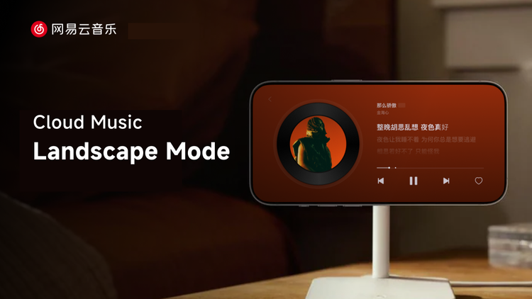
As mobile devices became ambient fixtures in daily life, user expectations for music apps evolved. NetEase Cloud Music on PC and TV was praised for its immersive "companionship" in home/office settings. However, the mobile experience was confined by its vertical orientation, functioning primarily as a utility.
The Core Problem: The mobile app could not deliver the same ambient, companionable experience that users loved on larger screens. Concurrently, iOS 17's Standby mode highlighted the potential of horizontal screen companionship, and user demand for a landscape mode surged. The challenge was to break the constraints of the vertical screen without disrupting established user behavior.

Design Process: Double Diamond Model
The design process for landscape mode followed the classic Double Diamond: two “diverge–converge” cycles. We first diverged from the problem to map core functions, then diverged again to explore innovative ideas before converging on the final, shipped solution.

The diagram below outlines our entire design process following the application of the Double Diamond model. According to the implementation steps of the solution, it can be divided into three parts: "Preliminary Preparation" – "Building Foundational Capabilities" – "Crafting Highlights." Next, I will walkthrough the design process of the landscape mode based on these three parts.

Phase 1: Preliminary Preparation
I began with a comprehensive discovery phase to align the team and ground our decisions in user needs and market context. It includes three tracks: real-world scenarios, external benchmarks, and our own product realities.

Scenarios Analysis: I identified that landscape mode was primarily used in static, ambient contexts like desks or home shelves. We mapped the activities they usually do while listening to music in those contexts, then pinpointed pain points and innovation opportunities.

Competitive Analysis: I systematically analyzed competitors' landscape modes, mapping their feature sets, interaction patterns, and strategic positioning. This allows me to utilize their experience to tailor our own differentiated innovation.

Information Gathering: To keep the new mode consistent with the rest of the app, I cataloged existing data sets, features, and layout patterns. This was crucial for understanding constraints and opportunities for integration from the outset.

phase 2: Building Foundational Capabilities
Building on the user scenarios and dataset we compiled earlier, I followed a three-step process: Feature Sorting → Layout Design → Feature Adaptation to lock in the core capabilities of landscape mode during the design phase.

Feature Sorting: Using a Value-Cost Matrix, I facilitated a workshop with stakeholders to prioritize features. This data-driven approach allowed us to build consensus on a Minimum Viable Product (MVP) while planning for future iterations. We categorized features into "Must-Have" (e.g., cover art, playback controls) and "Future Innovations."

Based on the matrix diagram, we identified the essential features for the landscape mode, such as the album cover and playback controls. I also made trade-offs among the desirable features based on scenarios and screen space to finalize the feature scope of the landscape mode.
Once the features were determined, the next step was to construct the overall page layout, gradually transitioning from the "functional scope layer" to the "information structure layer." To maintain consistency with users' existing logic and behavior patterns, we heavily referenced the layout of NetEase Cloud Music's player pages on PC and TV, striving for consistency in both the framework structure and interactive operations. This design approach not only helps users maintain a coherent experience when switching between different devices but also provides a mature and feasible layout reference for the landscape mode. From this, I derived a left-right split structure scheme that is more suitable for mobile landscape orientation.

Finally, I had to make the landscape mode fit different content type and skins. The base layout works for most existing features and player skins, optimized for glanceability and familiarity, but it can’t handle the more immersive ones. Since screens like Sleep Mode, Aura Mode and Hot-comment Player are functionally and contextually perfect for landscape, I created a second, immersive landscape layout dedicated to them.

I ultimately landed on two landscape frameworks: a side-by-side layout and a full-screen immersive layout. The immersive version gives more room for immersive design, delivering a deeper, more atmospheric experience.

With the core capabilities and frameworks now in place, the foundation of landscape mode is complete. Building on this base, I moved into the second “diverge” wave—brainstorming innovative highlights that will make the landscape experience shine.
Phase 3: Crafting Highlights
With a robust foundation in place, I focused on creating signature interactions that would delight users and define the experience.

I brainstormed and sketched multiple concepts for core interactions, with a focus on the playlist. The goal was to move beyond a simple list to a visualization that leveraged the horizontal canvas.


I eventually narrowed it down to two list-interaction concepts—horizontal swipe and vertical swipe. After testing the demos, the horizontal scrolling model emerged as the superior solution. It offered a more natural thumb path and a more stable scrolling feel.
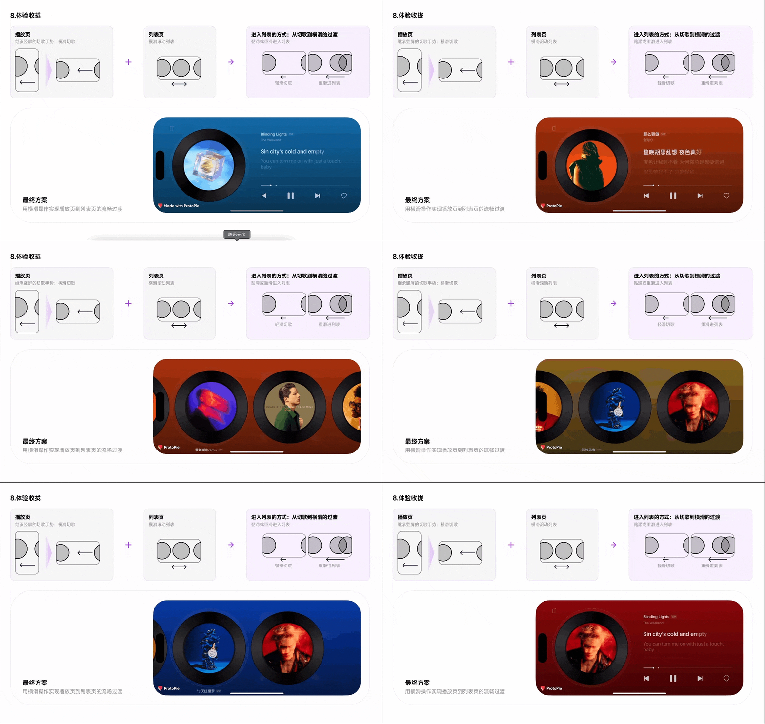
I believe the magic is in the details. To perfect the experience, I crafted the micro-interactions. A normal swipe skips tracks, while swipe-and-hold or a firmer swipe will get you to the immersive playlist—an easy, no-break way to pick your songs.
To polish the feel I worked hand-in-hand with engineering on motion curves and haptics.

Spring curves are the usual choice for “real-world” tactility, but in production they proved sub-optimal: their long tails block new input until the animation settles, making the interaction feel sluggish. We needed an animation that could finish swiftly and let the user be able to keep swiping. In the end, a well-tuned Bézier curve gave the smoothest, most responsive ride.
To provide a realistic tactility, I specified distinct haptic engine vibrations for key moments, like when the vinyl sprite "clicks" into place, mimicking physical interactions to enhance the sense of direct manipulation.

Summary & Results
Designing landscape mode was more than a UI restructure—it was an exploration of how “companionship” and full immersion can extend into new contexts. Starting from real user behavior, we pinpointed when and why landscape adds value on mobile; through competitive analysis and an internal capability map, we built the core feature set and layout framework; finally, by re-imagining the playlist, lyric motion, and micro-interactions, we delivered a differentiated experience.
The launch of the landscape mode was a resounding success, quantitatively validating our design approach and qualitative goal of creating a "companion."
Tangible Outcomes:
Massive Adoption: Following the launch, the Landscape Mode's Daily Active Users (DAU) reaches 800,000 to over 1 million, demonstrating its immediate value to a vast user segment.
Deep Engagement: The average time spent per user in landscape mode reached approximately 200 minutes per day. This staggering figure confirmed that we had successfully transitioned the mobile app from a sporadic utility to an immersive companion.
PROJECT BACKGROUND
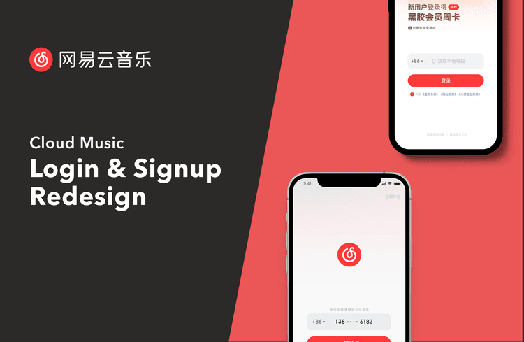
Cloud Music, like many apps in China, leverages one-click login through network providers for a seamless user experience, an alternative to SMS verification. However, due to network instability, the process frequently exceeded the 3-second timeout, forcing users into a more costly SMS flow. As the UX designer, I led a project to increase one-click login adoption, improve user experience, and reduce operational costs.
Problem Analysis


I began by analyzing the existing user flow and synthesizing feedback from user reviews to identify core pain points.
Anxiety & Uncertainty: Users were left staring at a spinning animation on the splash screen with no clarity on what was happening or how long it would take.
Forced Navigation: If the number failed to load, the flow dead-ended. Users were forced to manually navigate to a different screen (SMS login), feeling punished for a system failure.
Inflexibility: To use a different number, users had to abandon the flow entirely and start over, creating friction and increasing the likelihood of bounce.
The analysis revealed that the core issue was treating number retrieval as a single, pass-or-fail event on a static screen. Our opportunity was to make the process continuous, transparent, and asynchronous.
I explored several concepts:
Concept A (Status Enhancement): Simply adding a better loader and a "skip" button. Verdict: Solved transparency but not flexibility.
Concept B (Parallel Paths): Showing both one-click and SMS options simultaneously. Verdict: Provided choices but created information complexity and didn't leverage the loading process.
Final Concept (Dynamic Field): Transforming the static number display into a smart, interactive input field that serves as the hub for the entire login process.
The Solution


The new design introduces two key changes that work in concert:
1. A Redesigned, Smart Input Field
The input field becomes the central, persistent element.
It provides live status updates (Retrieving number/Retrieved/Failed).
At any point, users can tap into the field to manually enter their number without changing screens. This solved the inflexibility problem immediately.
2. Continuous Background Retrieval & Smart Prompt
The system continues attempting to fetch the number in the background, even if the user starts typing.
If successful, a non-obtrusive bubble prompt appears, offering the one-click option. The user can accept this faster path or continue manually.
This turned a one-time failure into a continuous opportunity for success, maximizing one-click adoption.
Results
After launch, we monitored the key performance indicators:
Enhanced User Experience: The login process felt more responsive and user-controlled. Negative feedback about login delays dropped significantly.
Increased Registration Rate: The smoother flow contributed to a +0.28% increase in registration completion, a substantial gain for our user base.
Significant Cost Reduction: By drastically increasing the one-click login success rate, we reduced monthly SMS costs by approximately ¥ 43,000 RMB.
Reflection & Learning
This project underscored the power of designing for resilience and user control. Instead of designing for the ideal ("network is perfect"), we designed for the real world. By making a technical process transparent and giving users agency, we improved their experience and achieved strong business results. A small, thoughtful change to a single component created a win-win for both users and the company.
Project: Designing a Mental Model for Podcasts on NetEase Cloud Music
My Role: Lead UX Designer (Responsible for user research, interaction design, prototyping, and iterative testing)
Key Results: +600,000 Daily Active Users for the feature, contributing to 35% of total Podcast DAU.
PROJECT BACKGROUND
When I joined the Cloud Music podcast team, the product faced a fundamental challenge: users had no mental model for what a "podcast" was in the Chinese context.
Unlike Western platforms offering mainly talk-based podcasts, Chinese platforms like ours include a wide variety of audio content: radio dramas, audiobooks, talk shows, and even DJ music and cover songs. This "broadly defined podcast" ecosystem was overwhelming for new users.
A key piece of user feedback highlighted the problem:
“When I entered the podcast page, I got lost. There were so many different types of content, and I didn’t know what podcast was. It seemed like a market with no organization.”
The primary business goal was clear: We needed to quickly establish a clear mental model, lower the barrier to entry, and encourage users to explore our diverse content library.

Cloud Music Podcast Homepage When I Joint The Team
Understanding Users

I began by synthesizing existing user research, which revealed four key scenarios. There are four critical insights from those scenarios that shaped my design direction:
Cognitive Dissonance: The podcast layout and UI were visually confused with the music homepage, and by default, it offers a lot of music content, leading to greater confusion and abandoned the page immediately.
Undifferentiated Content Mix: The broad spectrum of audio content (e.g., talk shows, audiobooks, music) was presented in a homogenized manner without clear categorization. This overwhelmed users and prevented them from forming a coherent mental model of what was available.
Decision Paralysis: Content across different modules lacked perceptual differentiation, as everything was recommended under similar, vague algorithms. This failure to provide clear, varied decision-making cues resulted in overwhelming similar choices overload for users.
Misalignment with Core User Need: The design prioritized active content selection, while a significant user segment primarily sought a background companion for doing activities like chores, similar to turning on a traditional radio.
These insights pointed to a need for an experience that was both educational and effortless.
Design Objectives
Based on the research, I defined three core design objectives for the new feature:
Differentiate: Make the podcast page visually and experientially distinct from the music homepage to encourage exploration.
Educate: Help users understand the spectrum of content available on the platform.
Simplify: Create an incredibly easy way for users to start listening with minimal cognitive effort.
Design Exploration: The Radio Metaphor
I led a brainstorming session to explore solutions. We considered traditional approaches like an enhanced card-based layout or explicit tabbed category navigation. However, these did little to teach users what Podcast is.
I proposed leveraging the radio metaphor. Podcasts originated from radio, and the concept of "tuning" into different stations (or content categories) was a universally familiar mental model. This approach offered:
Uniqueness: A novel experience that distinguished the podcast section.
Familiarity: An intuitive analogy that required no explanation.
Playfulness: A fun, engaging way to browse content, perfectly suited to passive, "background" listening.

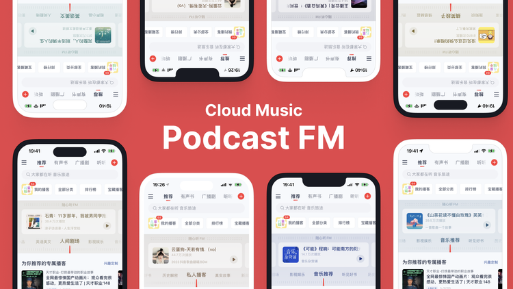
I designed Podcast FM, a feature that simulated a radio tuner interface.
The list of content categories was presented as different "frequencies" (e.g., Talk Show, Stories, On the Road).
Users could swipe to scan through categories, just like tuning a radio.
The main content area displayed a featured show from the selected category, with a large, prominent "Play" button modeled after a radio power knob.
This visual replication of a radio clearly indicated how to interact with it, eliminating guesswork.
Results
The data confirmed the success of the metaphor. Within two months of launch, Podcast FM attracted 600,000 Daily Active Users, accounting for approximately 35% of the total Podcast DAU.
This demonstrated that we had successfully created an entry point that established a clear mental model and encouraged exploration.
Iteration: Learning from User Feedback
The success of V1.0 sowed the seeds of its own evolution. Over six months, user feedback revealed a clear theme: as listeners became more proficient, the very radio metaphor that successfully onboarded them began to feel restrictive. They now expected the on-demand control of a digital product, not the passive experience of a broadcast.
Podcast fm version 2.0

I led the redesign of Podcast FM 2.0 to address this "lack of freedom." The key enhancements I designed were:
Horizontal Scrolling Content: I introduced a horizontal scroller within each frequency category, allowing users to browse more content options beyond the single featured show.
Enhanced Onboarding Experience: A subtle animation was added upon entering the screen to educate users about the new scrolling capability.
Haptic Feedback: To distinguish between scrolling categories and scrolling content, I choose to use a light haptic vibration when scrolling categories. This reinforced the physical "click" of a radio tuner and improved usability without requiring visual attention.
The result was a significant increase in content exploration and positive user feedback, proving that the feature could evolve with our users' growing sophistication.
Final Thoughts
Podcast FM was a resounding success. It not only met our initial business goals but also became a core feature that was iterated on for over two years.
My Key Learnings:
This project taught me the delicate balance of using metaphors in UX design. A strong metaphor can create an intuitive onboarding experience, but it must gracefully evolve to incorporate the power and control expected in digital products. My work on transitioning from V1.0 to V2.0 was a practical lesson in adapting a design to users' evolving needs.
The Ultimate Compliment:
At the end, I’d like to show a competitor’s tribute below.

Shortly after our launch, a competitor app replicated the Podcast FM design almost exactly. When we released V2.0, they followed suit.
I see this as the highest form of validation for a design's effectiveness and innovation.
PROJECT BACKGROUND
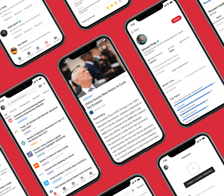
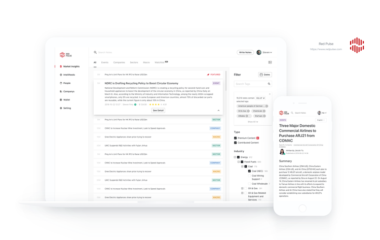
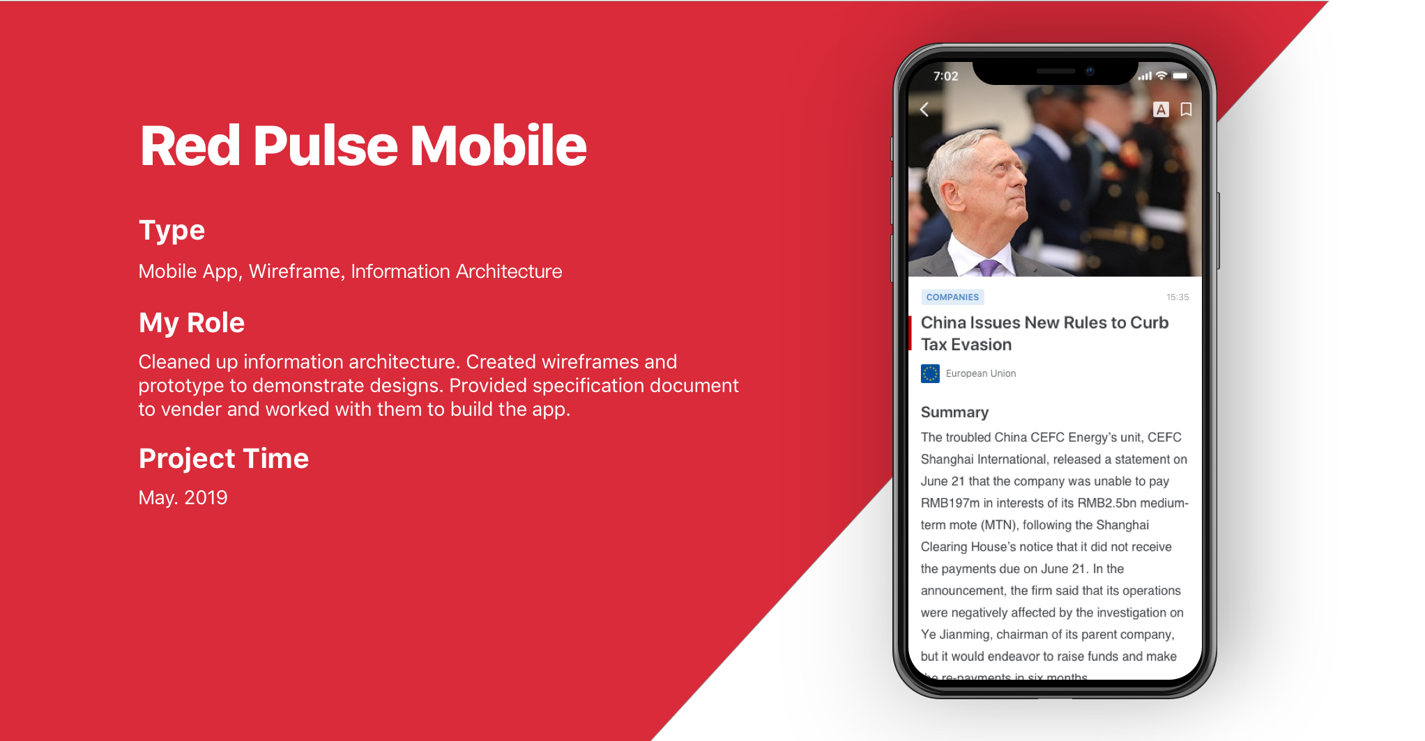
Red Pulse Mobile App is a mobile application that provides Red Pulse platform contents to its users. We designed and worked with venders to built the app that allows users to view all types of contents. The app has less features compare with the web version, so we re-organized the structure and focus on the user experience.
Information architecture
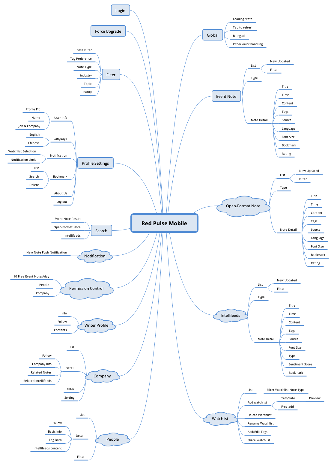
The mobile app has almost everything as the web platform but without signup, workspace, wallet and part of the settings.
Design Iteration
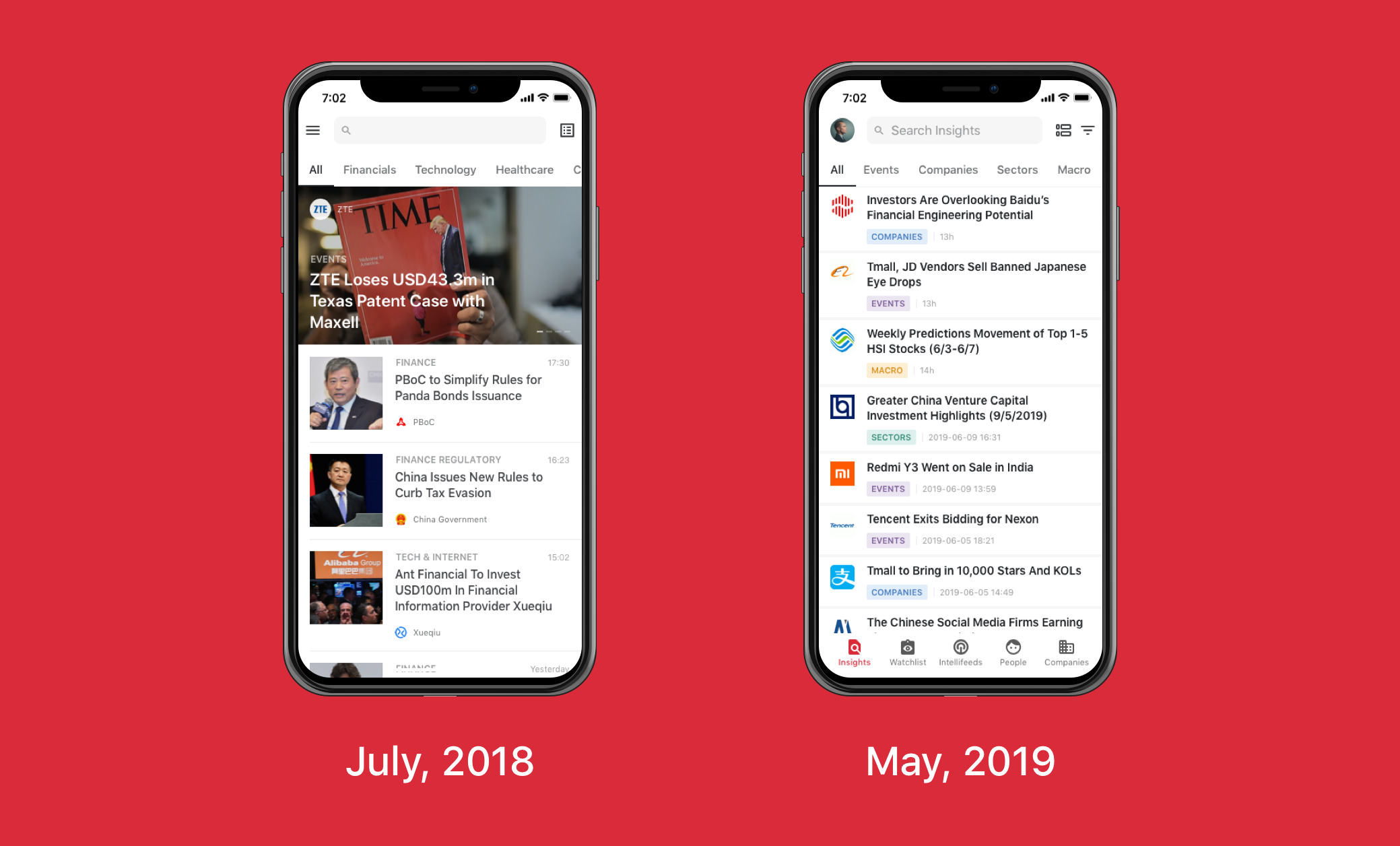
The first version of the app came out in July, 2018 and it only displays articles. In May, 2019, we upgraded to what it looks like now with features listed above.
We also changed the style to a more professional view according to feedback.
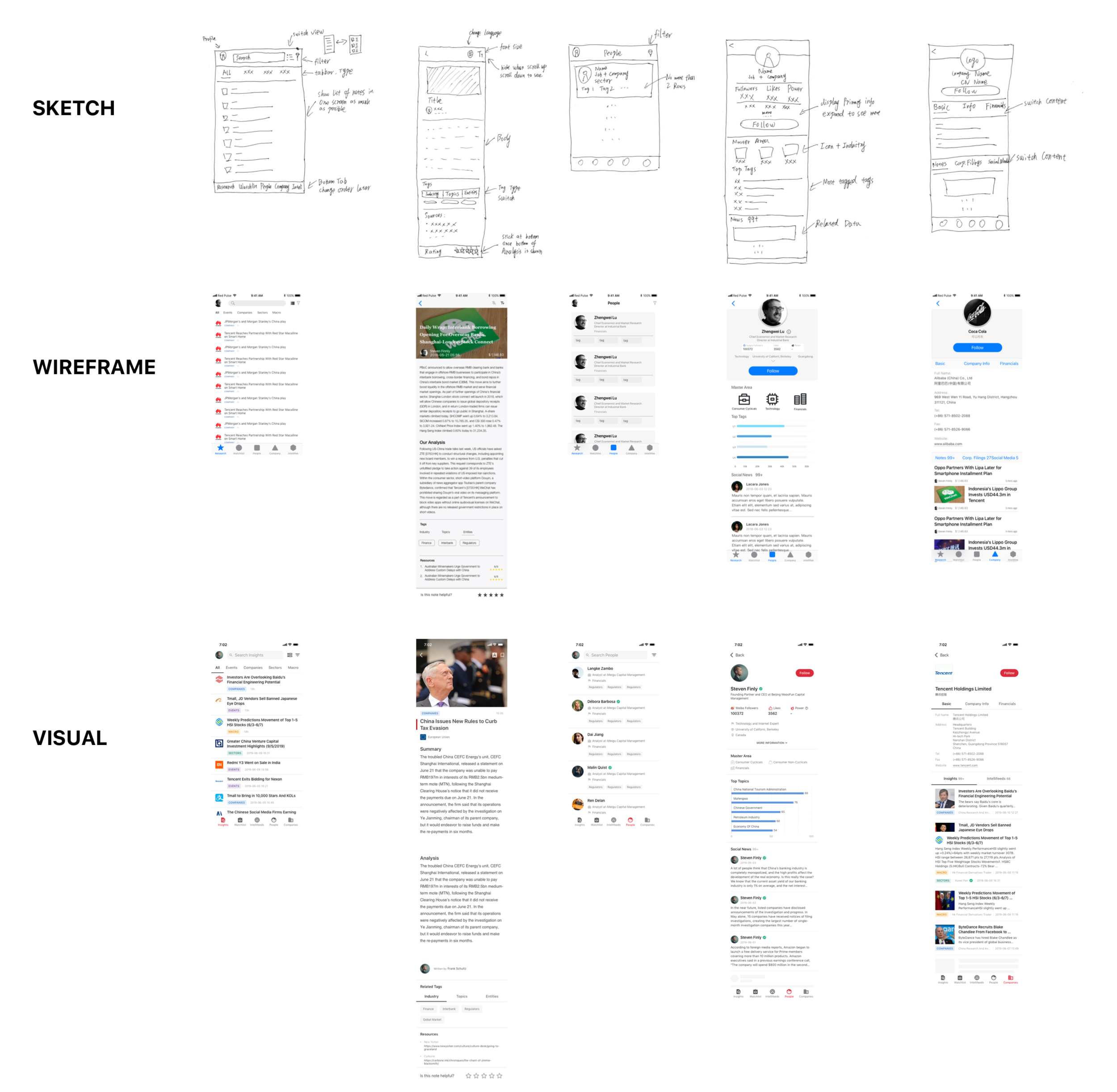
I started creating rough designs on papers and tried to get an immediate feedback from others. Then I created wireframes in Sketch with real data. This process has been repeated several rounds to get to the final design.
Design Considerations
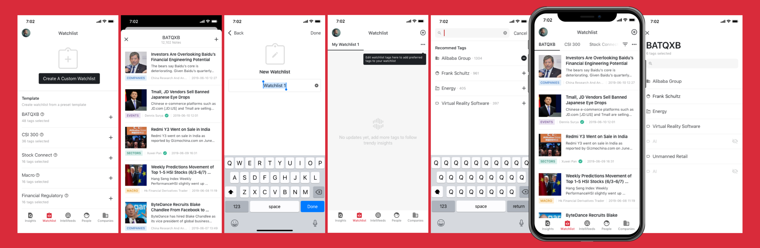
One of the challenges when designing the watchlist was that it consisted of many actions such as create, template, edit tags, search tags, etc. The first thing I did was to take watchlist out of insights and make it as a standalone option in the bottom navigation. Next, just like what I do often, I prioritized information, making sure the main flow is obvious and natural, hide secondary options. I designed immersive guides for users to discover other options such as empty state tips, tooltip, animation, icons, etc.
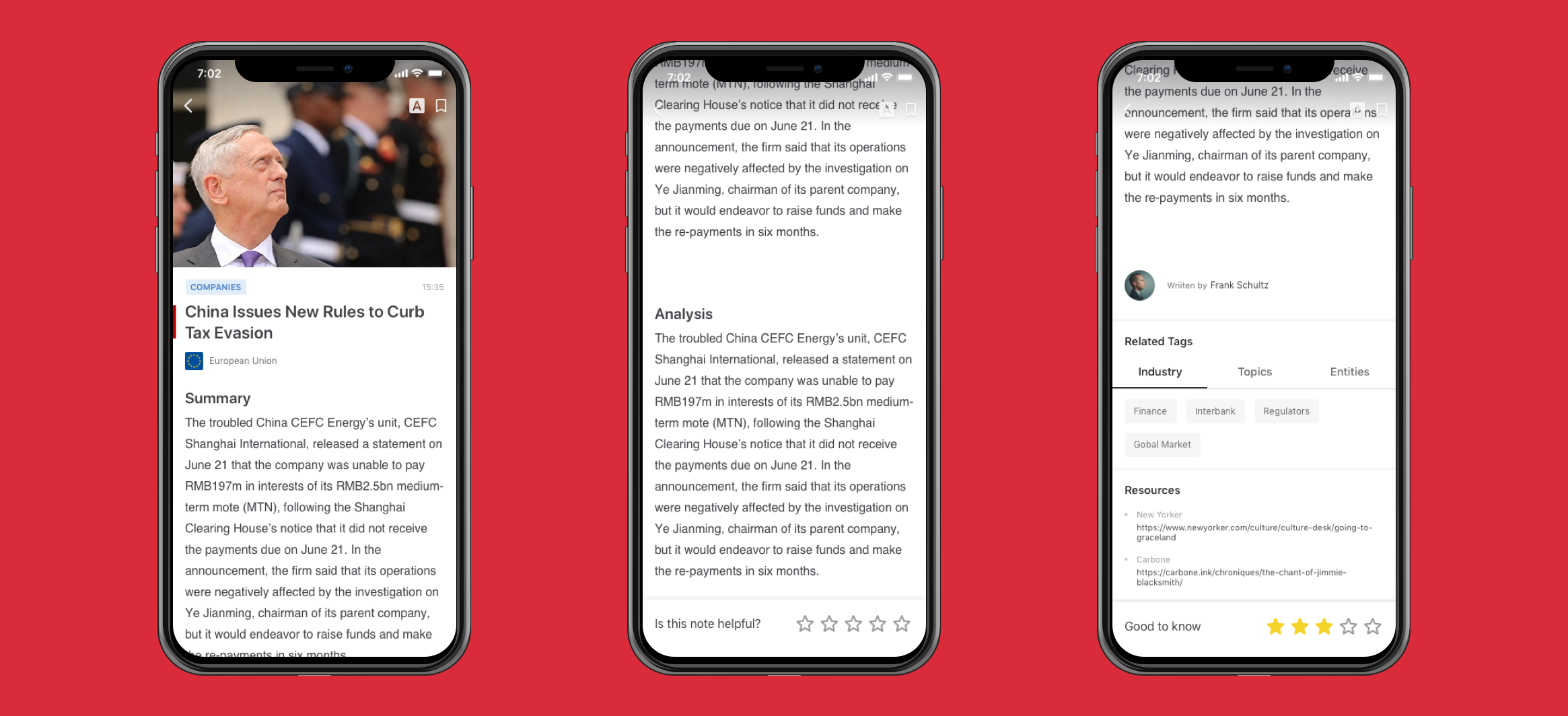
To provide an immersive reading experience and make sure readers would give a meaningful rating, the rating bar will not appear until reader scrolls to the bottom of the body of content, and the bar will then stick at the bottom of the screen. The rating is also designed that can be changed in 5 minutes. After that, it cannot be changed as ratings is part of our payment criteria.
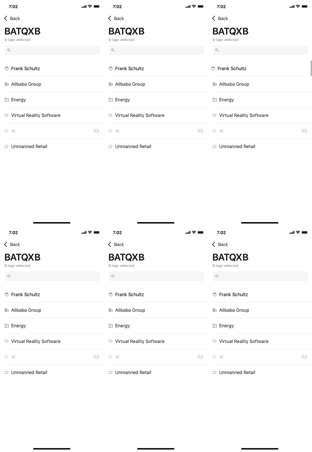
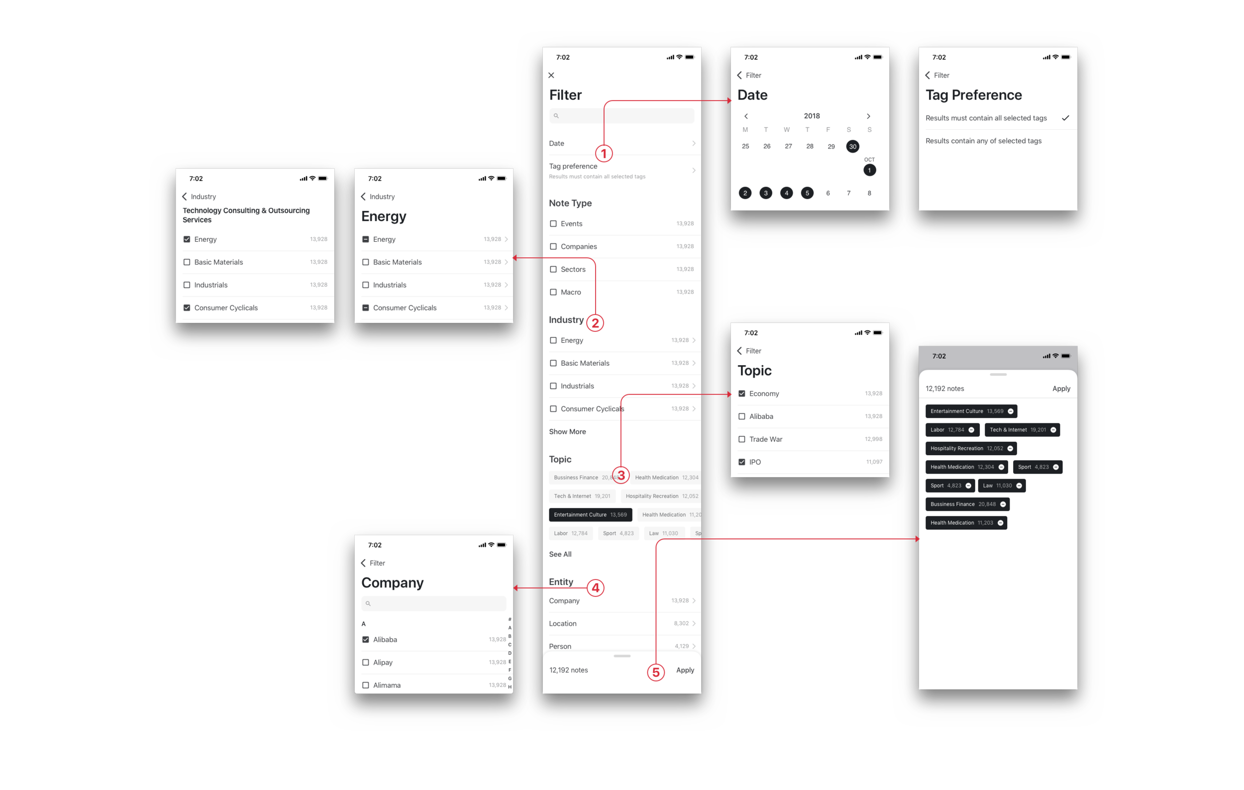
Filter is another challenge. On the website, it is easy to expand, navigate, and edit in one screen. However on the mobile, due to the screen size, the items are cascaded. The first thing to consider was the form of selections. For example, Note Type is important and only has 4 options, so we display it directly. For industry, we only display top ones and others are cascaded. Topic is random and time sensitive, therefore we allow users to scroll horizontally to see top topic tags. Once users enter Topic page, they’ll see full list of topic tags ordered by number of articles. For Entity, I categorized items alphabetically making it easy to navigate. Last, the selected tags are displayed and sticked at the bottom bar where users can scroll to see all selected items instead of looking for them in different pages.
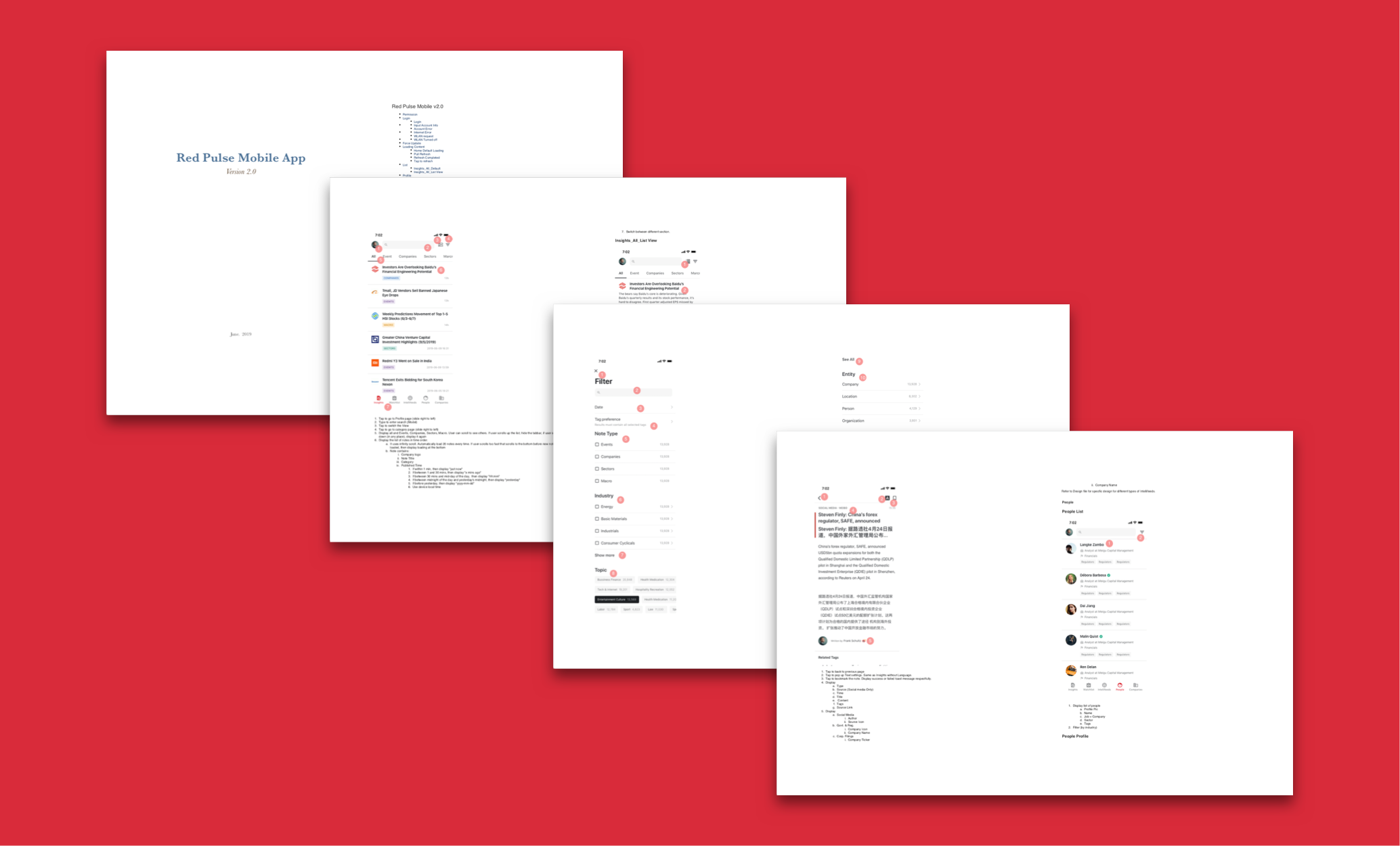
Design Specification
As we only took the design part in house and it would be developed by a vender, I prepared a specification document for the vender to follow.
FINISHing PRODUCT
Because the app would be developed by the vender, unlike the web platform using agile, we took waterfall process to build the app. Nevertheless, we were sort of agile when designing the app. I created wireframes and prototypes and often modified my according to feedbacks. I believe the earlier we get the feedback, the less mistakes we would make. After final confirmation, we started visual design, specification document and then handed to the venders and worked with them together to build the app.
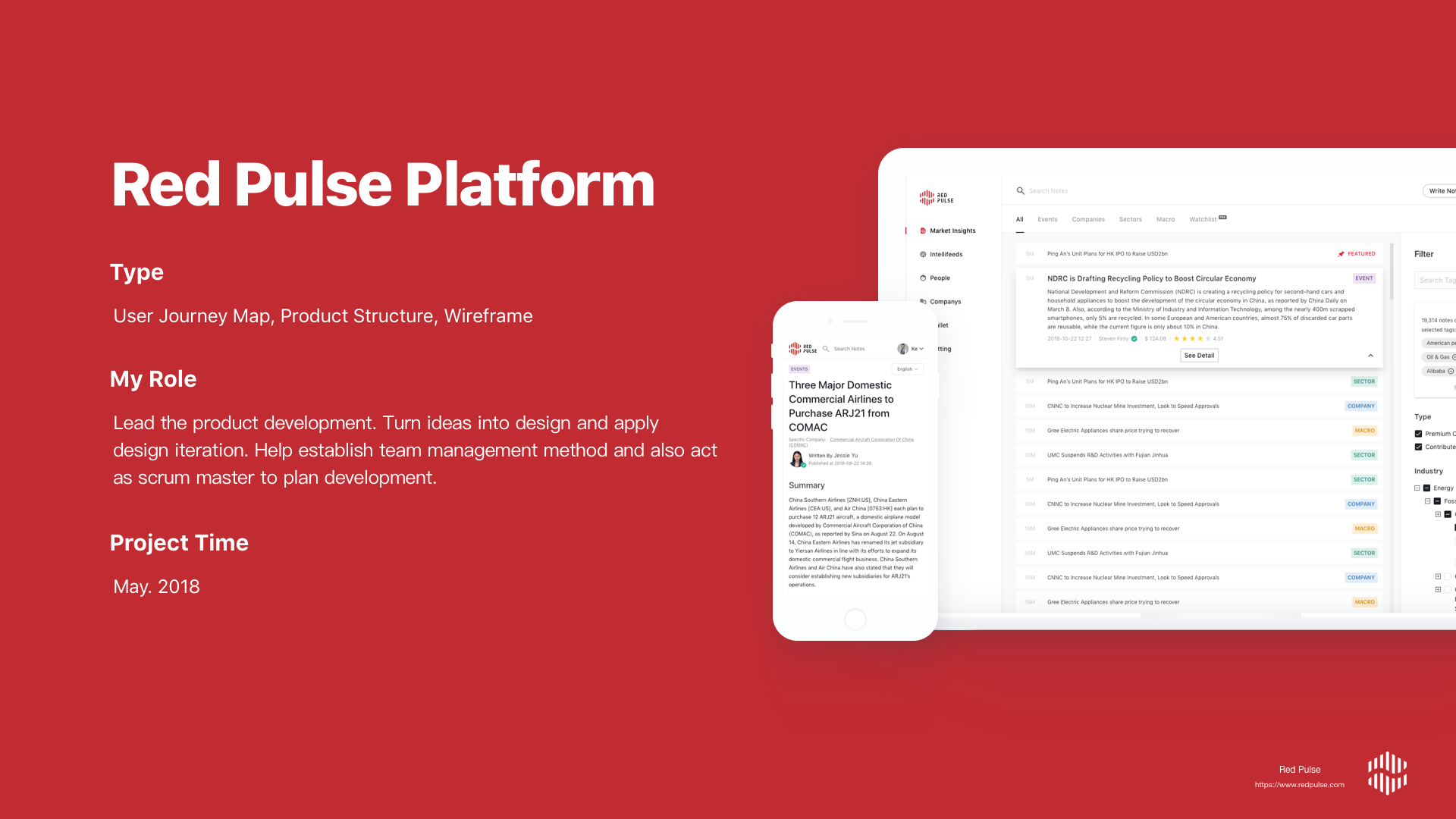
PROJECT BACKGROUND
Red Pulse Platform was the major product that I was responsible for at Red Pulse. It’s a closed platform that provides latest analysis on China market events. I started this project where there was only Insights section. Now it has grown to 8 major sections with other small features. The platform contains two types of contents, author generated content and scraping content and they are displayed in different sections. For author generated content, we have a workspace where users write, edit, translate, approve/reject articles. Contributors will receive payments in their Wallet in tokens and they can use the token for various things.
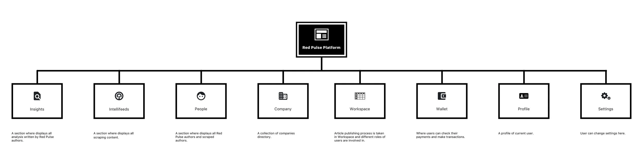
Main sections of Red Pulse Platform
Understanding Product
We created product blueprint to establish a common understanding among designers, developers, and management.
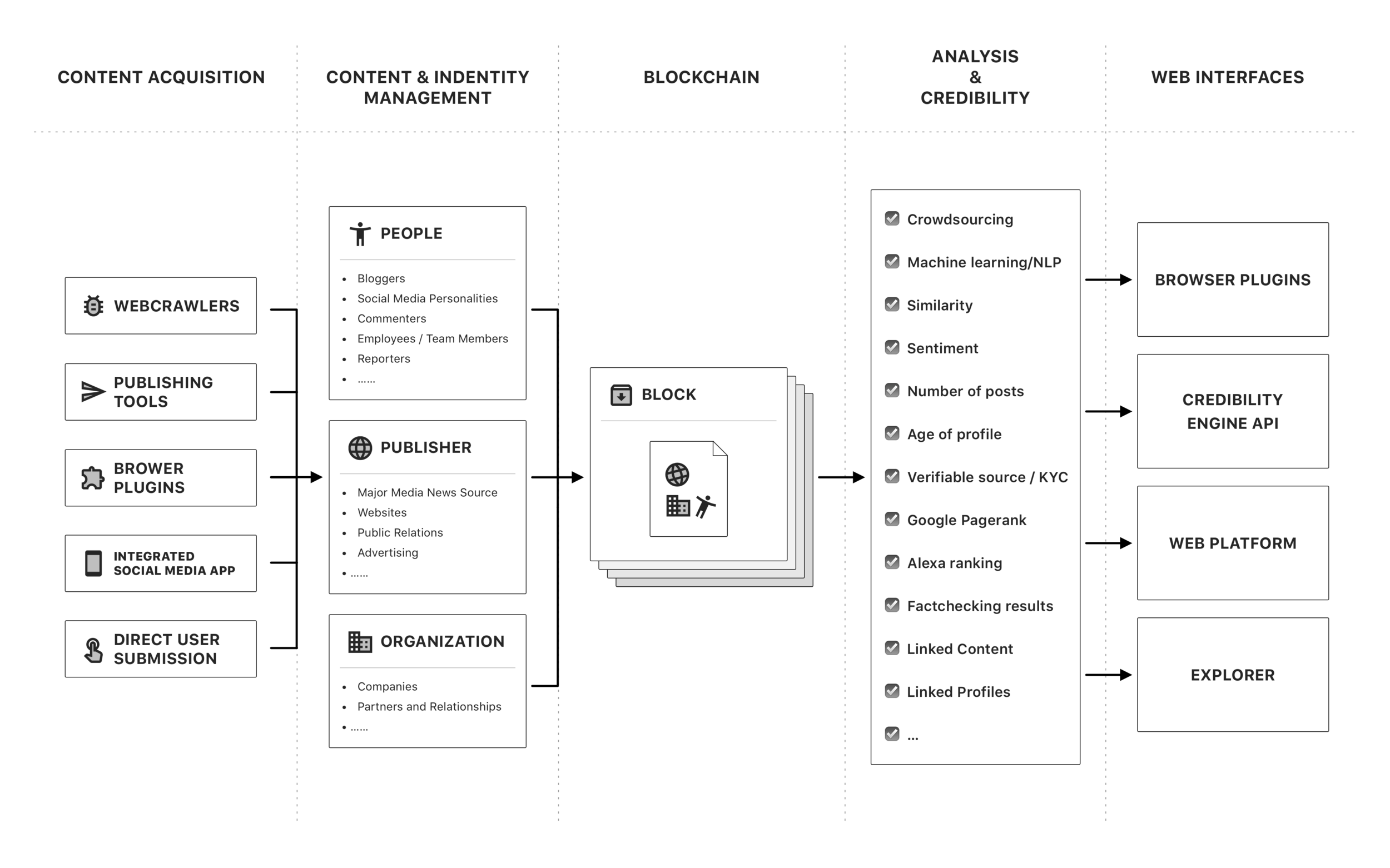
An example of how we create content, how we process the content, and where the content will be displayed
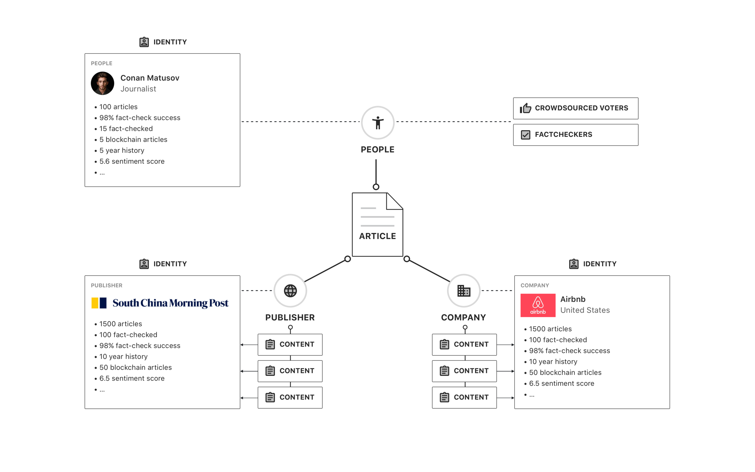
Connecting content with unique identities, therefore data can be linked and traced
User Journey
Red Pulse Platform has varies roles of users, including 1) Admins; 2) Content Producers, including 3 types of writers, supervisors, editor, and translators; 3) Readers, including basic account readers and premium account readers.
Red Pulse Platform Eco-system. Reader reads articles (up), Writer writes articles (left), and supervisor, editors, etc manage articles (bottom).
It is always a challenge to take care of each type of users. Especially Red Pulse is a closed platform and involves certification process and token payment, which makes the on-boarding process and the entire experience on the platform more complicated, therefore users may potentially experience problems on the platform. I created user journey map to better understand user experience in each step for individual type of users and what might be key points we need to consider and improve.
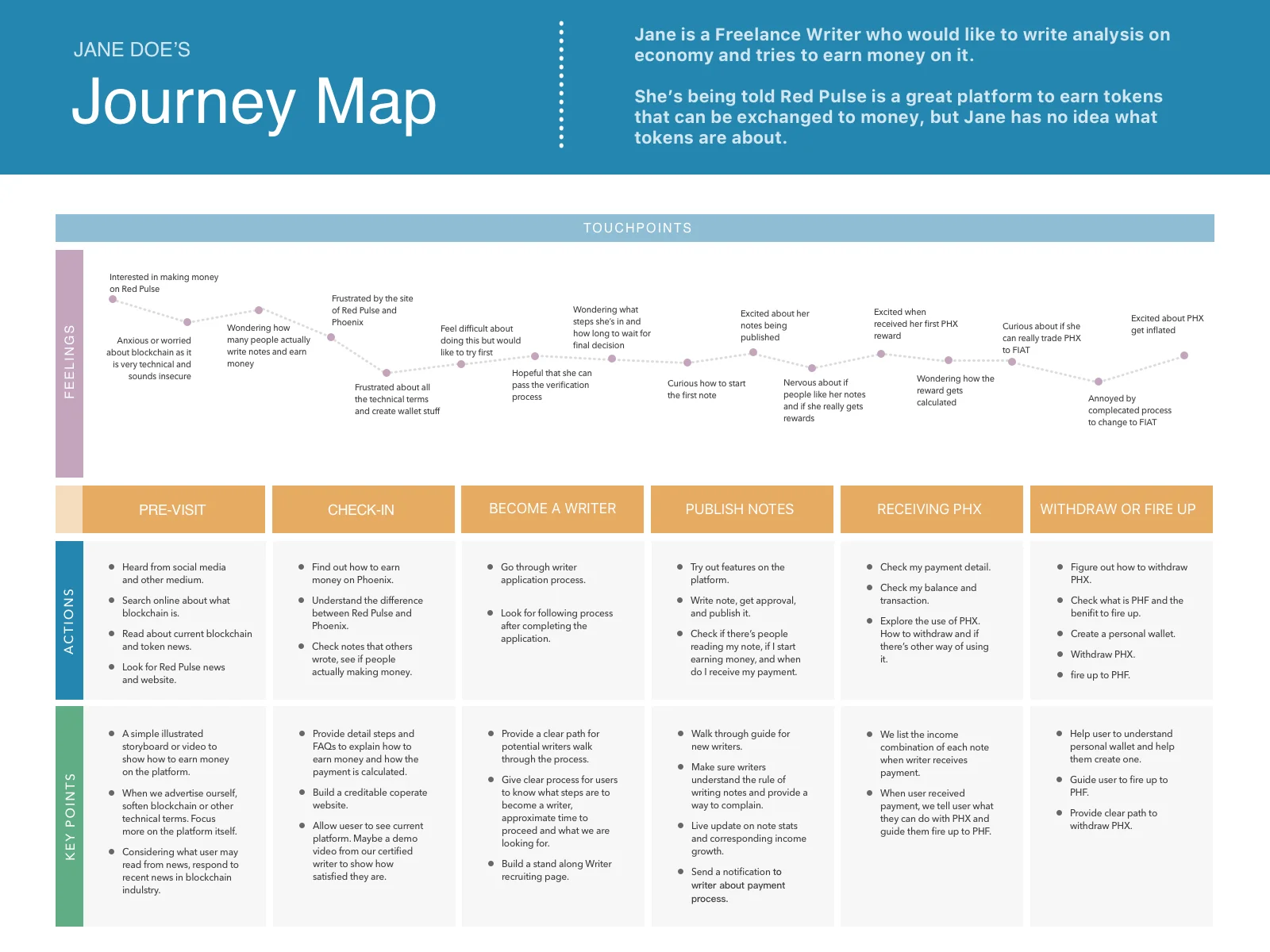
User Journey Maps were created to understand users’ experience on the site, what they might do, and where we need to help them to go through.
Product Iteration
Product iteration is fast and frequent at Red Pulse. I normally sketched a layout and approved by management, then filled in all the data and visualized the design.
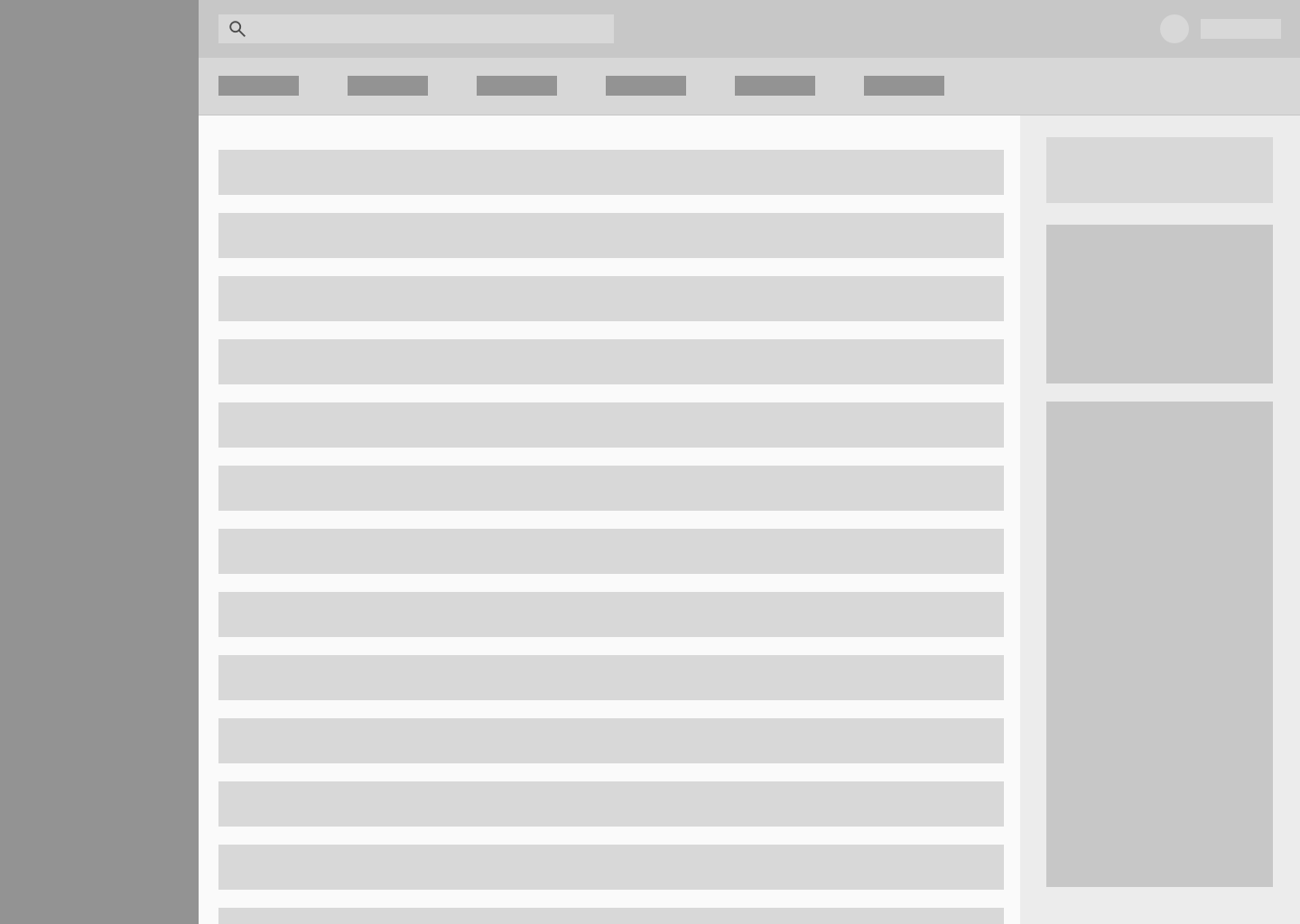
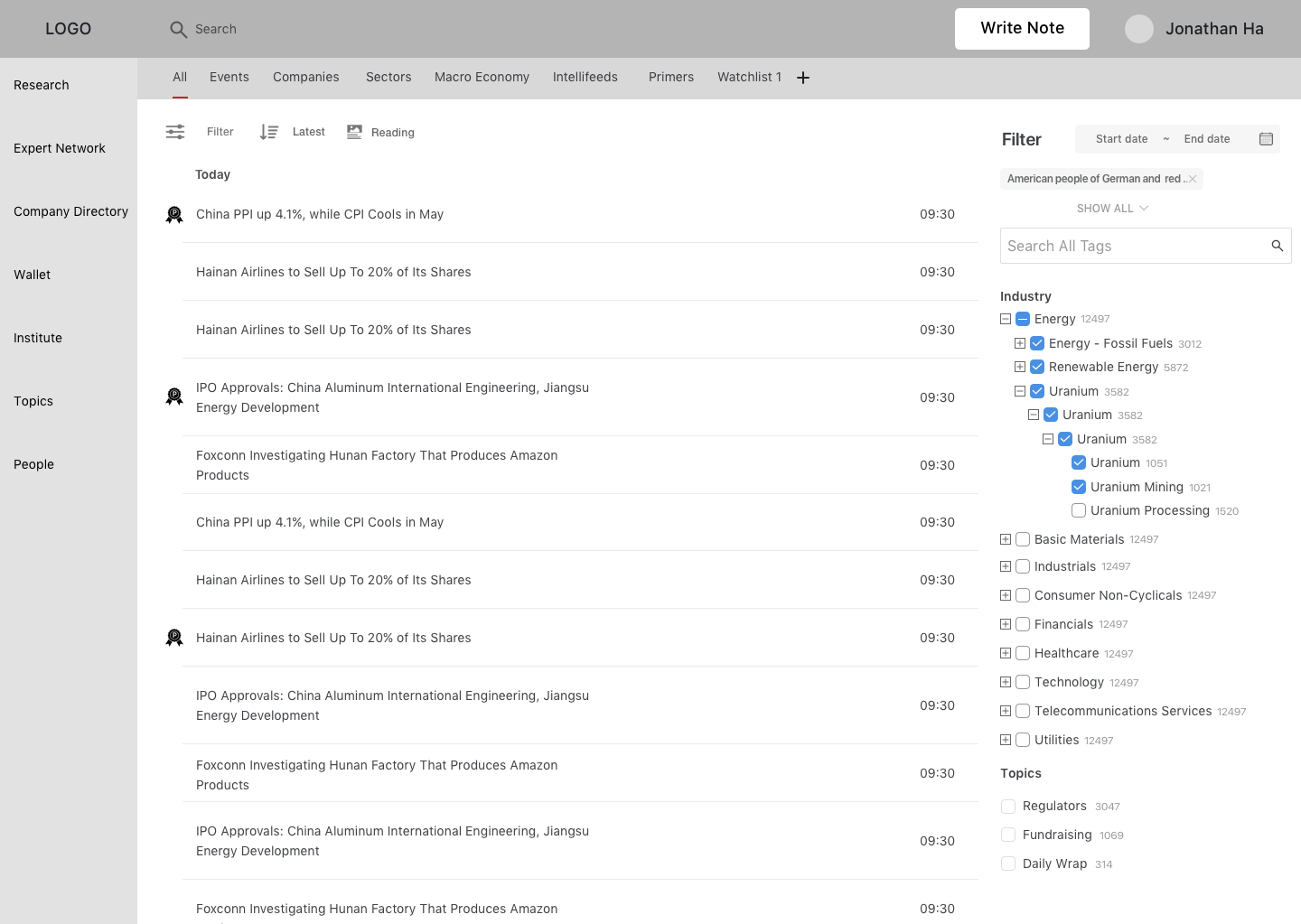
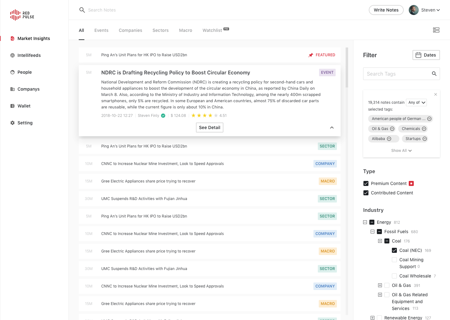
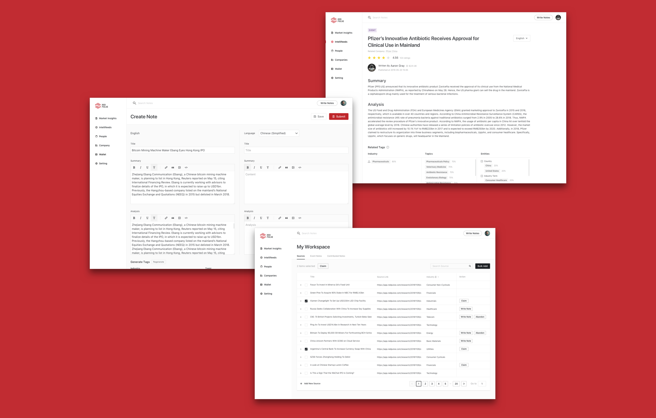
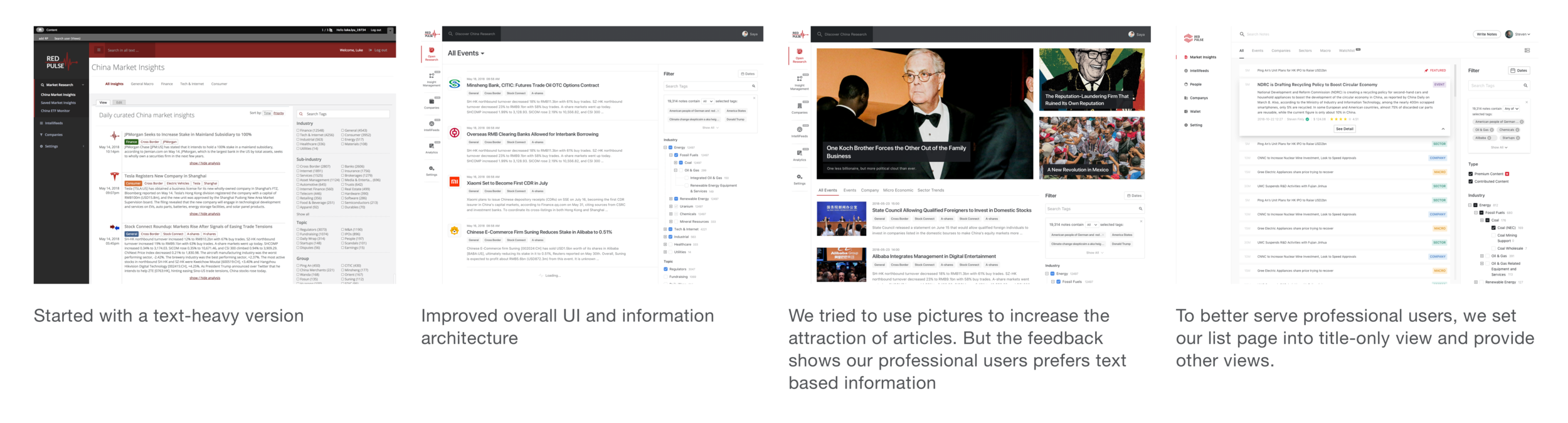
The product has been iterated and pushed forward by original product plan, user feedback, and designer review.
Product Highlights
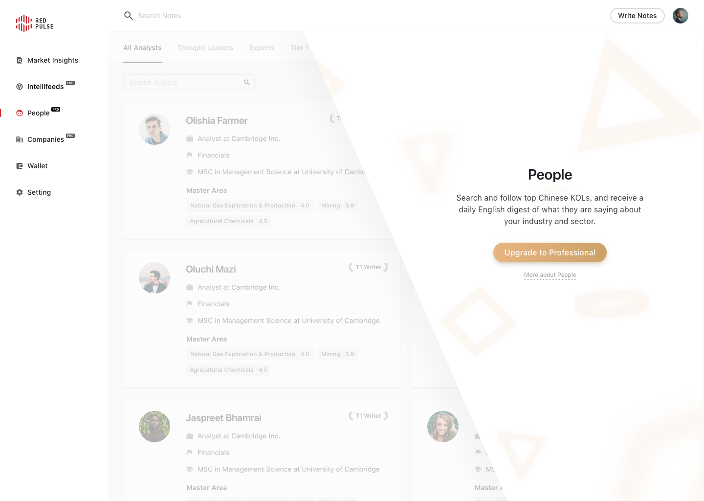
Instead of simply disable the feature, I created a promotion page for premium features. A free account user is able to have a peek of what the feature is and a direct entrance to upgrade.
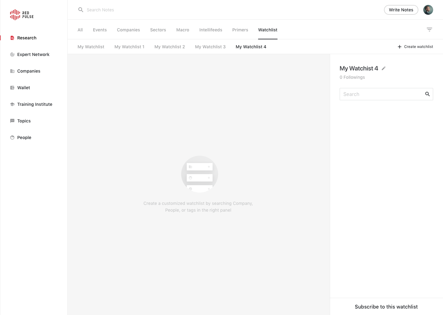
One of my design principle is to eliminate all dead ends for users. Here’s an example of the empty state that was designed to provide instructions of what to do.
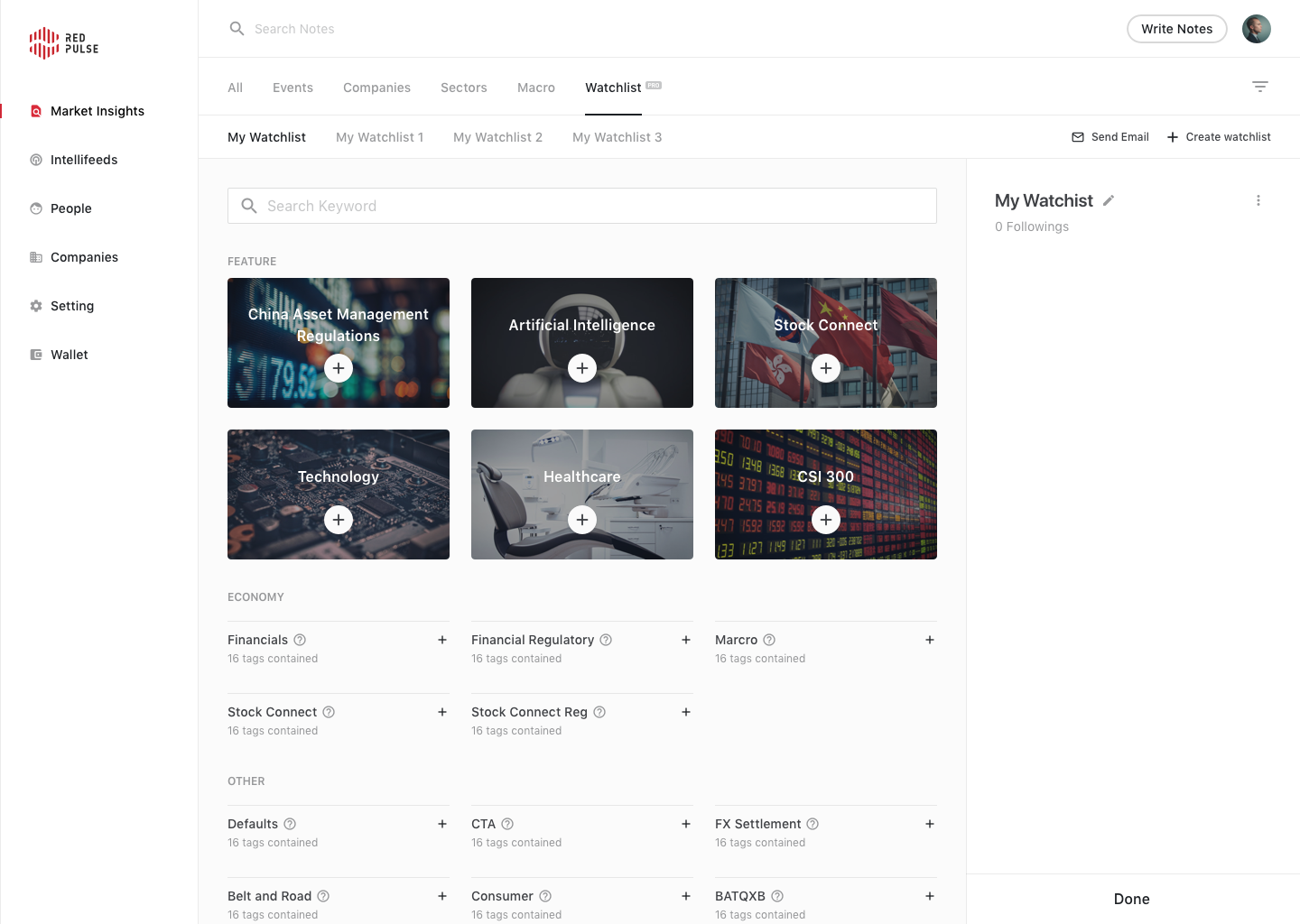
Another design principle of the product is to prioritize content when there is too much information.
We provided watchlist templates for users to select and highlighted most popular options at the top and categorized rest of templates.
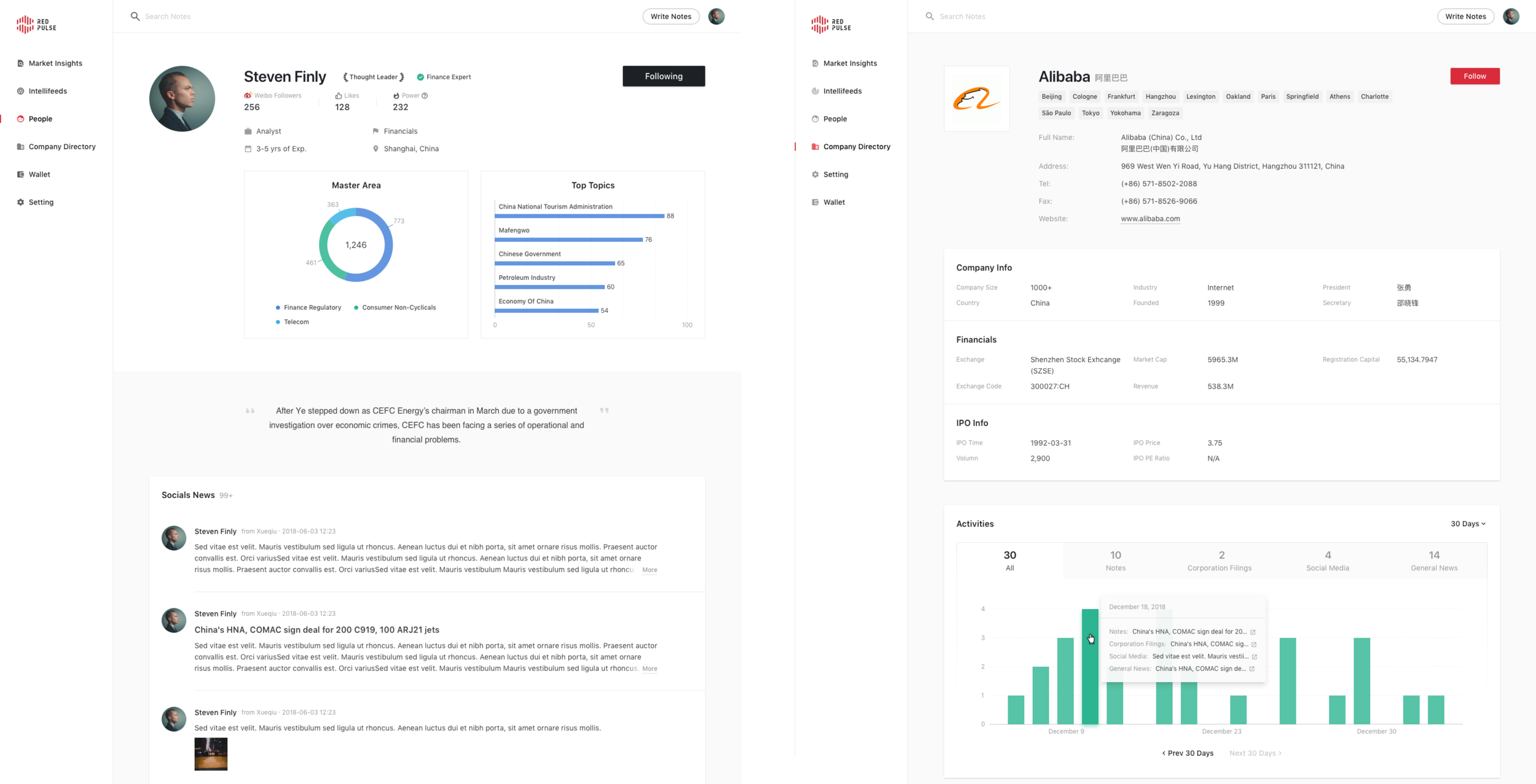
Visualized data to better track the change of number of articles and percentage of each article type.
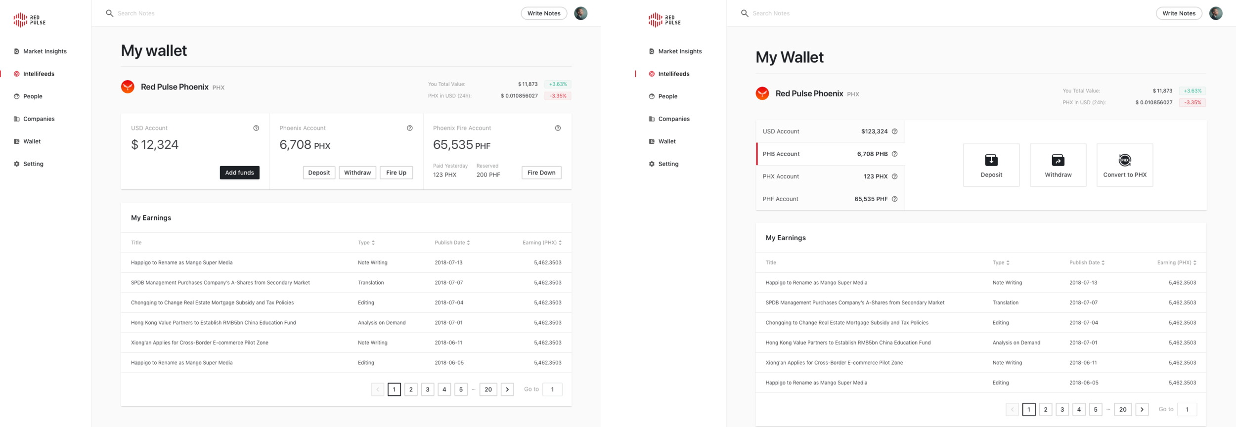
The Wallet had 3 types of accounts. We added 1 more later and then changed the way of interaction instead of simply add one more box beside.
Final Thoughts
Working at a startup company means fast, agile, multitasking, etc. I couldn’t start design directly at most times as there were still lots of things remaining unclear. For example, I need to figure out myself if the new feature had potential legal issue and I need to consult our lawyers. There were also many cases that I need to quickly sketch out to visualize ideas and help develop the idea. Many times it was just an idea, I had to do my own research, contact correct people, consult developers to build up the idea. I think it is exactly what a designer should do, to develop others’ ideas into real product and I enjoyed it.
Continue reading about the platform Red Pulse Workspace and Red Pulse Mobile
Related Article: How to implement 2FA on your site from a designer’s view

PROJECT BACKGROUND
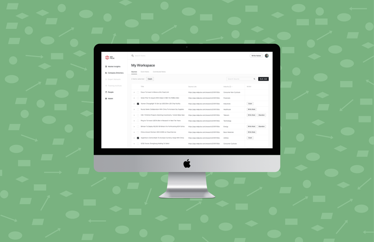
The Workspace is one of the core feature of Red Pulse Platform. Red Pulse recruits numerous writers to write on our platform. It is a professional platform targeting on industry experts, practitioners, and professionals, thus we review every piece of content from writers. The Workspace is the place to complete content publishing process and connects all the stakeholders involved in content producing.
Personas
The first thing I needed to figure out was how many roles would be involved in producing contents.
Admin - Who has complete permissions and oversees all the activities of others.
Writer - There are 3 levels of writers. The work flow will be different for writers in corresponding levels.
Tier 1 Writers
Tier 2 Writers
Contributors
Supervisor - Who is responsible for approving, rejecting articles, and assign writers and editors.
Editor - Edit submitted articles.
Translator - Translate articles.
I then created personas for individual role.

Personas were conducted together with product manager and research team (which responsible for manage involved roles and publishing articles) to analyze user goals and needs of features for the platform. The user scenario workshop helped set the pathway for initial version by thoroughly understand user requirements and usability.
User Flow & permissions
The work flow is most challenging aspect of the project due to the number of roles and complex of process. Analysts from research team were interviewed to help create the flow chat.

Action-based Flow Chart
The action-based flow chart indicates the actions that different roles of users make to publish an article. This flow chart provides a clear route based on what action a user makes.

Status-based Flow Chart
While action has to be made by users, change of status can be done by the system automatically. Thus it is needed an other flow chart to describe status change of an article.

Status-Action Table
In each status, users with different roles are able to make actions to the article. To provide a clear sheet of what users can do in each status help development team to correctly develop as requirements.

Status-visible Table
This Status-visible table helps understand the scope of things a user is able to see according to the status and permission
Design Consideration
Once the user flow was worked out, I started crafting the design to make sure users would have the best experiences during the complicated process.

Considering users were using excel previously to complete such job. I try to move the same experience on the workspace. Now, users can directly add a new source on the table and edit directly as well instead of enter a new page or pop-up to edit.

To save users’ time, we make the table expandable to see all information.

Due to the number of columns, I designed fixed Title and Action column for better use of the table.

All actions made would be notified by system feedback. I always keep the principle in mind that users should always aware system status.

PROJECT BACKGROUND
EF Mobile Classroom provides an alternative way for students to take online private and group classes. Currently 24% of private classes and 23% of group classes are taken on phone and tablet. Since the mobile classroom was designed a long time ago, student feedback and regular testing results indicated that the interaction was not intuitive and the UI was outdated.
This was primarily a design driven project that I set out to design a new version of the mobile app and tried to get approval by management. I need to present the reason of redesign (luckily, previous testing results had already shown the need of optimization, I just need to summarize and validate again), and the new concept that would improve the experience.
Usability Testing
At EF, we do usability testing regularly. Thus I already had information in hand, but I’d like to run a usability testing again specifically for the redesign purposes to have an up-to-date insight about the Classroom app.
The main experience problems of current app centered in information architecture, content discoverability, awareness of status, task-handling and complexity of user-flow.

Design Principle
I had a brainstorming session with our design team looking for directions to solve problems. Here’s what we concluded.
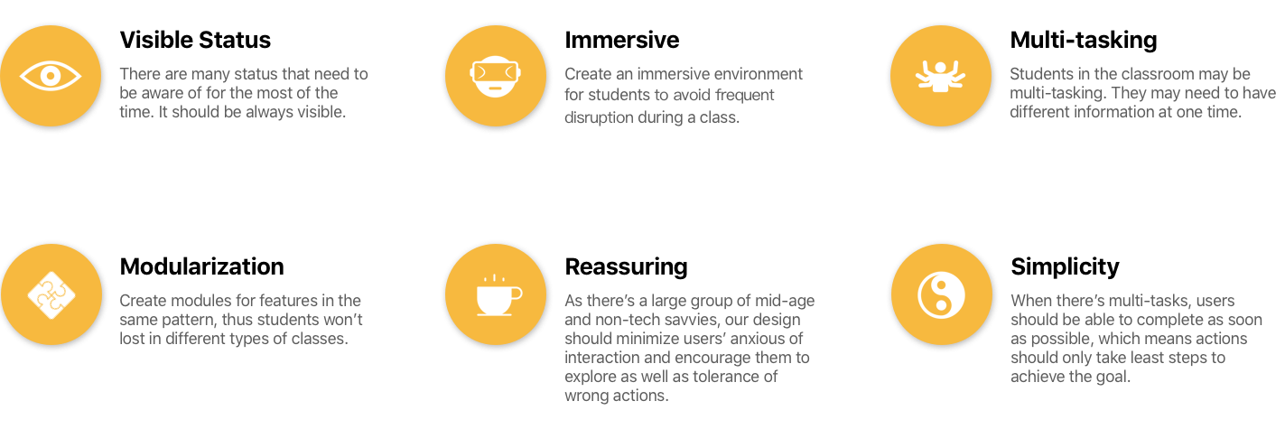
Apply Principle into design

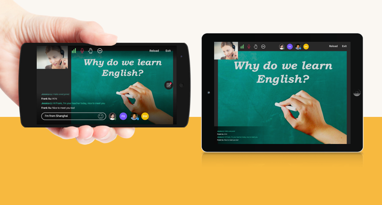
During the class, students’ microphone, camera status could be changed by the teacher. Previously as the status were hidden in the side bar, students couldn’t notice that. Now they are visible to students all times and least interrupted.
Same problem happened to chatting text. It was hidden and users had to switch between chat panel and the slide. It was much worse in the group class as teacher might chat with someone else and students didn’t know until they open chat panel, and consequently their learning experience was interrupted. I designed the chat area at the bottom left side. Only when there is message, it will be displayed. Students can always know what is happening while keeping focus on the slide.

Inherited from previous core interaction, users can tap on the screen to call more actions. The status are notably enlarged and some icons now can be tapped to change the state. At the bottom, user can type text to send messages and also check other student's’ status. At the right side, user can call out the notes panel. Instead of having note panel only as previous design, we could utilize the space to display both slide and notes.

The tablet version is slightly different but follows the same principle. As the screen size is much bigger, many actions can be directly put on the screen and notes can be displayed over the slide. Due to the screen ratio of the tablet, I used push-in panel for the note section on tablet.
Final Thoughts
The new design provides an immersive learning environment, and status are intuitive to users to notice any changes to them. I put the slide as the core to focus but also allow users to do multiple tasks at same time. To define design principles or directions are important before design, we know what problem to solve and also what we should keep in mind.
The concept had been presented to the management and received great feedback. Unfortunately I left EF soon after the presentation, but this project was carried on.

PROJECT BACKGROUND
EF would like to let students have a more organized study plan on mobile applications to increase user stickiness and avoid loss of students. The business side didn’t have a clear plan on how to design a learning plan for the students and whether the learning plan can be successful, but they wanted us to launch this feature to verify as soon as possible. Due to the urgency of the project, I proposed to develop in phases to quickly meet the MVP requirements first, then conduct in-depth user research and design verification in the second phase to optimizing the product.
Process Overview
The project started with two phases. The first phase is to quickly meet business needs in a limited time, and the second phase is to provide a more comprehensive solution after user research and design verification. After that, the product will continue to iterate.
Phase 1 - Meet requirements

Although we cannot conduct a comprehensive user research due to limited time, we had a talk with student adviser on how the current study plan was created offline.
One challenge to transform this offline activity into an online activity is to make students understand what they are doing and how they can do it.
Students do not have a clear understanding of the meaning of different stages. This process is currently completed by the help of student advisors. Therefore we consulted with student advisors about the meaning of each stage to students (e.g. how many hours to study, how many lessons per week, skills they can learn), and not just let them choose the level. We want to enable student to complete this process by themselves to create a rational study plan.
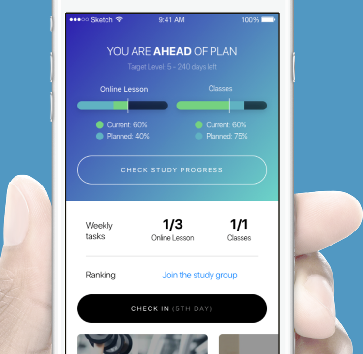
The design will also provide students a clear preview of their progress, where students would be notified if they were ahead or behind the plan.
User Research
At the early stage when we discuss with the business side, we found that although it seemed that what business wanted was to develop the study plan feature to let students create study plan on their own, but the actual requirement should be how to motivate students to learn more actively.
So while the design of first phase was being developed, we went to several student centers and deliberately invited students in different levels and time they had been with EF to participate in the research and try to understand three main questions:
How do students currently set up and complete their study plan? (To validate our first phase design)
What are the major issues to stop them from completing the plan? (Pain points)
What helps students engage with study more actively? (Motivation)
Students were interviewed. To explore more about students’ thoughts and experiences, we tried to guide them by pre-set questions then dug into their answers. Then we asked them to went through the prototype of phase 1 design to validate if our design had solved their problems or partially helped them. We also interviewed some SCs (Student Consultants) who normally helped students set up study plans and tracked their progress. By interviewing SCs, we could utilize their experience to optimize our designs and considering the app could also potentially reduce SCs’ workload, their inputs are important as well.


Phase 2 - diving deep
Summarized the results of user research, we put our focus on following aspects:
Interaction with others. It was almost a common understanding among students that they come to center instead of studying at home because they felt they were studying with others and they liked it. Although Smart English app was designed to be a self-study app, we were trying to enable students interact with others as they study.
People are lazy so we need to give a push. “By nature, man is lazy, working only under compulsion”. From students and SCs, we knew the major reason that students stop studying was laziness. By all means, we need to help them overcome this weakness.
Encourage rather than punishment. By punishment, we may force people to study, but it certainly lowers the efficiency and may eventually fail. Therefore we spent more time brainstorming on how to encourage and reward students.
Breakdown the goal of study. One of the issues we found was the ultimate goal was set towards the end of students’ study. As the time passes, students might lose their enthusiasm to complete the goal. We wanted to help students breakdown the goal into months or even weeks.

Monthly Report
Learning from many other apps, we created a Monthly Study Report to summarize the progress of the month for each student.
We designed 4 scenarios with different copies in order to encourage everyone in a different way. Even for one who had done nothing, we turned the tone to be more humorous and tried to cheer students up.
In addition, with monthly report, students can be notified and track their progress on a monthly basis to avoid falling behind too much to catch up.

Share Achievements
We designed several scenarios that allow student to share their progress, achievements, skills with others on social media. Interaction with other users brings numerous advantages for experience and business.
People like to show off especially their achievements. We could fulfill their self-satisfaction and also build brand recognitions as it spreads on social media.
The achievements were designed to be shared as a picture in phase 2. Later we planned to transform it into a more interactive form to be shared.

Target Breakdown & Stimulation
Not only monthly checkup, we even went further for a weekly checkup. We evenly split online lessons and offline classes into each week but also allowed users to adjust their target every week while remain monthly target unchanged.
If user hasn’t finished their tasks, we also send notifications to remind them.
Hence we could stimulate students at least on a weekly basis.

Customized Recommendations
To push students to study, we also designed a place to recommend students what to do next. It checks students’ progress and completed tasks and directs students to the next task which fits students’ progress.

Engagement
Students could opt to join study group to study together and compete with each other. The competition focus more on meaningful achievements instead of time-consuming achievements.
I wanted to adopt gamification philosophy in the app to make studying more interesting therefore increase students' engagement. One of the idea was to reward users with badges when they achieve something.
Final Thoughts
It is normal that designers have to complete a project within a short time and there was no time to complete any sort of user research or analysis. But better late than never, many projects are agile and we have chances to iterate the design. We’ll eventually find time to do the research and testing and there are always rewards for designers to do it. Additionally, it is always a good choice to spend some times on secondary users, in this project, the SCs, they will also provide valuable information and fresh thoughts from another angle to help designers solve problems.
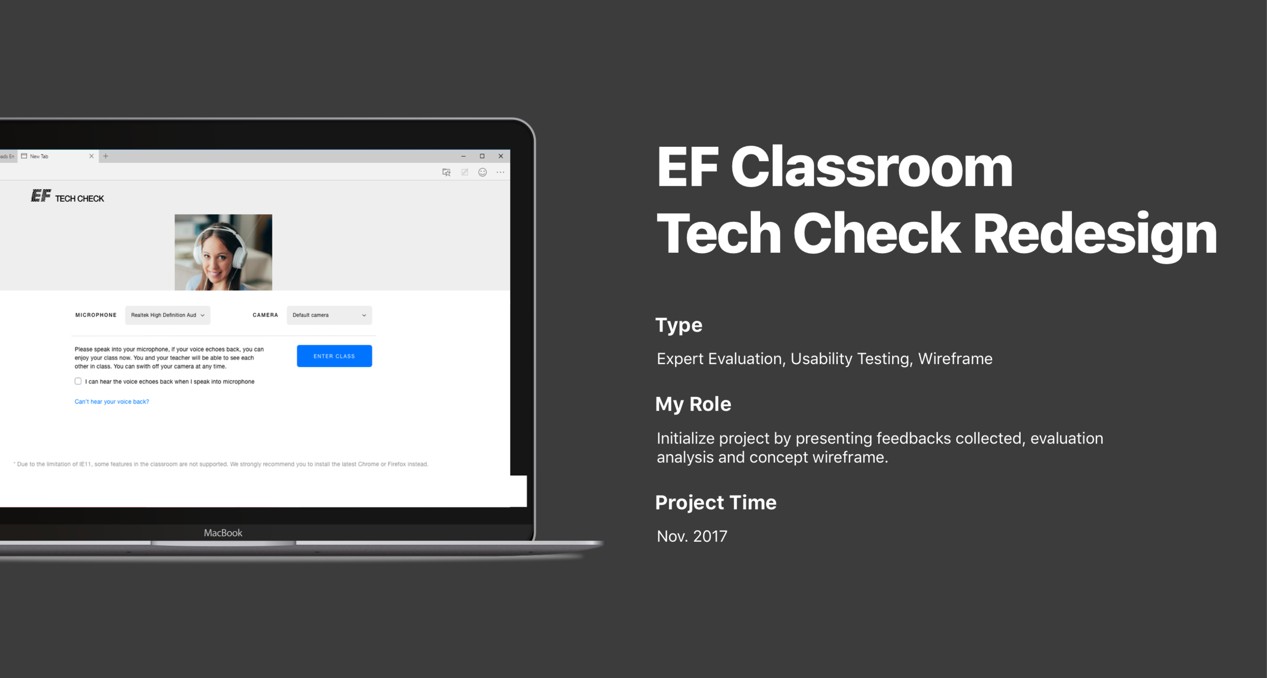
Project Background
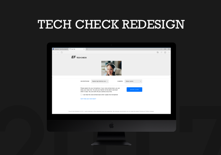
EF Classroom is the major study tool in EF students’ study cycle. It is available on multiple browsers and mobile apps for both iOS and Android. Before entering the classroom, it is required for teachers and students to take a Tech Check, which aims to make sure their internet, video, and microphone etc. are working properly.
The customer support team has consistently reported issues that users have experienced. Although the root cause was majorly technical issue, and the development team was trying to solve problems in their way, I also found many UX problems that amplified technical problems. I initiated the project and got approved by management to implement the solution.
Process Overview
The first time I used Tech Check, I realized there was a lot of things could be improved. I went to customer support team and collected feedbacks regarding Tech Check and found out many customer complaints could be solved or reduced through UX improvements. I’ve also completed an evaluation on the current Tech Check flow with some designers and developers. Then I had an image of where to improve.
Next, I started wireframing. With wireframe that indicated how the problems could be solved, the management agreed to add this project to the pipeline. I then carried out usability testing on real users to understand the behavior and validate the problems. Based on the result, the new Tech Check has been finalized and developed.
Original Tech Check
As the feedbacks were collected and an evaluation was completed, the following issues were identified as the major problems we were going to solve:

Too much information.
Irrelevant information in one-page view.
Annoying audio check.
Final step looks too similar to processing step.
There’s a freeze when switching from local check to remote check.

The process indicator doesn’t really match the current state. While it says Audio Device Check, it’s also checking video at the same time and then gives video device check result afterwards. Therefore when user is in step 2, one will be confused as there’s also a camera video showing one’s self.

The page includes a progress bar, camera check, microphone check, problem description, and transmission indicator. The user would easily lose what to do on the page, especially the camera was moving all the time.
Re-designed Tech Check
We set out the direction of the re-design was to focus on providing a clean interface, let users focus on one task per time, and prioritize the information.


The failure states now focus on one thing at a time only. We separated problems and solutions to make it clear to users what happened and what’s next step.

For complicated problem solving tips, or secondary information, we moved them into a pop-up where only displayed if user wanted.
Final Thoughts
The new Tech Check has been launched 2 months later after the proposal. Later we added some other little things for different states, but I tried to keep everything under the principle to avoid becoming overstaffed again (Using pop-up instead of add into the page directly and Gestalt to organize information). Later when looking at the report, the Tech Check pass rate had increased significantly and student complaints had dropped.

PROJECT BACKGROUND
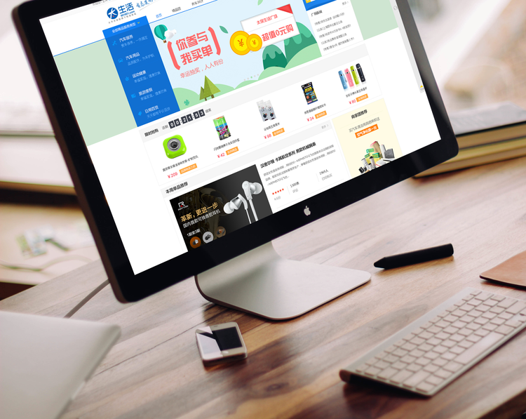
In 2015, CPIC wanted to launch their new e-commerce website to better serve their customers. Just like many other companies, CPIC wanted to copy the leading e-commerce websites in the market, therefore there were more about the details instead of creativity. Despite that, this project had one very special aspect. Most of the users were those who bought insurance from CPIC, and then received vouchers/redeem code as promotion to attract them to the e-commerce website. Therefore, I put our design focus on the gift redeem process.
Competitive Analysis

We analyzed major e-commerce websites to understand what information should be included in each process and why.
Potential Problems
Too easy to get visual similarities. Brand identity may be too weak
Navigation is important as features/modules are many and fragmented
Too many colors may result in lost on the site
Users may not be able to complete objectives if the information hierarchy is not clear
Highlights
Variation of product display
Promotion banner is visually eye-catching
Striking colors
Design for user objectives
Persona & Scenario

Requirements V.S Expectation
From the client’s perspective, they want user to sign up before redeem the gift and therefore get users’ information.
But user just want to get the gift, why they have to sign up?

“We could have a menu called Gift Centre, so the use can see it once entered the website and then click in (really?). And in the next page, you put a sign in box and tell users that they can redeem after sign in or sign up.”
Original Redeem Process User Flow
The client had an idea of how to redeem like this:
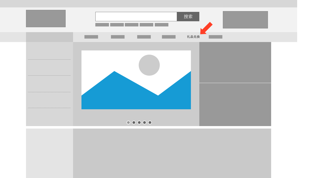
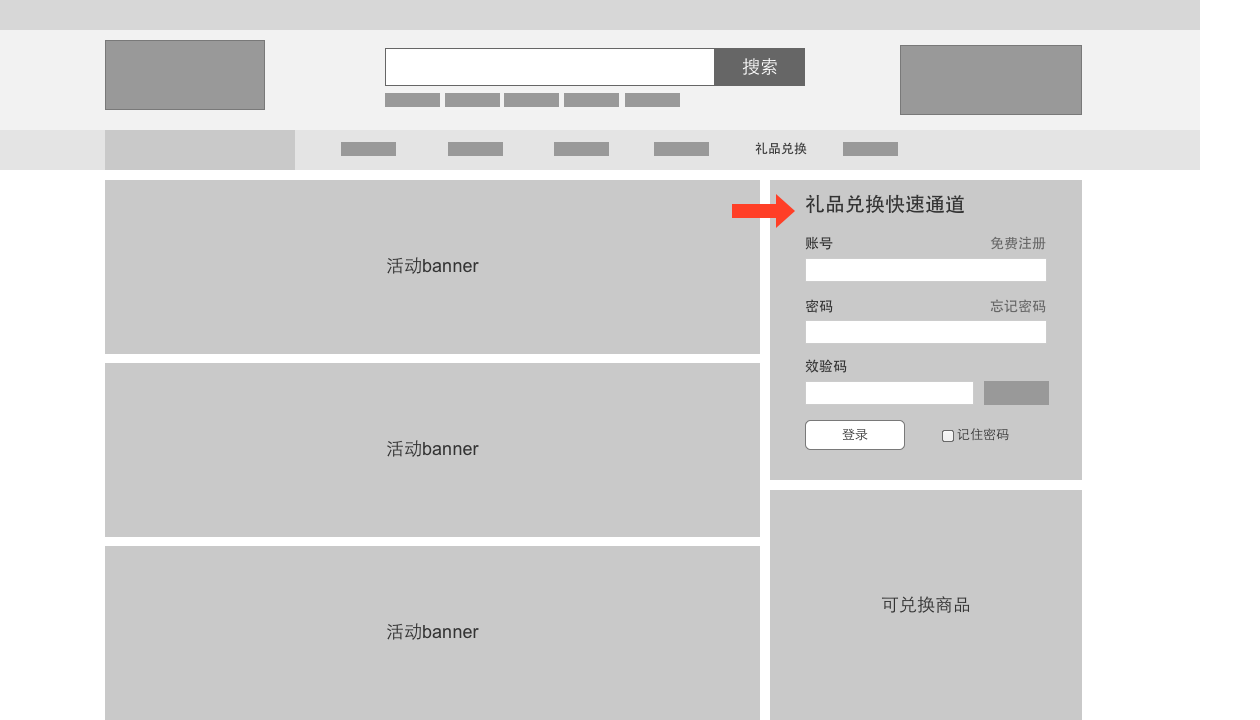
Homepage > Gift Redeem Center > Register/Login > Input Redeem Code
Where’s the entrance?
Why do I need to register?
Where do I input the code
It's understandable for a client to think like this. They have provided the entrance for gift redeem, and told the user to sign up/sign in first, the user should follow the instruction and do what the client expected. However, to the users, signup is not a necessary step for them. When asking users to sign up, they think they are doing something not related to gift redeem, therefore dissatisfy and then give up.
Solution – Be Obvious

Analyzed users’ cognitive path. The first thing users consider is: “I got the code, now where do I input it?”
A dedicated area for gift redeem.
Users are seeking for a place to input their code, and here we provide it (Phone number is linked with the redeem code).
Get rid of useless pages.
Be cautioned that users may give up if they are asked to sign up before redeem the gift.
Play a Little Trick
The redesigned page allows users to participate in redeem process from first page.
Once users enter the phone number, they are already in the process and no matter what happened there, users will think it’s part of redeem process.

Using “goal-gradient effect” to increase user participation rate. Users will find out that they have already made progress to step 2, they have more motivation to complete the task.
Mobile No. (account No.) is auto filled in. Verification code is auto sent. Users only need to fill in two text fields.
Wireframe

Yes! It’s responsive!
Hybrid grid.
Responsive contents & responsive modules.
Ready to see interactive responsive design wireframe.
Description of responsive rules in every wireframe page.

Who wants to see documents?
No complicated documents, all in one wireframe file.
Explanations of blank status, variations. Trouble free for front devs.

Web app version is also available on mobile phones.
Final Work


Management
I also took responsibilities in project management. There were 2 other UX designers and 3 UI designers involved in this project and I was responsible for managing the project progress, assigning resources, daily work management, quality assurance and then report to manager and client.

I have also written an article about this project, take a look: A Case of Design Psychology, the Tricks that We Use in the Design

PROJECT BACKGROUND
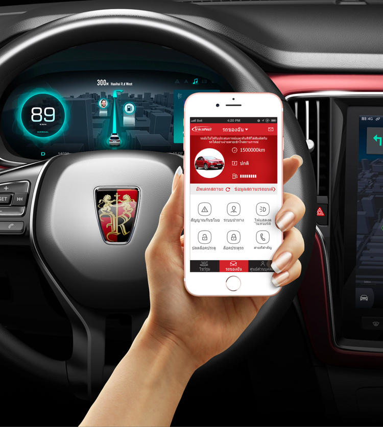
Automobile industry is embracing the new technology, not only advanced HMI but also the IoT. SAIC was launching a new vehicle in Thailand together with a brand new mobile app which can be used to interact with the vehicle and receive vehicle information. We were discussing a HMI project with SAIC but noticed their app design and pointed out few potential problems. The client was immediately interested in our solution. I spent a day to make a project proposal and met with client to present. The client then decided to invite us and to help them improve mobile app experience.
The goal of the project was to:
Evaluate the Usability of the mobile solution
Identify problems areas, or key areas for optimization
Provide suggestions for improvements based on the findings
All of the above actions will be conducted in consideration of the Thai market
Process & deliverables
Initially, we proposed to conduct user research in Thailand. Due to the time and budget constraints, we agreed to do user research in China but recruiting Thais to participant in the research. On the other hand, as the client had an in-house design team, we were only responsible for usability testing and providing recommendations.

User Research Participants

Participants were filtered by screener questions and 7 Thai participants were recruited prior to testing.
Figuring Out Information Architecture

The client only provided the paper design, we organized and structured them according to user scenarios to understand the architecture and flow.
Test Preparation

We designed 12 test cases and we carefully measured several metrics such as task completion time, number of errors, satisfaction rates, number of steps, etc. to understand how well they could complete the tasks.
Prior to test day, we conducted a demo test session in our office to test the scenarios created, the equipment that was going to be used and to get a first impression from a non-related audience.
All the designs received from the design team, were printed out in color and was resized in order to imitate a real smart phone experience.

Testing


Most people tend to feel anxious and nervous when taking a test, especially when other people are observing. In order to create a comfortable and safe environment for the user we collaborated with a professional usability test lab and encourage participants to think out loud during the test.
We used a video camera to record the users’ gestures and responses so we could review in detail later. The clients were also invited to observe the testing sessions.
Major Findings
Navigation - registration processes were too long and required repeated information. The location of the main buttons didn’t stand out, size was too small and the color blended in the background. Too much text was used in places were icons could have been more beneficial.
Descriptions - not enough information was provided and the users were confused in many places, especially in regards to professional terminologies.
Localization - the design was created based on Chinese users’ standers. Many elements interpreted differently when it comes to the Thai audience such as: the map, icons, structure and even the colors.
Consistency - The design was inconsistent in many places including title names, colors, language, location of buttons and actions.
Aesthetic and minimalist design - the text should match the design and will only contain necessary wording. we found many place where the text is too long and doesn't fit its frame. Also, Text was used in places where an icon or picture could have been more appropriate.
User control and freedom - Throughout the design the user has a lot of freedom, however, user has to provide too much information in the registration process that requires too much time and the information could be difficult to locate.
Analysis & Documentation
In the report, we identified the issues that we found during the research, provided the data and figures to support our findings, and provided optimization recommendations respectively.
The report was delivered to client’s design team and they re-designed accordingly. We then had a 2nd round usability testing session to validate the optimized design.


PROJECT BACKGROUND
Nowadays, mobile app is a major entrance of bank services. Bank of Hangzhou also relies a lot on their mobile banking app and we were approached to redesign the experience of their mobile app.
Banking is one of the most complicated services and jargons are heavily used. I spent lots of time to understand all kinds of services they provide and major issues were found as below:
Due to the design constraints, all features are tiled without categorization and hierarchy.
Too many redundant steps to complete a task.
UI is outdated and lack of user feedback.
Thus the main goals of the redesign include a cohesive type, color and language system, improved information architecture, content discoverability, simplified user flow and a mind on extensibility.
Competitive analysis
I have tried out many banking apps and financial apps on the market to see which had the best experience, why the experience is good or bad, and what I can learn from them.

Using icons to indicate different features on the home page
Using “Hamburger” or Bottom Tab to categorize features based on apps’ core business
Some are using creative ways to interact but the experience is not the best (e.g. CCB, PSBC…)
Importance of better banking app experience includes simplicity, discoverability, user feedbacks, etc.
Information Architecture
Information architecture was the most important part of this project as it was the major problem of current app and it was important to content discoverability. I analyzed the current information architecture and worked out the new hierarchy. Features were categorized in a way that users were able to understand where features were located and how to navigate through.

I created this information architecture to re-organize their features. Many small features were grouped together into a module. Based on the information architecture, the method of navigation and homepage can be decided
Wireframe
I sat close to the client therefore I can get feedback everyday and I had been through 4 rounds of proper design reviews with clients. At last, over 100 wireframe pages had been created and made to clickable interactive wireframe for users to test.

Homepage optimization
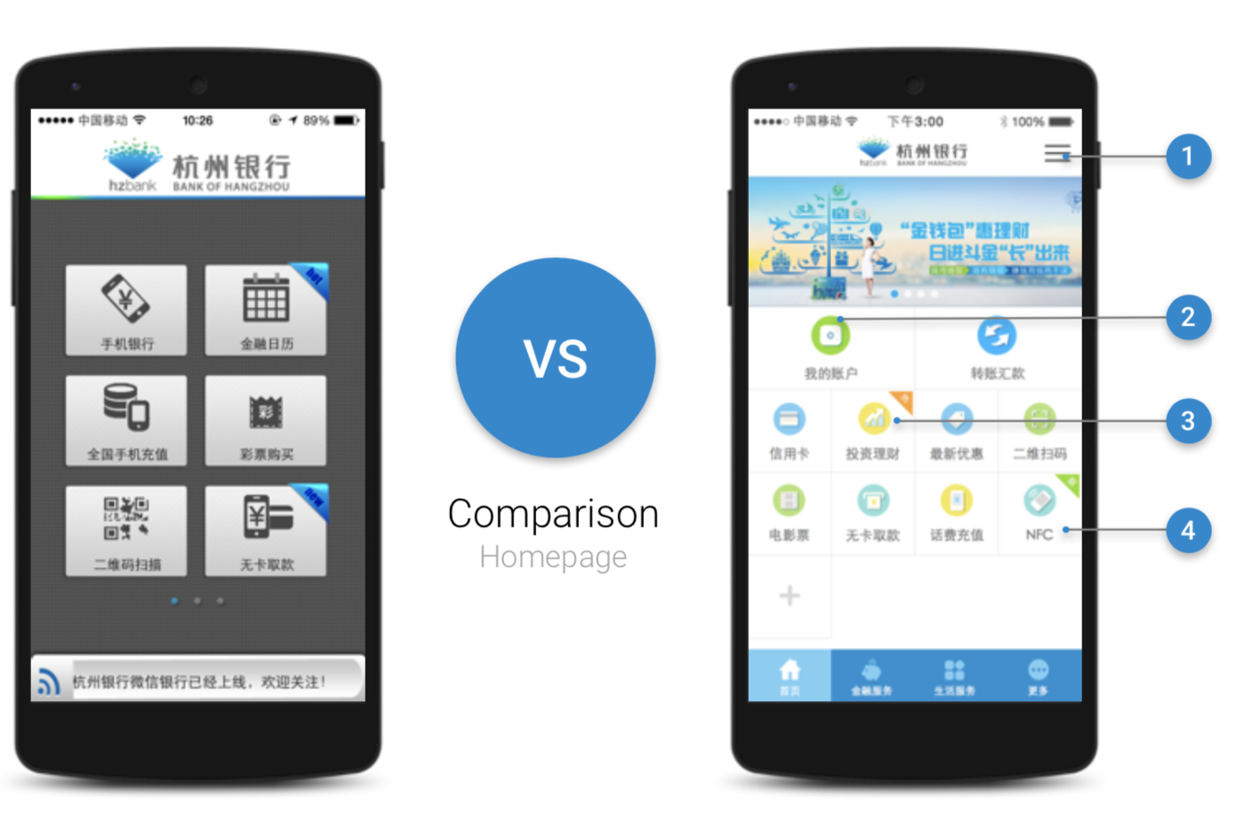
Sidebar + tabbar are used specifically for complicated bank services. The sidebar of any major page serves to cross-link users to other major content, which was one of major user needs for bank app. This helps the user find what they are looking for and discover additional helpful content without having to dig through nested menus.
Based on user research, we prioritized main features for users
Blocks direct users to internal and external content pages that are most relevant to what user needs. Icons are differentiated with other apps to create better recognition.
Using flat design, bright, clean color palettes to delight our users and broadcast the brand identity
Accessing My Account

The content was nested deep in the hierarchy. User has to click four times to get to the details.
Users have too many choices. But the most frequent used one is hidden.
Confusing navigation. Tabbar appears in sub menus but not in the homepage, users are easy to misclick it and have to go through the process again to get back.

Optimized path to access My Account page. I focused on users’ main objectives, move secondary activities afterwards such as card selection and have three main features (My Account, Debt, Credits) into one page.
Transfer

As one of the most frequent used feature, it is hidden, transfer is a pain to the users.
Users have a simple task that is to transfer but they have to understand different types of transfer and jargons.
Tabbar is unnecessary in transfer page as transfer is an immersive environment.
Icons and layout provide no help but misleading users.

The system will be intelligent enough to help users fill out the form.
Focus on users’ primary needs (transfer), then make other compulsory actions (transfer type)
One-way process to avoid back and forth and focus on current task.
Once the process is completed, provide other useful options instead of a dead end.
OTHER DESIGNS

Bank of Hangzhou mobile banking app won “The Best User Experience Mobile Banking App of Regional Commercial Banks”

PROJECT BACKGROUND
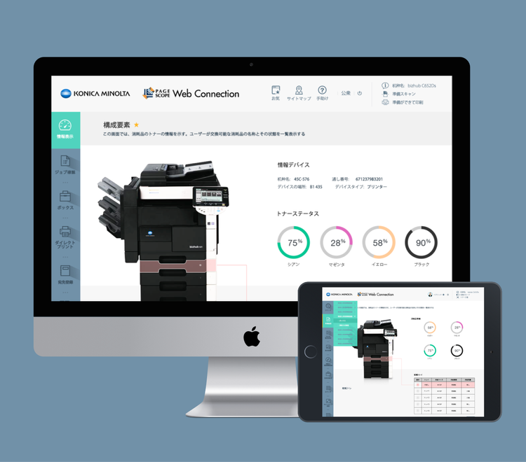
Konica Minolta’s printer has been largely purchase and used in various places include companies, schools, libraries, governments and convenient stores. The client had received many complaints about their printer products, and asked us to improve their printer management system experience. Contrary to dashboard panel embedded on the printer, the printer management system can only be accessed via printer IP address just like routers. Compare with dashboard panel, the management system has much more features for complicated operations which is vital to Konica Minolta as their customers are mostly business customers who need to manage their printers instead of just printing.
Design Process and Deliverables
As we were requested to make a preliminary design, i used a user-centered design process: creating personas, conducting expert evaluation, ideating based on findings, creating prototypes, hallway usability testing and high-fidelity visuals for our proposed design solution.
The project has been divided into two phases. The first phase includes creating personas, conducting expert evaluation, and visual directions. I created 5 personas, reviewed over 100 screens of current system, created an information architecture diagram and I also wrote a 32 page report that outlines the process and summarize all our findings and recommendations. After first phase, we had a review with client and got their approval on our report, then began phase two where we could complete full wireframe and visual designs.
Personas

Although the client knew where their products were using, and who the users were, they didn’t fully understand users’ behavior and motivation. I was unable to identify optimization direction without understanding target users. Therefore I created user personas and scenarios together with the client to form a common understanding.
Expert evaluation

Every page of the system had been evaluated and usability issues were identified with recommendations for optimization provided.
Optimization Directions

Layout Analysis

System Info and Supplement Info occupy too much vertical space, users have to scroll to see more important information.
The information in Supplement Info Area are separated, similar information are too far from each other.
The logout, refresh, support icons look similar visually, and belong to the same group, but they are placed upper-right, lower-right and left 3 positions.
Logout button next to user name will build nature connections to its purpose automatically.
Menu space is not enough especially in admin’s view, it is more difficult to use in a tablet .
Optimized designs

For different user groups, I try to let them focus only on what they need without unnecessary information interruption. Therefore the information on the screen would be clean and tailored for the specific users and save overwhelmed space.

Based on “What you see is what you get" philosophy, I try to make user aware what they are actually operating, especially action in management system involves a lot of remote work.
Visualized information increases the efficiency of understanding the information considering the system is full of data.

For complicated setup process, clear instructions and tips can improve the efficiency and accuracy. I made clear process instructions in each user flow, simplify the process, increase the possibility of user self-correction and error prevention mechanism, to ensure users can complete tasks timely.
Final Thoughts
This project was a good example to demonstrate how to utilize the user-centered design process when there were constraints to conduct user research. I was surprised to know there were needs of using a web management system of printer. However, after diving into this project, i realized there were many scenarios that we might not see often but the needs existed for a large groups of people you just didn’t know.
I was glad that we went to the final phase so we could present our complete designs to the client. It could only be done if the client acknowledge the output from the first phase. It was important to keep close connection with client especially when they located far away, which helped us understand client’s thoughts and get them approved.